Well, it’s been quite a while since my last post, so much for the tablet making things easier! Actually, I’ve just been opting to draw in the evenings (on the tablet) rather than make updates. I should probably just set aside one particular evening or something and be consistent with it. I was actually in the middle of a post last night, but the tablet dipped below 60% battery life, which is when it flakes out and reboots itself. I was hopeful that a draft had been autosaved before that happened, but apparently not. Grumble grumble.
Anywhat, while I haven’t been particularly reliable with my posting frequency, I have been somewhat productive. Aside from the sketches and digital paintings I’ve been working on at night (which will show up in a post at some point), I’ve been revisiting the covers I did for L.S. Gagnon’s The Witch Series. With the launch of her new publishing venture, Autumn Day Publishing, Lisi wanted to revamp the first four covers I worked on. Specifically, she wanted to have full wrap around covers. It proved to be a fun and interesting challenge, allowing me to go back and correct some of the things that I wasn’t happy with (but didn’t possess the digital skills to improve at the time). It was also quite the eye-opener as far as how much my efficiency, work flow, and overall skills have improved in the few years since I originally created the covers. Each of the original covers took me between 80-100 hours each. The expanded cover (basically a slightly more complicated back cover, since the front cover was already done) with improvements only took 6-12 hours each. That’s a significant improvement. So, where else would I start but book 1…
The original cover for book 1 was alright, but full of problems from my point of view. Aside from being too dark (and causing printing issues because of it), there were a lot of color, lighting, and detail issues I just wasn’t happy with, but it was the best I was capable of with my digital skills at the time.
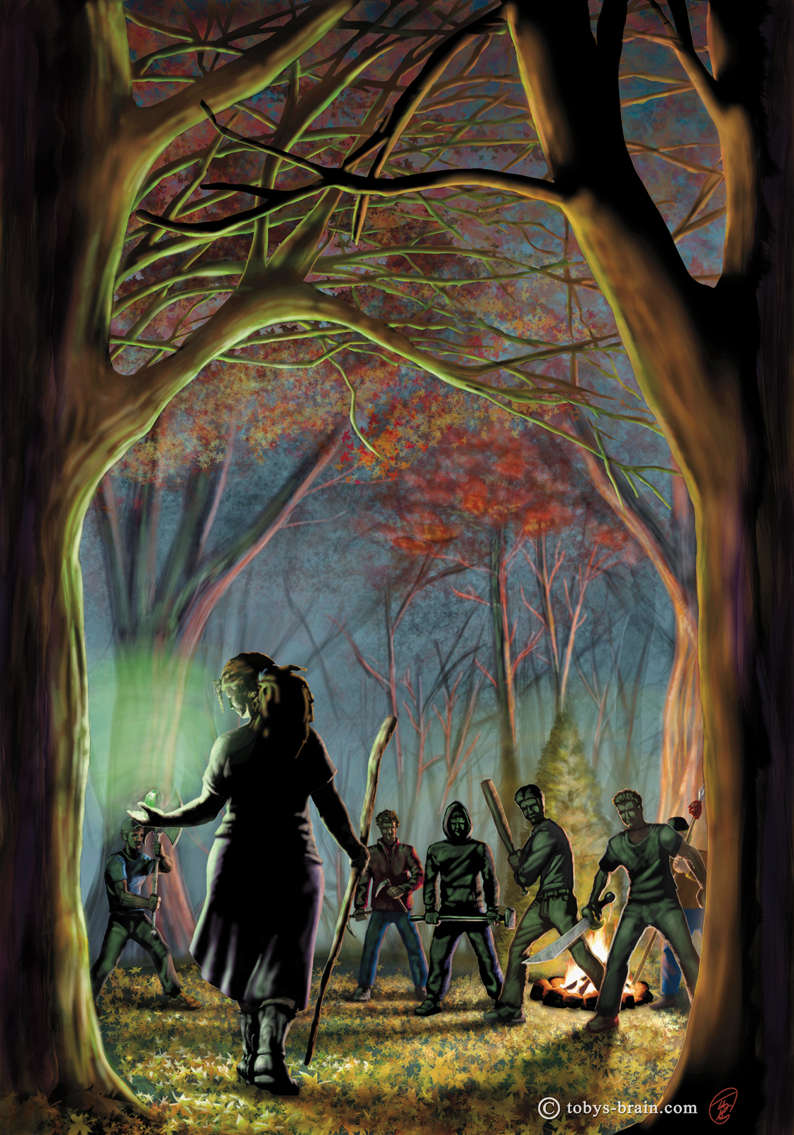
Here’s the expanded cover for book 1, which, in my opinion, is miles ahead of the original. There are still a lot of things I don’t like (some of the colors are a little too saturated, some of the edges are a little to soft, I could have done more with textures…), but overall I’m much happier with it. Among other improvements, I tightened up some details, brightened up the dark areas, and got rid of the jumble of branches at the top. The dual light sources made this image challenging to begin with, but it’s a lot closer to what I originally saw in my head now.

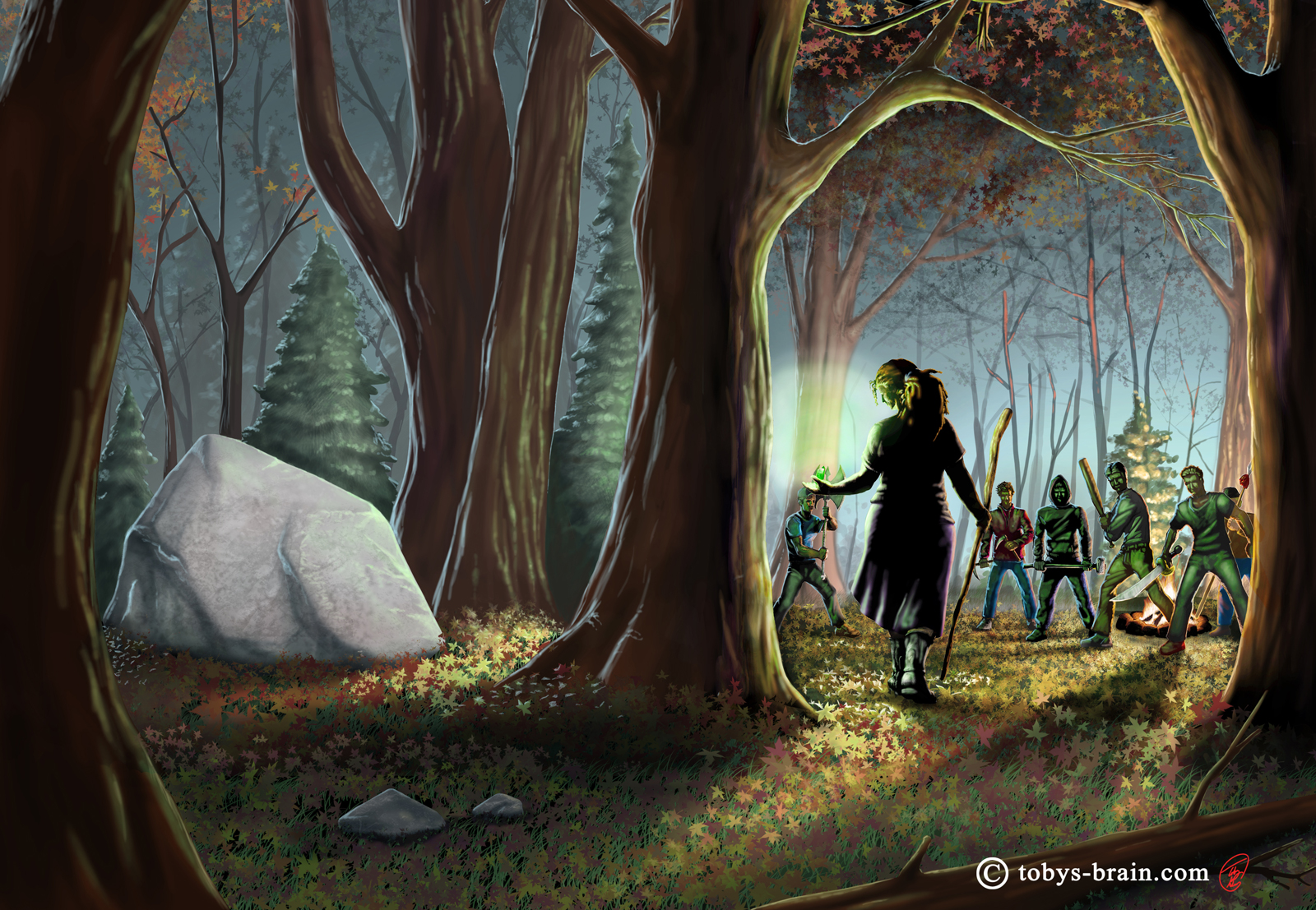
Of the four original covers, this one was probably my favorite. For the revamp, I didn’t really touch any of the original cover (other than maybe adding a few leaves and blades of grass along the right side in order to push the main image closer to the center of the front cover). For the back cover, I kept the colors muted to enhance the contrast between this side of the portal and Magia. I could have done a bit more with some bark textures, I think, but overall I’m happy with this one.
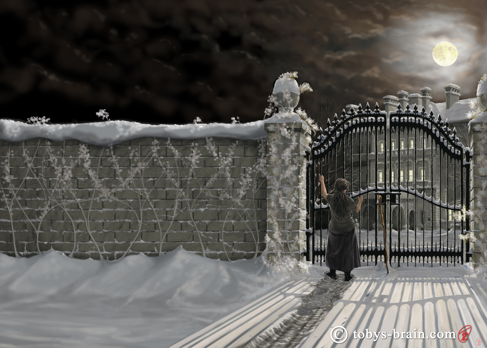
This was actually the first cover I did for Lisi, and like book 2, I didn’t have to go back and change much of the original image. The expansion was pretty simple, though plain, but seeing as it’s on the back cover and covered by text, much more than that would either be lost or become a distraction.
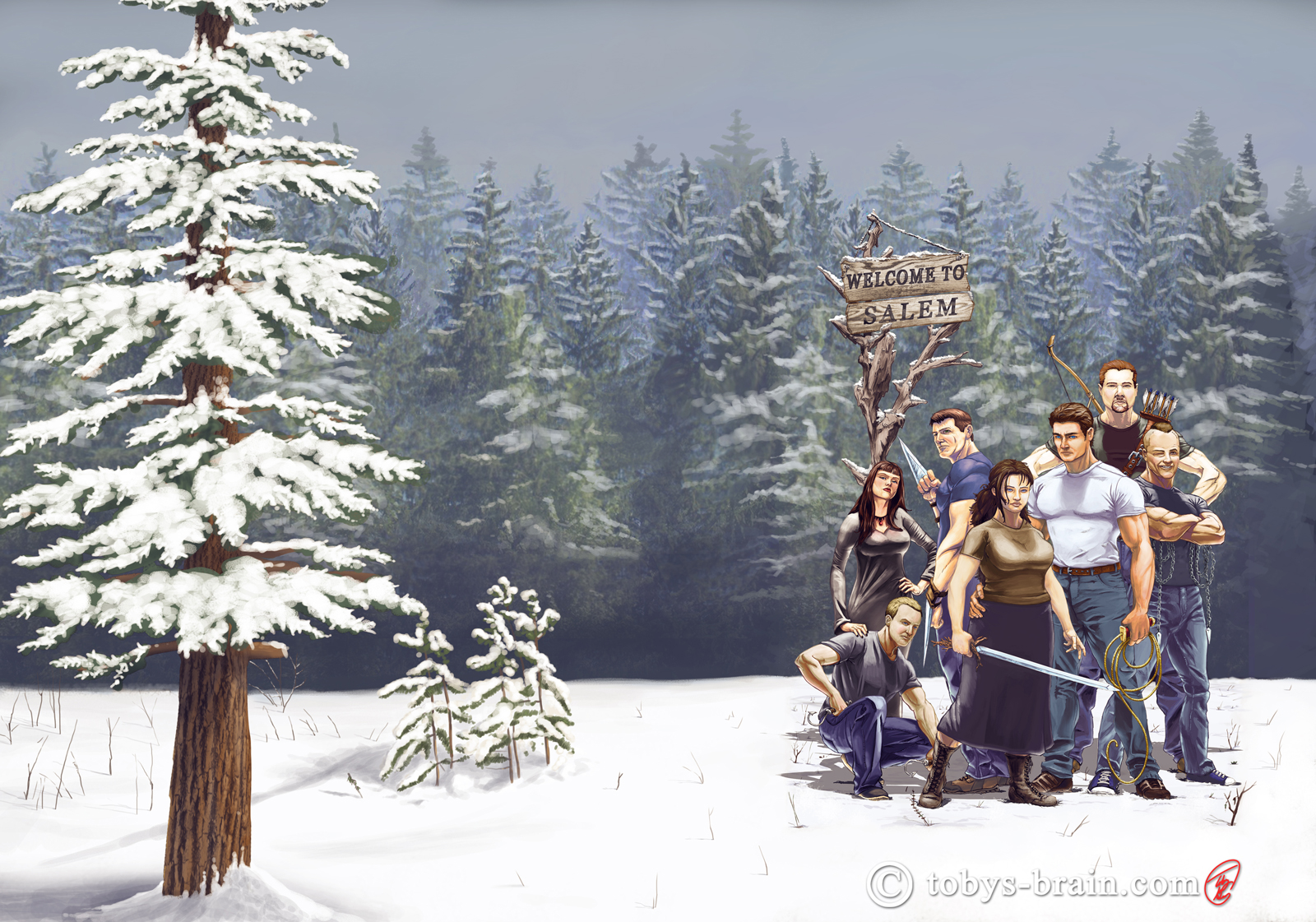
This was the last of the four covers I did, chronologically speaking, and the one that probably best represents my skill level at the time. The number of figures, and the fact that they are based on real people the author knows, definitely made this one challenging. I was absorbing so much information, trying to learn how to be a better digital artist, and artist in general, during the couple of years I created these covers, that pretty much every cover was done with a different “method”. With this particular cover, I was experimenting with colorizing a fully rendered black and white painting. Given the look I wanted to achieve, it wasn’t the most efficient or best way to go about things, but I made it work. This was another simple expansion, given the background, which was intentionally left minimalistic so as not to distract from all the figures.
After completing the wrap around covers, Lisi set me on a new task: illustrating the covers for her children’s book series. There are currently two books, both with photo based covers (one is a straight photo, the other is a photo composite), but she wanted me to take a crack at them.
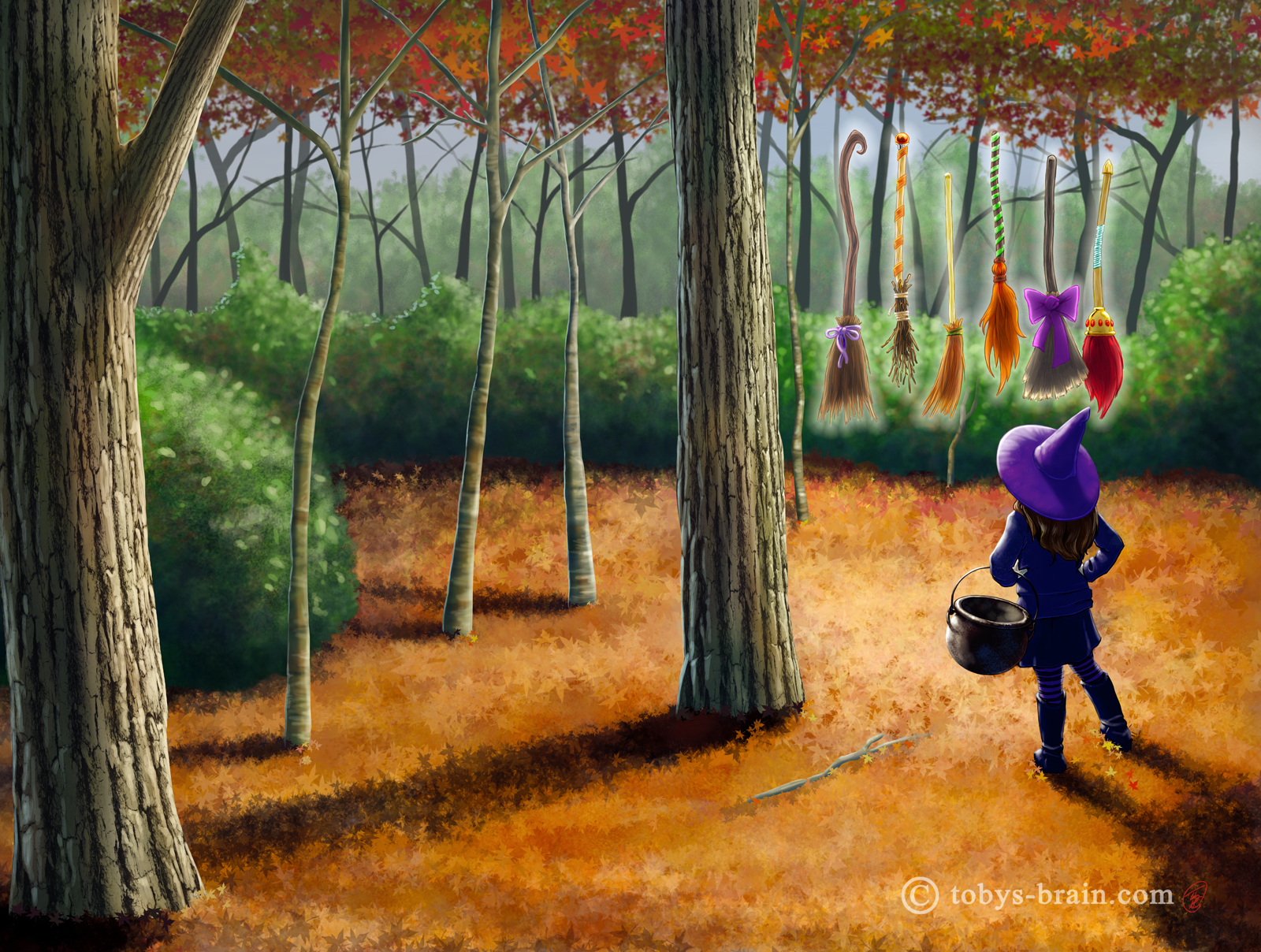
This is book 1. The photo cover was a nice composition, but it didn’t quite “pop”. I kept the elements that were strong (and important), like little Thea and the brooms, but reworked the rest of the setting and gave the colors some more life. Originally the brooms were suspended between two trees on a line, but I thought it might be cool if they were magically floating in front of Thea. I also took the opportunity to add some nice textures to the most prominent trees. I like this one overall, but in hindsight I might do something different with the greens, either change the textures to make them look more like evergreen scrub, or alter the leaf colors to match the rest of the fall setting. They were based off of what was in the original cover photo, fall leaves on the trees with leafy green bushes, but the more I look at it, the less “right” it looks in my illustration.
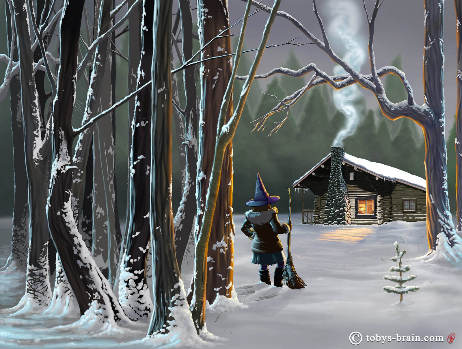
Here’s my latest cover, for the second Little Witch book. There will always be things I’m unhappy with in any “finished” piece I create, but I’m really quite happy with this one overall. It is teh culmination of a lot of learning and practicing working digitally. I began with a photo composite of my own in Photoshop as a reference for the layout and a few details, then went to work drawing and painting digitally. I’m pretty happy with the snow-caked trees, as well as some other elements. I wanted to push the shadows darker, to bring out more contrast since this is a night scene in the woods, but past experience told me that would lead to printing challenges again.
There you have it, that’s what’s been keeping me busy for a few months. Next up is a cover for the newest, not-yet-released Little Witch book, as well as a cover for a new series by my patron saint of the (my) arts. Amidst all that, I hope to squeeze in some more It’s Plunger Monkey Dynamo Time! work as well as some doodles I have going on my tablet. I’ve been asked to contribute some promotional type art for the wonderful jiu jitsu group I’ve started training with, which should be fun. I also might be designing some new class B shirts for our Boy Scout troop. And there’s always 10 Things to finish up (I actually had someone contact me through the TOBYSBRAIN FaceBook page to inquire about it’s availability. I was almost embarrased to admit it wasn’t finished, but it’s good to know there might be an audience for it out there somewhere.).
Enough typing, time for drawing.
Please let me know what you think, it makes my brain happy.