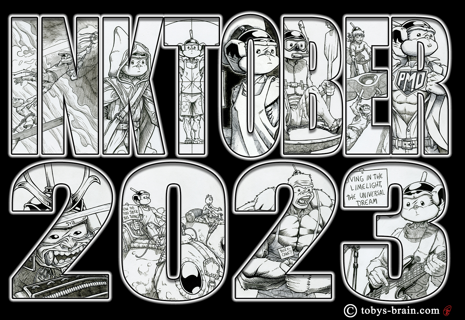
Alright, trying to get back into some kind of productive nightly ritual and put my tablet to good use. I have several other post ideas, but I’m skipping over those to get to this one…I just can’t come up with a title…
I love working digitally, but I miss “traditional” media. It’s part of the reason I’ve been drawing It’s Plunger Monkey Dynamo Time! exclusively the old-fashioned way, then scanning, tweaking, and formating the panels into strips. I like the feel of pencil and ink on different textures of paper. I like erasing the pencil lines to fully reveal the crisp, inked lines. I like getting dirty. Working digitally affords a LOT of short cuts in the process (like not having to fiddle with getting an image to scan properly, or digitally having to correct images when they weren’t lined up properly, or stitching images together because the scanning bed isn’t quite big enough. It also allows for a lot more experimentation for someone like me, who often gets paralyzed with indecision mid-drawing. And of course there’s the ease with which one can switch to working in color or mimicking a variety of different media) and it is by and large the more logical, time efficient way for me to work. However, sometimes I just want to get dirty.
Last week, my youngest son’s Cub Scout den started working on their Art Explosion Adventure. The requirement I had them working on was to draw two self portraits using two different media. I showed them some of my self-portrait work from Inktober 2015 to get them thinking about the different possibilities and to encourage them to have fun with it, to reveal some of their personalities. I had them work in pencil for the first one, and water-color for the second (because I knew they were somewhat familiar with it from school and it’s easy to set up and clean up). As I was gathering supplies for the meeting, I started thinking about the tubes of water colors in my hand and how I’ve never really taken the time to play with them enough. I remembered how much I love the combination of water colors and colored pencil that I’ve seen some other artists employ. Those thoughts combined with my more recent desire to play more with my Copic greyscale markers…I think the best way to describe it is I got creatively hungry. It’s very similar to what eveyone feels when they are thinking about or looking at something they really want to eat (yes, I know that sounds weird), I can kind of feel it in my mouth and throat…
Anywhat, by the end of last Monday night, I had decided that as soon as I finished up the digital project I was working on, I was going to have some fun with ink, Copic markers, water colors, and colored pencils. I just needed to come up with an idea for an image, which was proving challenging.
Plunger Monkey to the rescue.
Given how big a role PMD plays in my life and my art these days, I figured it had to involved him. I’m not sure where the image idea came from (that’s a lie. We ALL know where it came from), but I drew this:
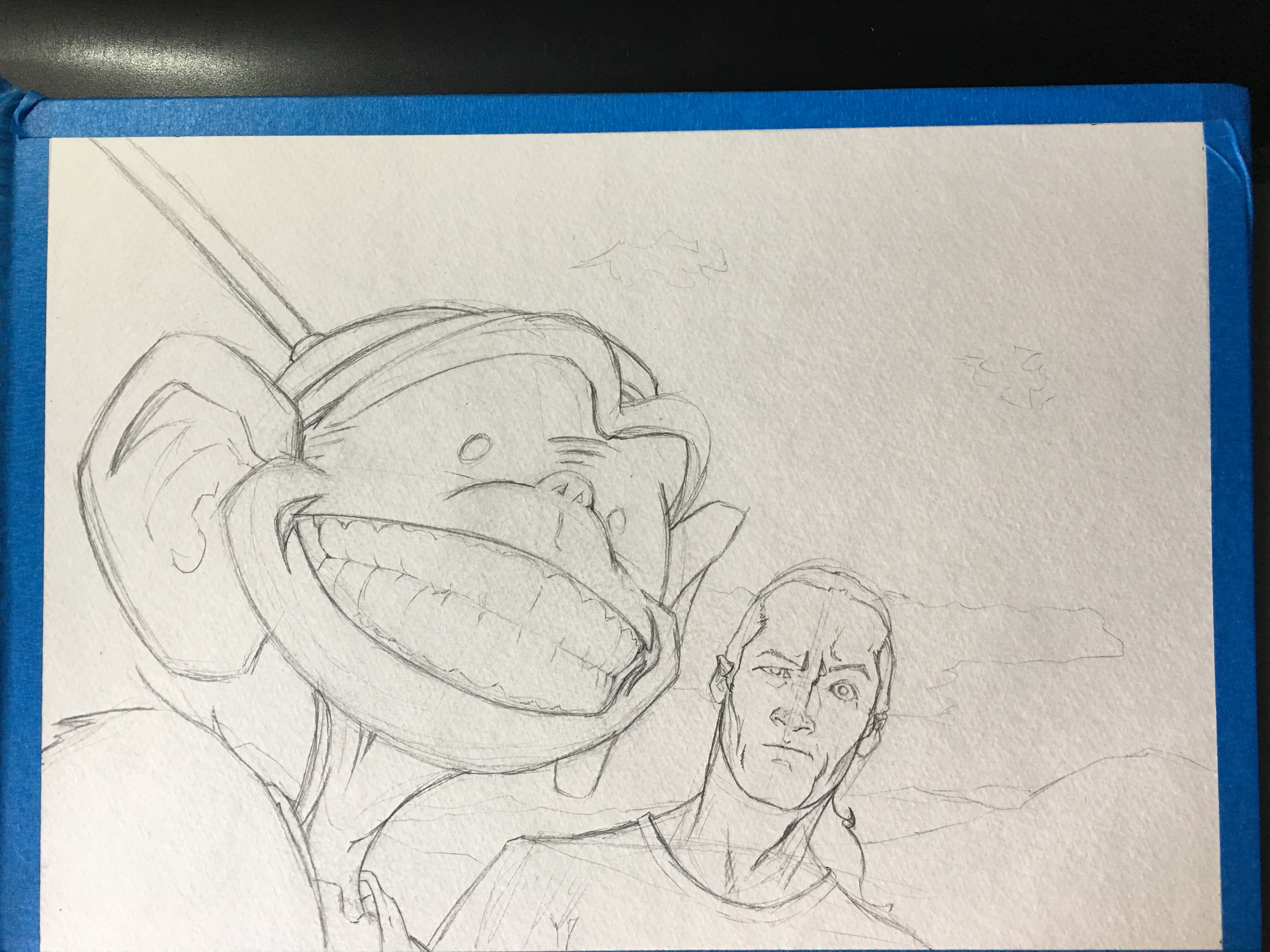
Say cheese…
So, this is from that time that Plunger Monkey and I went hiking in the mountains, and he kept taking selfies…
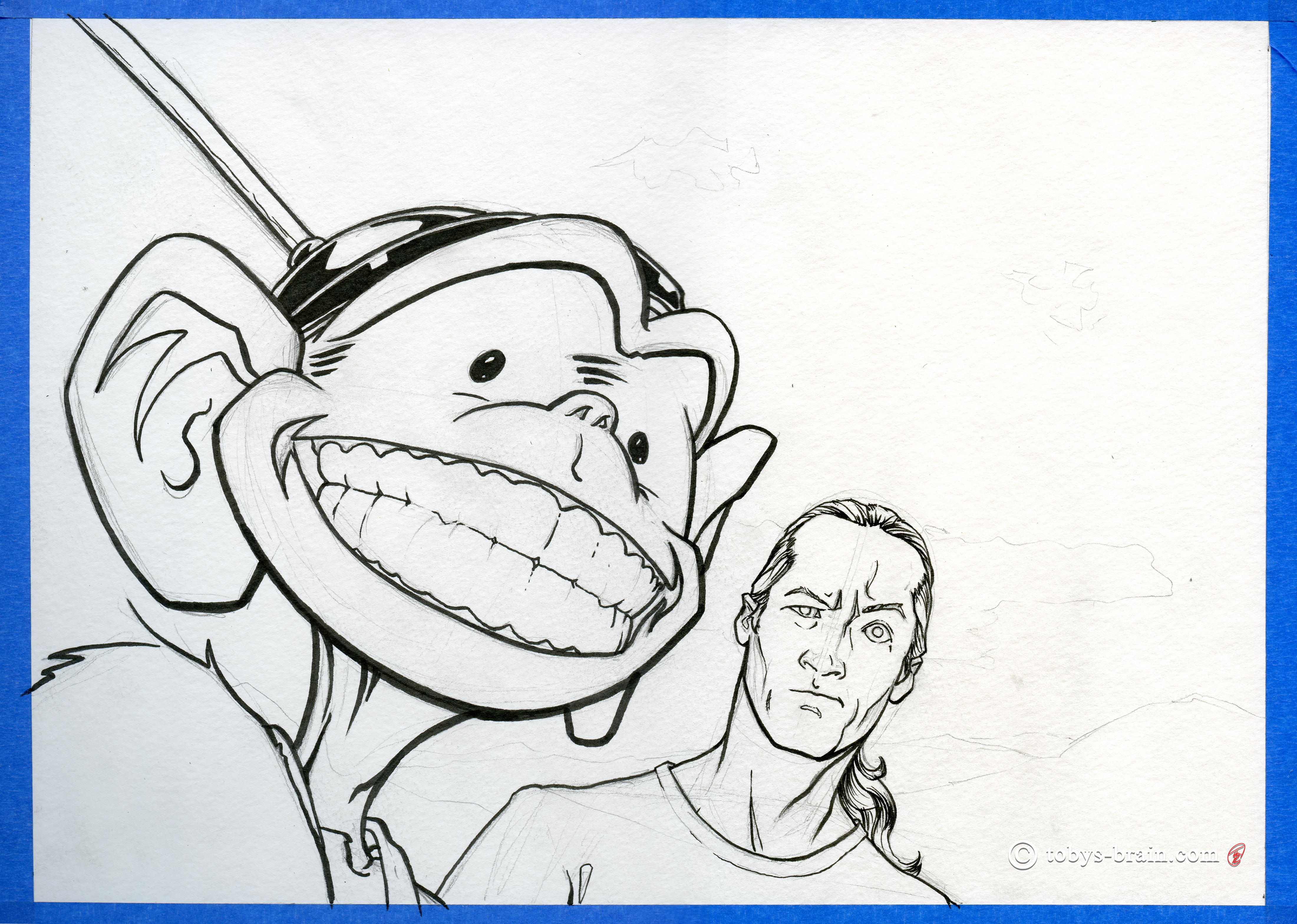
The first step after the pencil sketch was to have some fun with my beloved Copic, Pigma, and Mangaka brush and fine point pens. When I dug out the colored pencils I found some of my crowquill pens, nibs, and some inks. I was sorely tempted to go that route, but I’m not even sure if the ink is good and I figured I had enough experimentation ahead of me. Perhaps next time.
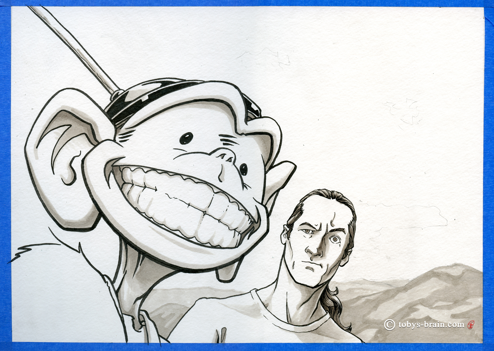
Phase 3 was to break out the Copic greyscale markers. I love working with these, they blend really nicely and I’m able to create a tonal drawing quickly. I purposely did all the background with the Copics (no blacks) to help it sit in the distance. I used one of our family selfie shots from a hike we did in The White Mountains this past summer as reference.
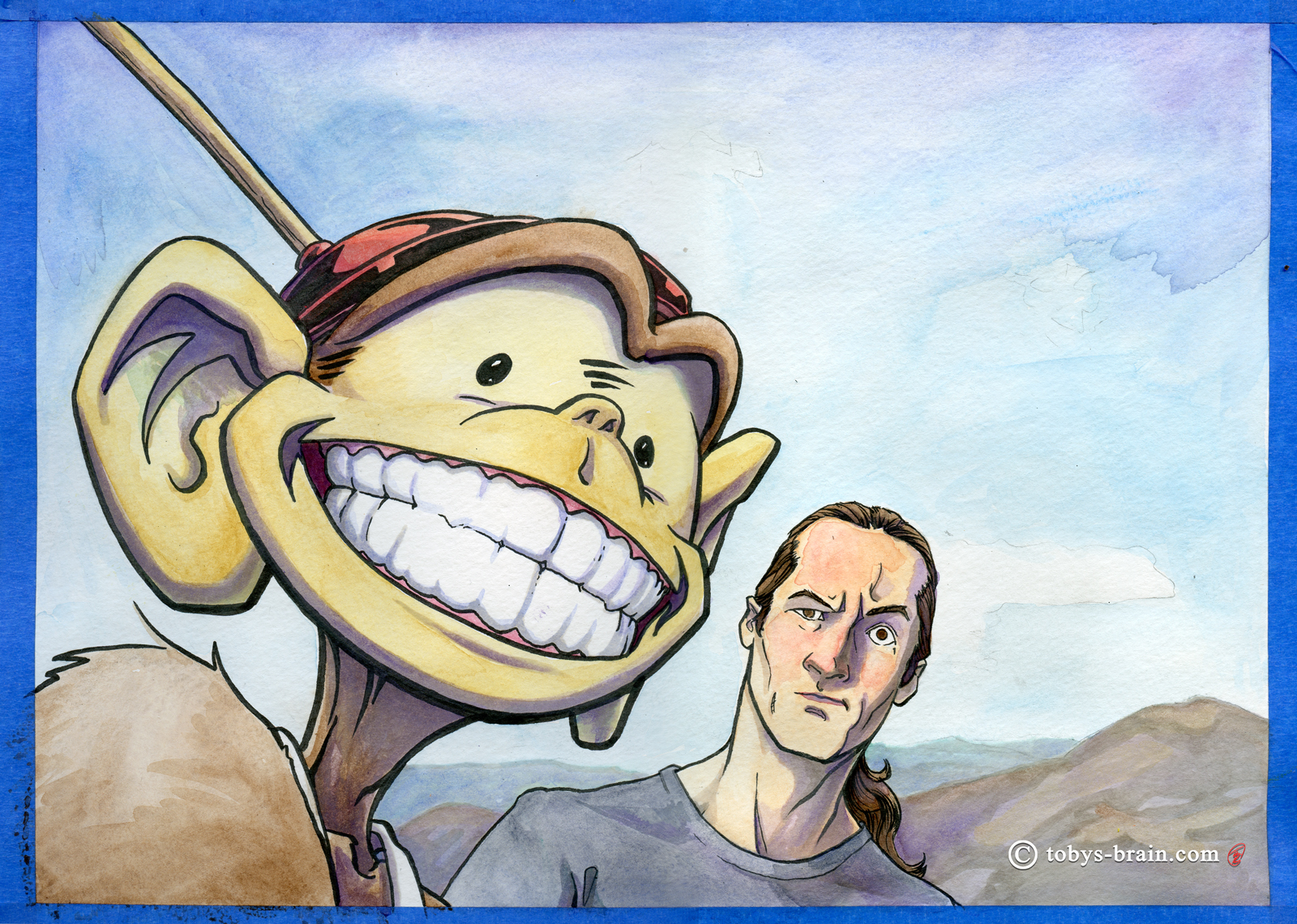
Next, I played with my water colors. At some point I acquired (most likely a gift from my lovely wife over a decade and a half ago) a nice set of water colors in tubes (the brand escapes me at the moment, if you’re that curious, message me and I’ll check when I’m actually in my studio). One or two of the tubes had solidified, but they’ll come back to life with some water. This stage was nerve-wracking, as I’m not terribly experienced or confident with water colors, and the bench mark in my mind is one of my inspirations: Bill Watterson. He did some amazing things with color and floating the pigments in such a perfect and organic way, I could stare at his water-color panels for hours. I may never achieve a similar level of competence in this medium, but I sure have fun on the journey. I managed to create some accidental blends and textures in a few spots that I’m happy with, at least.
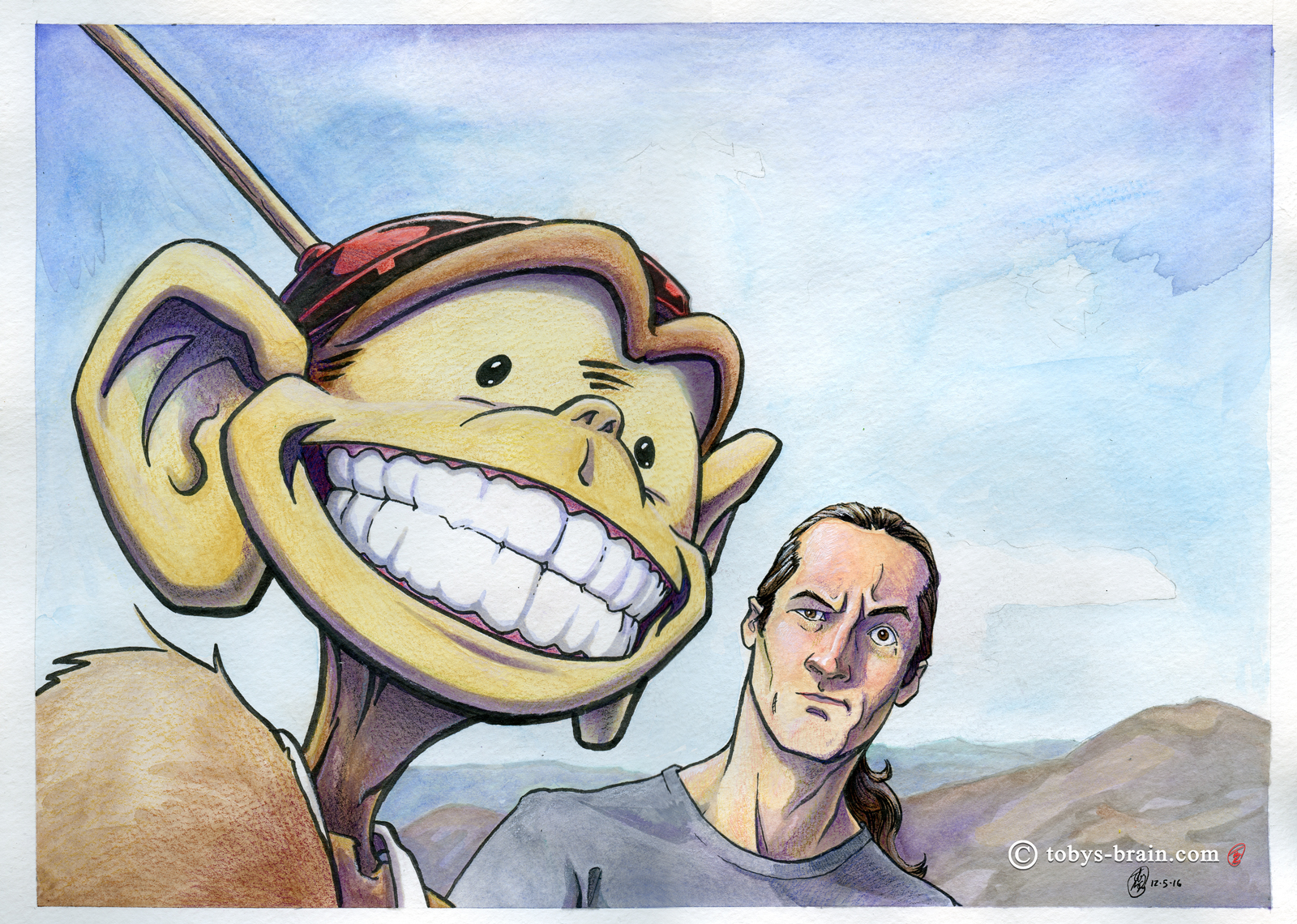
The final phase (before some digital tweaks) was to add some more texture and color using my Prismacolor colored pencils (yet another awesome gift many years ago from my super wife. It’s a sweet 120 set that I’ve barely touched-only 8 or so pencils had been sharpened). This was another stressful step because there’s no going back, there’s no “undo”. I worked lightly and sparsely, I didn’t want to over do it, and I think I more or less succeeded in what I was trying to accomplish at this stage.
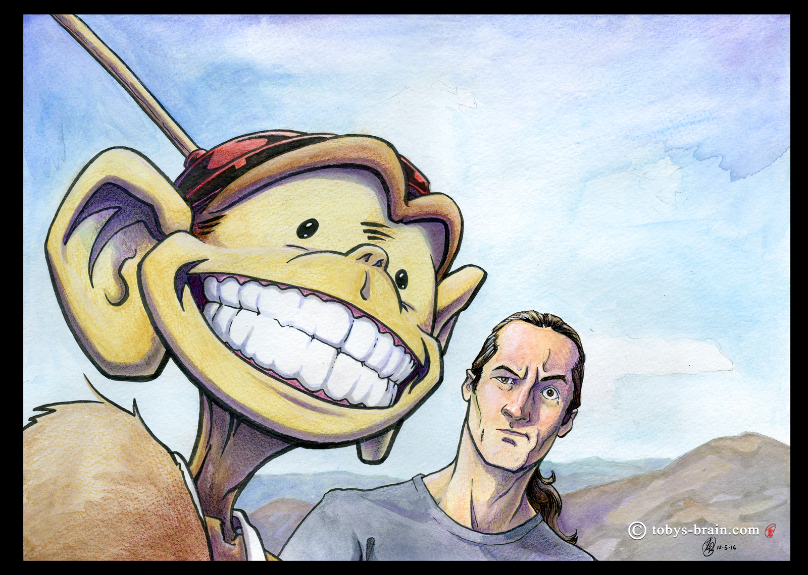
After scanning each of these steps along the way in two pieces (paper larger than scanner issue), I spent a considerable amount of time futzing around, trying to get the halves to match up properly, then to remove the slight shadow cast because the paper couldn’t sit flush against the glass of the scanner. I put all the stages on separate layers in one document with the original intention of animating a process GIF (it’s been a while since I played with that), but there were too many registration misses from layer to layer that I was unable to correct that it proved too jarring. For the very last phase, I straightened out the boarders (and made them black) and made a few minor tweaks to the vibrancy and levels so that it more closely matched the actual image in natural lighting.
There you have it, the convoluted way that I arrived at the final image. It was a lot of fun, I subconsciously dragged the process out because I didn’t want it to end. I will definitely play with this process some more, as well as let it inform some of my digital work. Actually, some of my digital work informed the way I approached this image, like “flatting” the local colors and working on light and shadow in a separate step. I’ve recently learned a cool way to add more custom, traditional media textures to my digital paintings, which is basically to use acrylics and/or water colors to paint random, organic abstractions, then scan them, desaturate them, and overlay them onto the digital painting. I’ve seen some examples and I like the way it looks.
Anysquids, art is fun. I just need people to pay me to sit around and draw Plunger Monkey all day. And then people can one day visit my theme park…
Please let me know what you think, it makes my brain happy.