On December 15th, the wife and I decided to surprise the kids after school by taking them to the first pre-opening day showing of Rogue One (yes, I thought it was awesome. This is not news). For a while now, I’ve been thinking it would be fun to do some PMD illustrations outside of IPMDT to commemorate certain events or happenings. Star Wars Rogue One was the perfect event, given the overall significance of Star Wars in my creative life. I’ve always thought of Plunger Monkey as somewhat of my alter ego, a manifestation of some of the crazier parts of my brain. But the more I draw him, the more I’m realizing he’s also my outlet for expressing my emotions, particularly the ones that I don’t often show. I played with a similar process to the PMD Selfie illustration I posted recently, which went much quicker, and was tons of fun. I’ll continue looking for excuses to work this way.
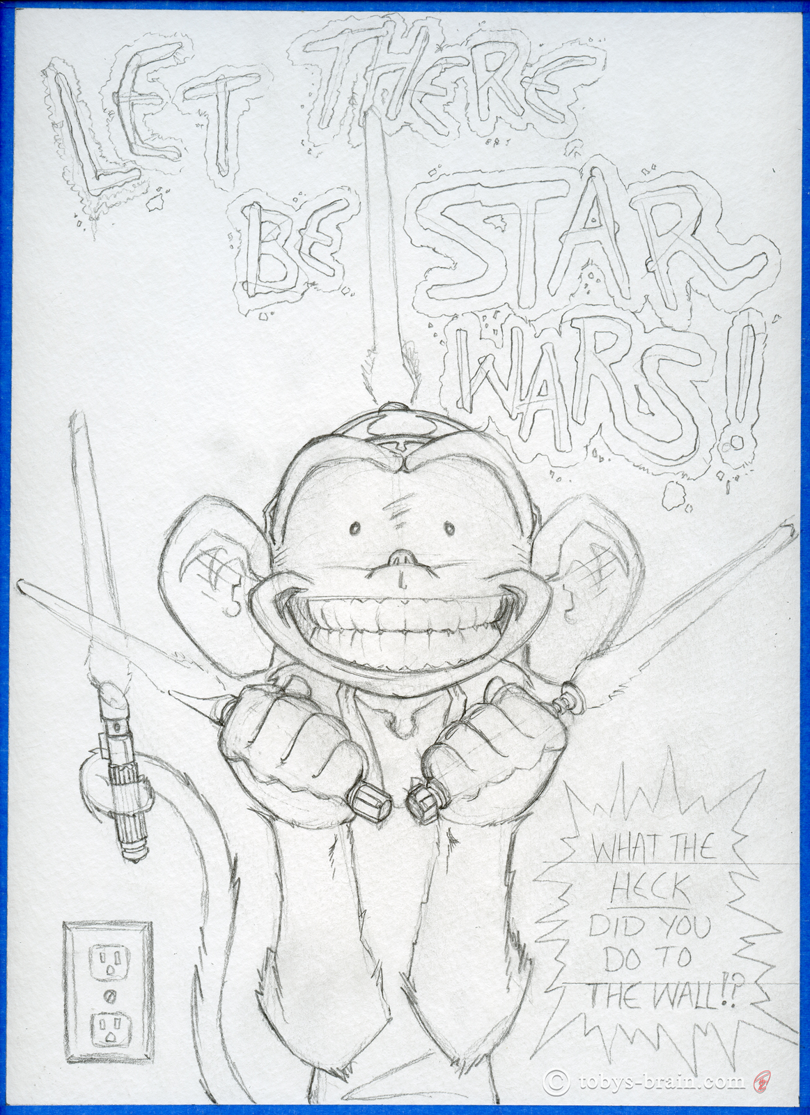
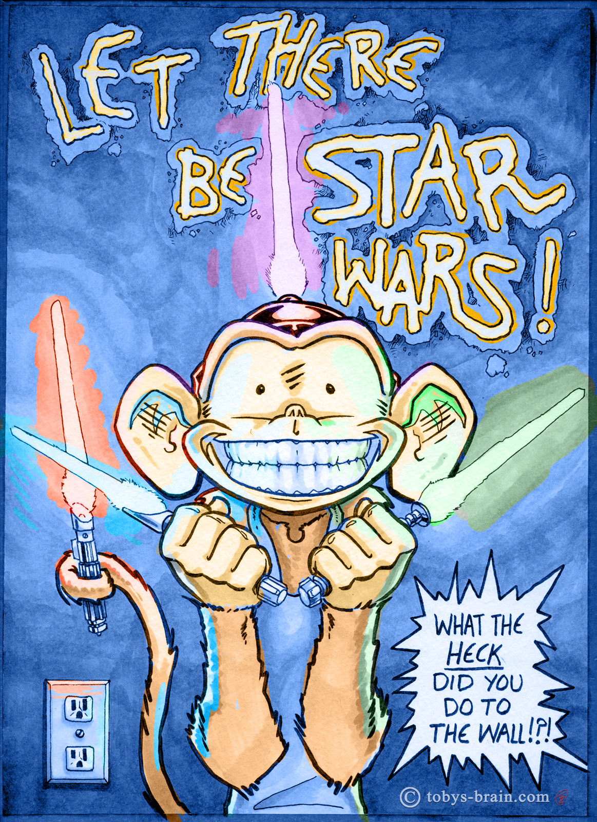
The starting point for all my “analogue” art: the pencil sketch (after a few thumbnails). The Plunger Hat Saber makes its return. The lightsaber in PMD’s left hand is loosely based on Obi Wan’s (I used the small scale replica my best bud Bill Gauthier gave me when I was his best man), and the one held by his tail is loosely Darth Vader’s (I used the giant Vader statue L.S. Gagnon gave me for reference, he stands behind me in my studio, next to the scanner). I wanted it to look like he had used the lightsabers to melt the words into the wall, a la Qui Gon Jin trying to cut through the blast doors on the Neimodian space station/ship in The Phantom Menace. I decided I needed some way to indicate this was a wall, so I threw in the wall socket. That word balloon is me, by the way, and this overall “gag” makes me chuckle.
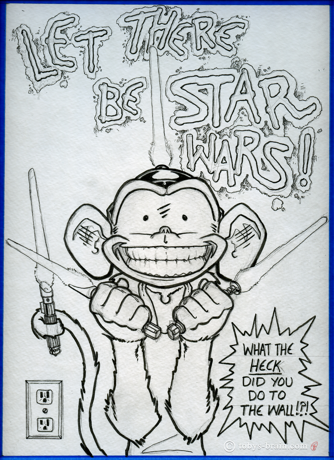
The next step is one of my favorites: inking. Actually, that’s a lie. I love all the steps pretty equally for different reasons. I like taking the roughish pencils and refining them, making them bold and crisp and organic. The process of erasing all the pencil lines and smudges is kind of like opening a present or something. I like the reveal process.
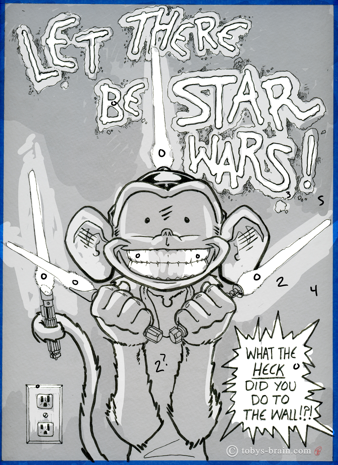
Okay, clearly, in order for me to be sharing all these steps, I scanned after each one. The reason is primarily because I can sometimes get paralyzed by either indecision or fear of “ruining” an image once I’ve already decided I’m happy with something in the middle of the process. That is the great appeal to working digitally for me: the ability to “undo”, and to work on changes or try out different options on different layers. When working traditionally, scanning each step of the way is my mental safety/security blanket. I also had the brilliant idea to work out things I was uncertain of on the digital file first. This is how I worked out the lighting and shadows, which were somewhat tricky because of all the light sources, before making permanent decisions in Copic markers.
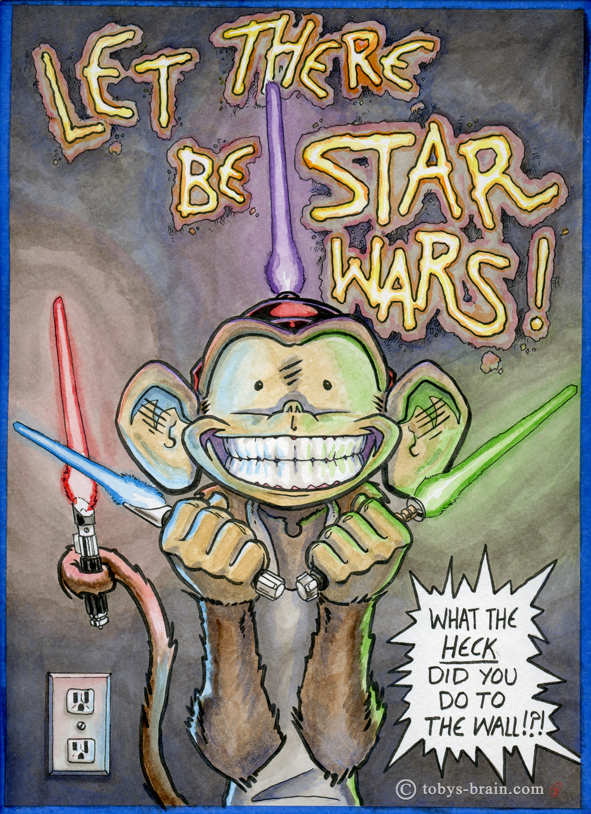
Here’s the Copic marker greyscale step. I learned how to blend a little better to produce some smoother gradients (though the scan seems to have made those transitions more distinct), which basically involves swaping back and forth between the two adjacent tones (a 2 and a 3, for example) while the ink is still wet. I had to spend some time refilling some of my most frequently used markers, which made a big difference in my ability to use them. Because of the gradual nature of them drying out, and the fact that I haven’t used them regularly in a while, I really forgot what a nice, fresh, juicy marker is like.
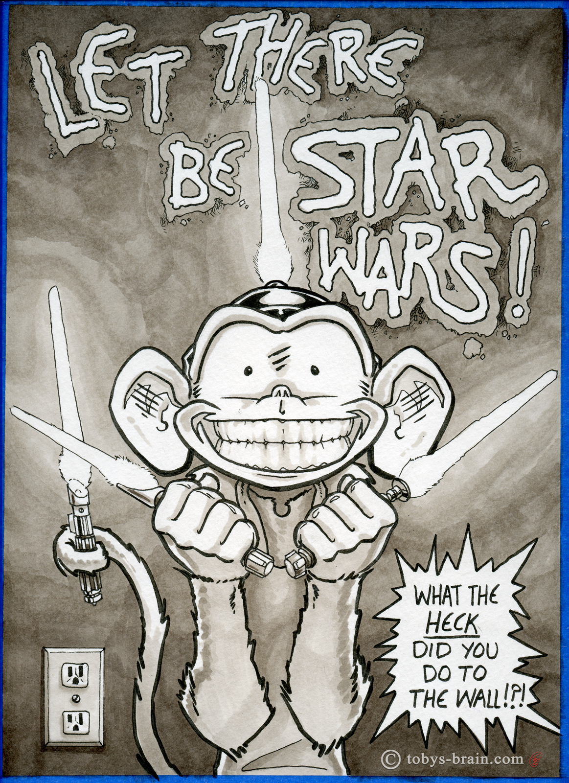
Next, I went back to digital to figure out the color scheme and what lightsabers were going to be casting their hue where. I also wanted to tint the wall blue to push it back a bit and to compliment the saber colors. I knew I didn’t want to leave the wall Copic greyscale colored, because that would look odd juxtaposed with the water colors and colored pencil, but I wasn’t certain blue was the way to go.
Finally it was time to bust out the water colors. I was more patient with my approach this time, actually waiting for sections to dry and layering more color on. The one downside to creating a tonal under drawing/painting is that the water color doesn’t have as much opportunity to do it’s organic water color thingy (sorry for the high brow art jargon). I’ll work out a happy medium the more I work this way.
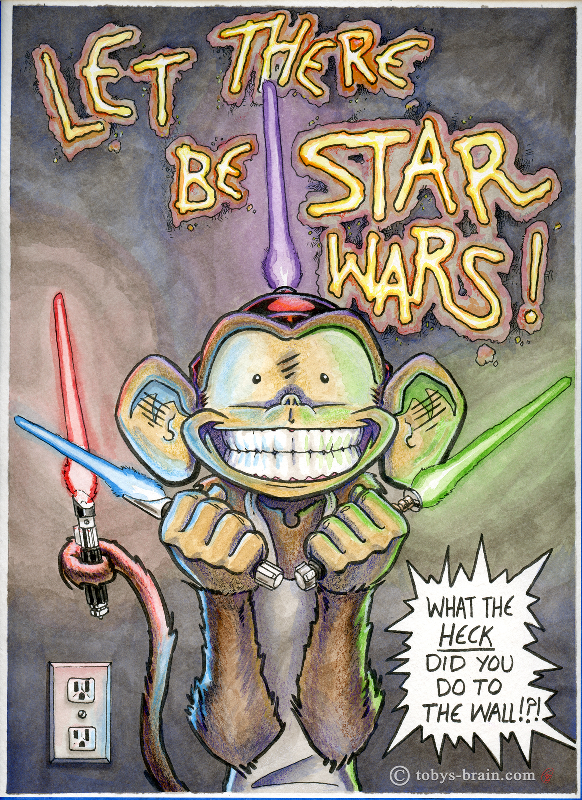
Finally it was time to punch up colors, deepen shadows, and add a little texture with colored pencils. I really love this water color/colored pencil combo for some reason, I’m not terribly skilled at it yet, but I’ll keep working at it because it’s fun.
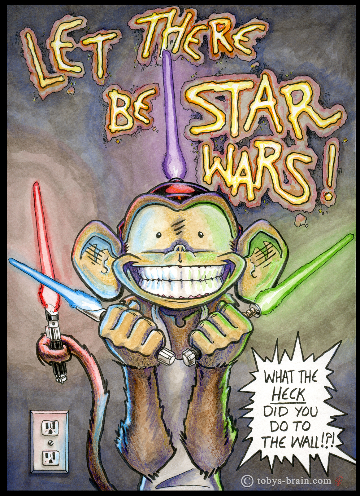
And here is the final piece after some minor digital tweaks to the vibrancy and a crisp border.
I had so much fun working on this piece (and it gave me an opportunity to throw together yet another logo variation), and I managed to bang it out in just two days, finishing in time for Rogue One. The last two weeks or so have been crazy in the studio, trying to wrap up various projects before the holidays. I have two somewhat time sensitive gift type pieces to finish up, then things should be back to normal. Maybe. Normal is over rated, anyway.
Thanks for reading! There was, indeed, Star Wars!
Please let me know what you think, it makes my brain happy.