Everyone loves dragons, right?
Of course. But few love them as much as my wife.
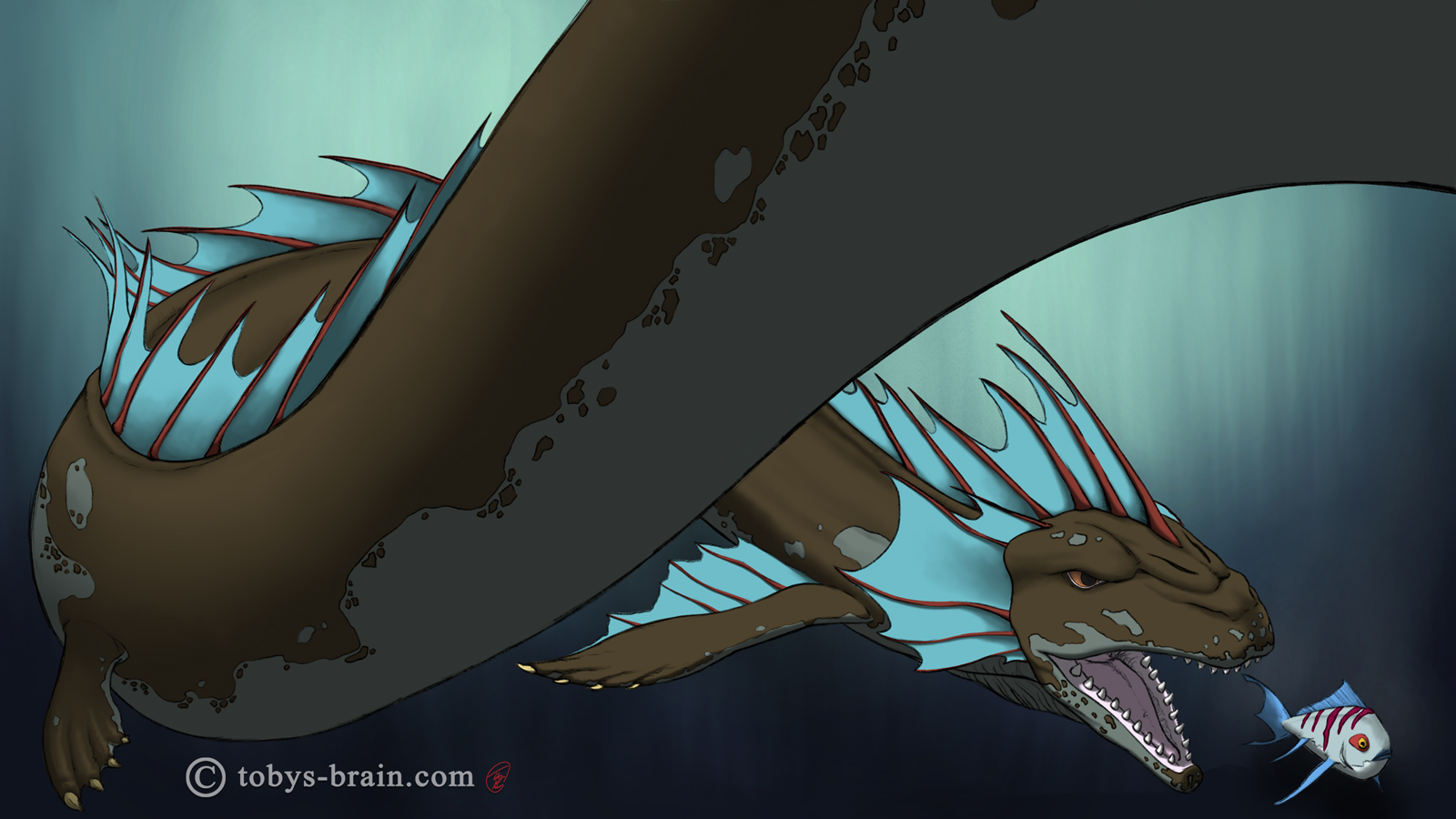
It’s birthday time for my wife again, which means another dragon wallpaper from me! I went back to Procreate for this one and spent over a week noodling away at it. Here’s a breakdown of how it came together.
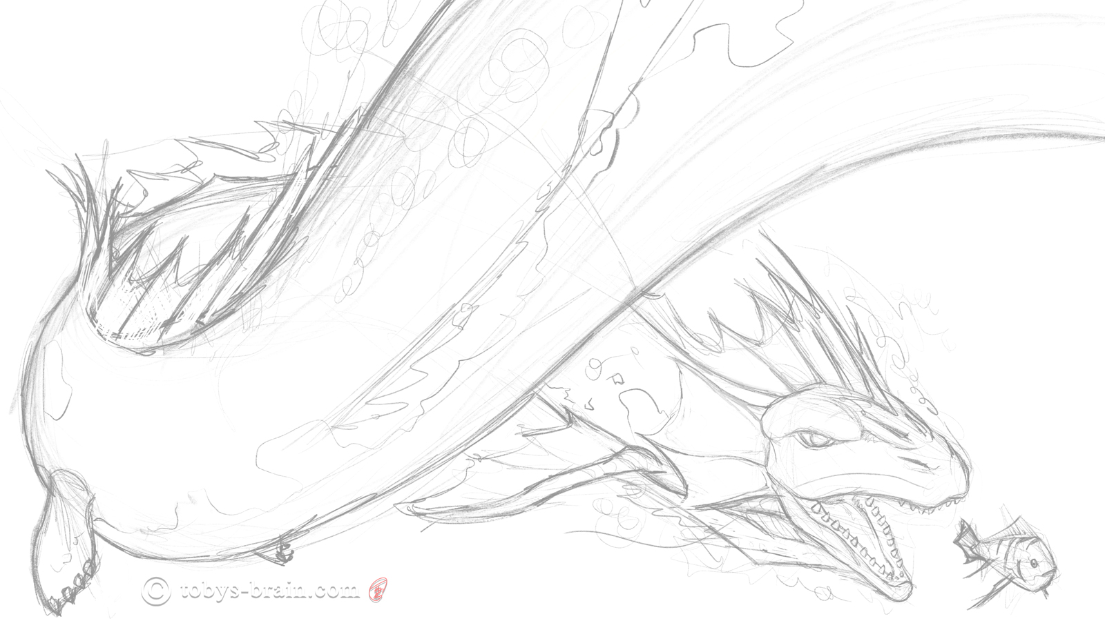
The first step to any art I create-whether it’s digital or traditional, whether the media is pencil, ink, or paint-I start with a rough drawing. I knew I was going to draw a dragon. I even knew it would be a sea dragon, but the rest of the details were up in the air. I really enjoy when I sit down with just a vague idea and things just start to come together, which is the way this one took shape.
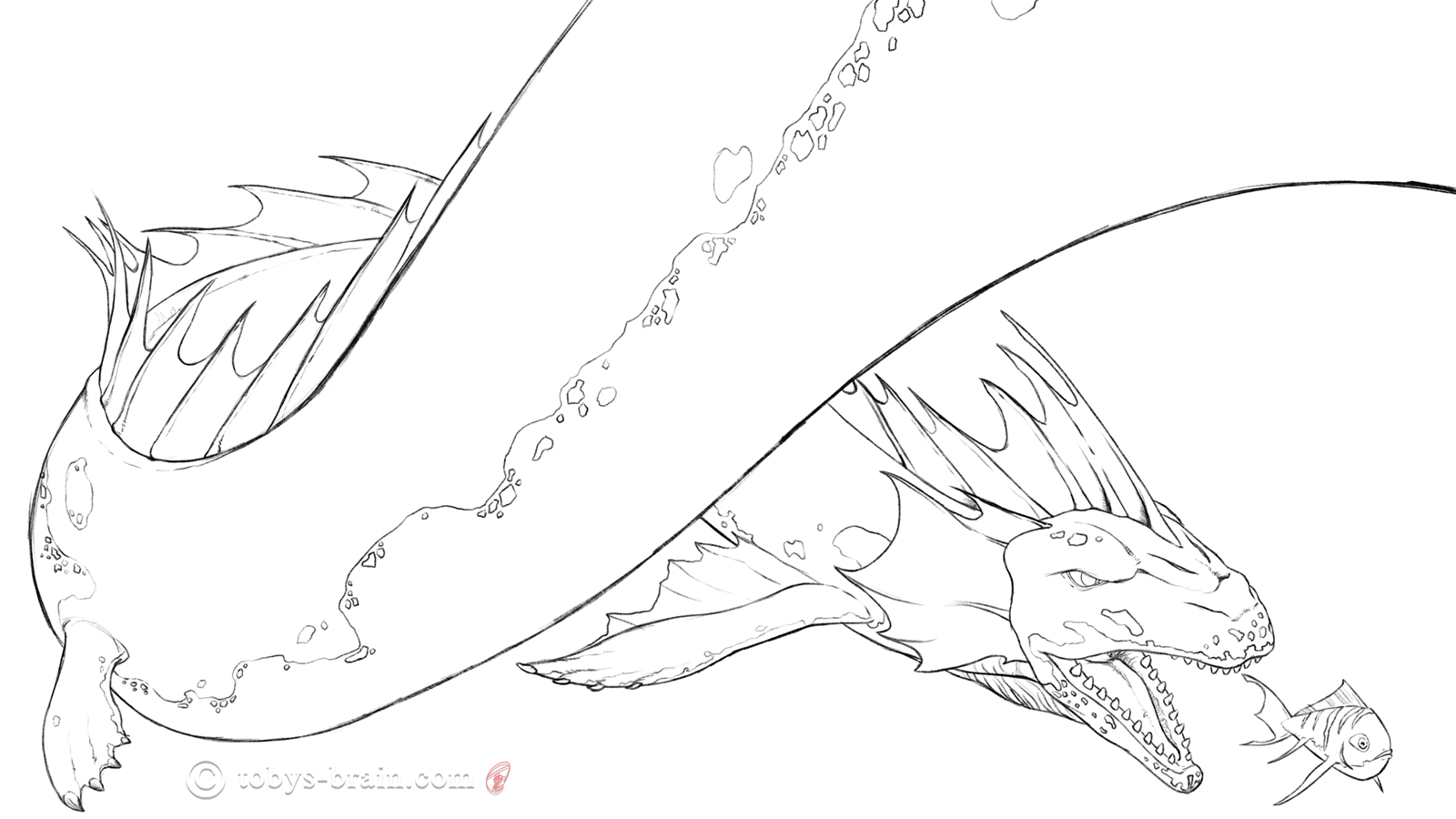
Once most of the composition, shapes, and rough details are laid out, I like to do a refined drawing. There’s a certain freedom in going straight to paint that’s still a bit too loose and open ended for me. I’m a stickler for details, so I like to make sure I have some kind of road map of where I’m going and what I need to remember. Even once I start adding color or tones, I often go back to the refined drawing, or even the rough sketch, to work out some details I missed or changes I need to make. Looking at this now, I kind of like the lineart version more than I remembered.
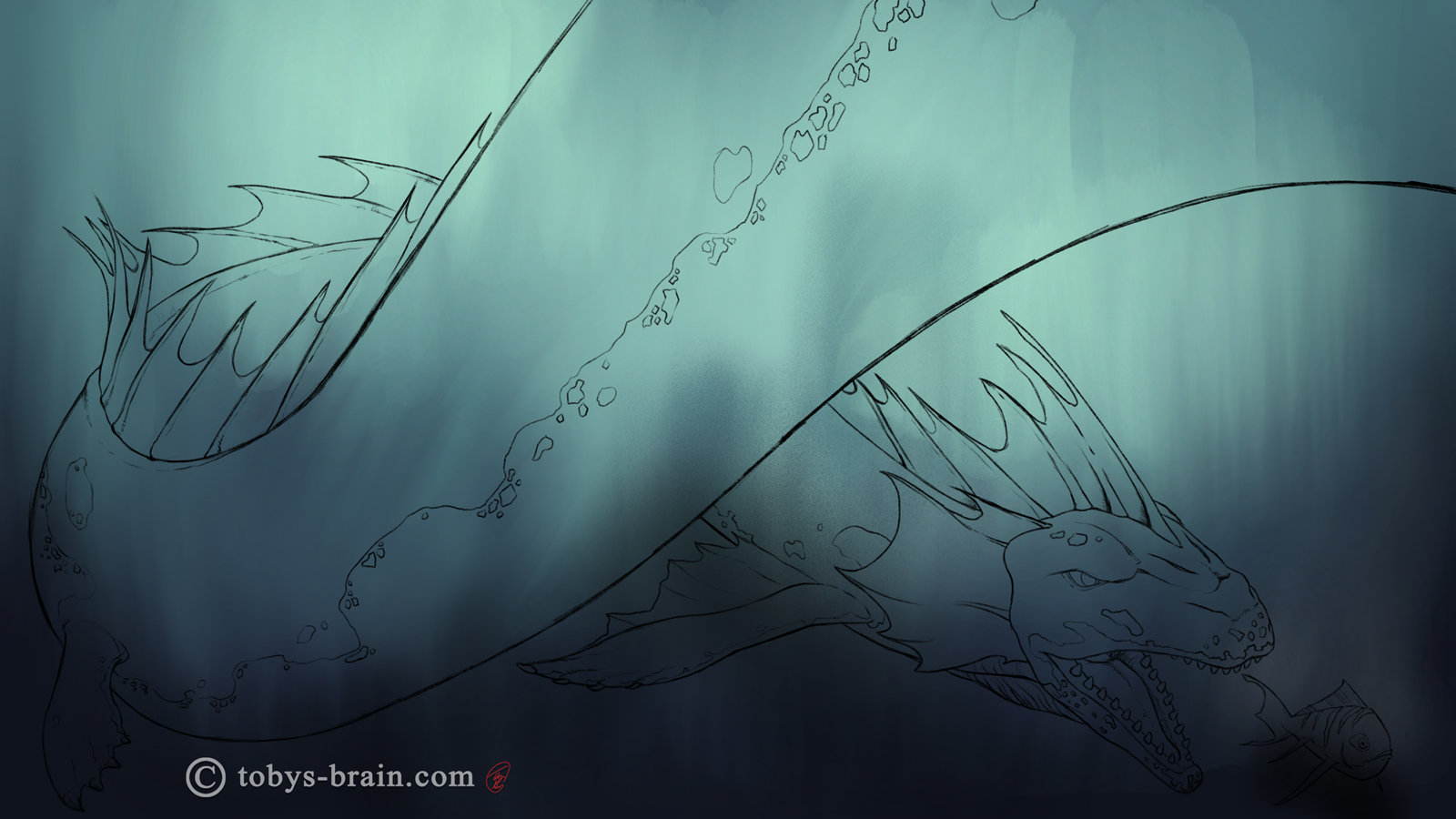
One of the challenges about digital art and working with layers is coming up with a logical and efficient work flow. I try to keep things simple, but I often get carried away with layers. This is actually a merged layer (I ran out of working layers, so I don’t have them separate anymore) of a solid color background and then a layer of colored brush strokes. The goal was to use the texture of the brush and some blended colors to imply an underwater environment. I didn’t want to get any real details in there because I wanted the focus to be on the dragon.
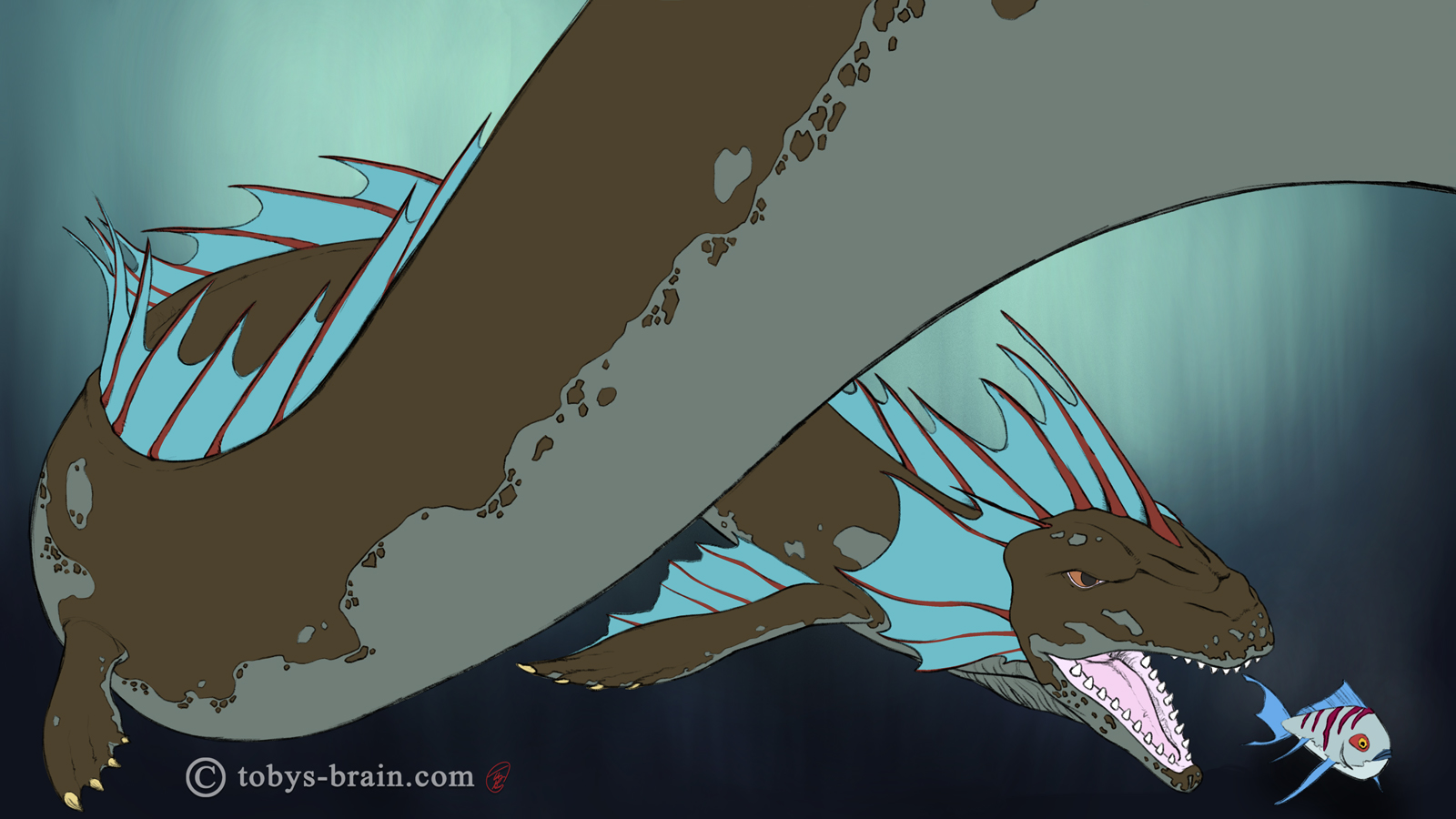
With my background and lineart road map in place, I moved on to “flatting”-which is just the common term in the industry for laying in solid chunks of local color (the color something is when it’s unaffected by light or shadow). This process makes it easier to make selections later on to constrain further painting, it helps maintain the already developed edges and forms. I haven’t used Procreate in a while, and I know it’s had at least one major update in that time, so that workflow was a little challenging for me. It took me a while to remember how to do certain things (Procreate is very integrated with the touch/gestures on the iPad, whether it’s double taps, one finger or multiple finger swipes in certain directions, all to access different functions. It’s great if you can remember what they are…a bit cumbersome and frustrating if you can’t).
Once the local colors were flatted, I added the main shadows on a multiply layer. This is one half of trying to define forms and volumes with this approach (the other half being…)
Once the shadows were in, it was time to turn on the lights with an overlay layer. Multiply is my go to layer blend mode for shadows, but there are usually a few options I will try for the highlights like screen, lighten, color dodge, etc. More often then not, though, I settle on overlay as the color of the “light” I paint with still comes through, whereas some of the other blend modes translate the color simply to white.
At this point I realized I needed to further define some areas, so I added another multiply shadow layer, which allowed me to add some more shape and depth to the head and particularly the mouth areas.
The next step is one I’m in danger of overusing: the secondary light or a bounce light. Painting light is a tricky thing (at least for me), because it’s never just coming from one direction or one light source. Even if you have just a spot light in an otherwise black space, light bounces off surfaces at different intensities and causes subtle lighter areas in shadows. I picked up this little “trick” with the blue secondary light from the same place I learned much of my digital artmaking workflow: Aaron Blaise (he’s much better at it, of course). I think I mostly restrained myself this time, and the blue works well with the rest of the color palette and really helps the shapes pop.
I wanted to punch up the highlights a little bit, but I wanted to add some texture at the same time. So, I used a chalk brush to fake a little specularity on the dragon’s skin.
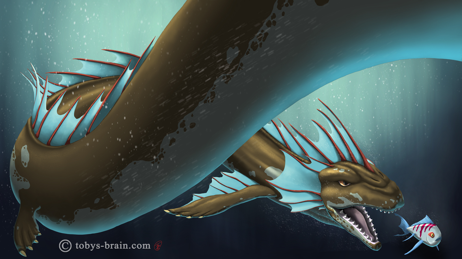
I went back and forth about adding bubbles. On the one hand, it could add some cool “atmospheric” effects to the image. On the other hand, things moving underwater don’t generally create bubbles unless they break the surface or are somehow releasing trapped air (…keep the jokes to yourselves…). In the end, I decided to add a few bubbles with a built in Procreate “driven snow” brush on a new layer (actually, on several). I played with opacities and motion blurs to hint at some semblance of movement. I also figured that an ocean isn’t necessarily crystal clear, so some of the white blobs might not be bubbles. They could be plankton, or debris, or…skin flakes…(sounds like a bad cereal idea: Skin Flakes! Part of healthy breakfast!).
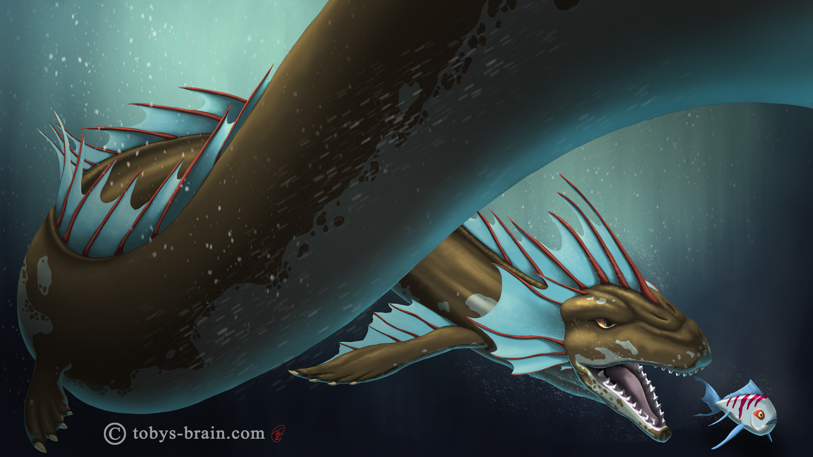
Another little tip I picked up from the great Aaron Blaise is to control the focus, and therefore the eye of the viewer, by either leaving areas of the painting intentionally less detailed and/or placing soft dark or light gradients in key areas. In this case, I added some darkness in the lower left and upper right corners, which seems to keep bringing my eye back to the dragon’s head and the fish (but that’s just me).

When I work in Photoshop, one of the steps I will often employ (again, another tip from Aaron Blaise) is to add some textures with custom brushes. In Photoshop, it’s pretty easy (there are no layer restrictions, essentially)-you import a texture or stroke with your custom brush, then use the powerful transform tools to get the texture to flow with the form you are mapping it to (think of wrapping a piece of paper around an object). I think this process can be accomplished in Procreate, but I’m too out of the loop to build my own textures and brushes. Fortunately, it comes with quite a few really neat brushes built in. I found an “old skin” brush that used lightly in key areas (you probably can’t even distinguish between this step and the previous). Depending on the size of the textures, I’ll often go back and paint over them, to really get them to feel like a part of the image. This time, they were so subtle (and I was short on layers) that I didn’t feel the need to. This layer was set to multiply. I then went and did a similar step with an overlay layer to add some textures to the light areas.

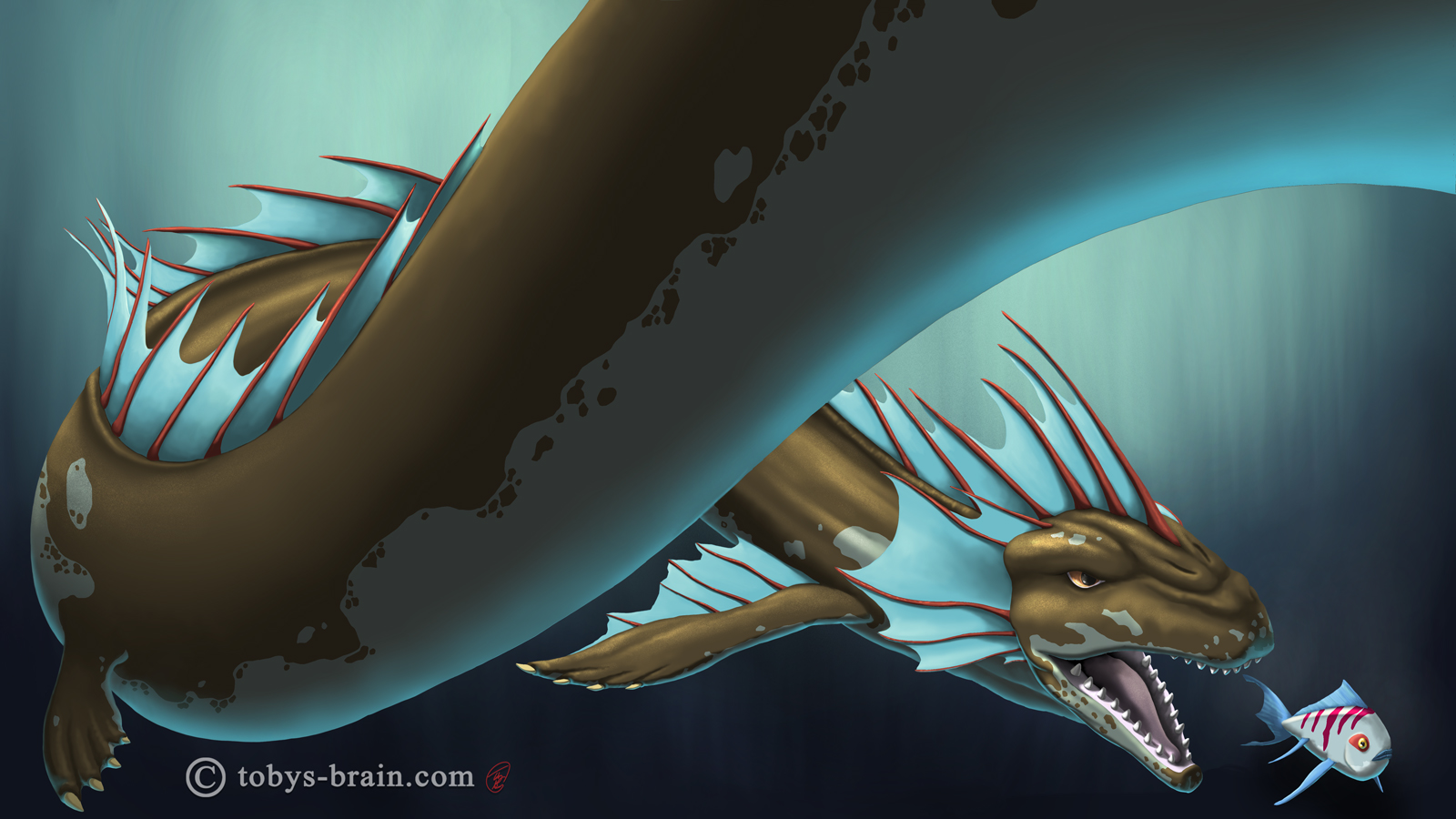
For the last 3 years, I’ve drawn a dragon for my wife that she can use as her desktop wallpaper (she spends a lot of time in front of her computer for work). For 2018, I went with a sea dragon. Lately I’ve been using Clip Studio Paint and Affinity Designer, but I decided to use Procreate for this. I enjoy drawing in the app, it’s got a great “feel” and is pretty smooth in its interface, it just lacks some of the other tools and functions I want for many of my other project ideas. One upside of Procreate, however, is that it records every brushstroke and layer action and packages it as a timelapse video, which is something I’ve been doing more of with my IPMDT panels.
There’s still lots of room for improvement, I could have noodled away at this for considerably longer. But, I was running out of layers, and it’s already the day after my wife’s birthday, so I decided to bring this image to an end.
Just for giggles, here’s a few extreme closeups (just in case you thought I stopped being OCD about details…)
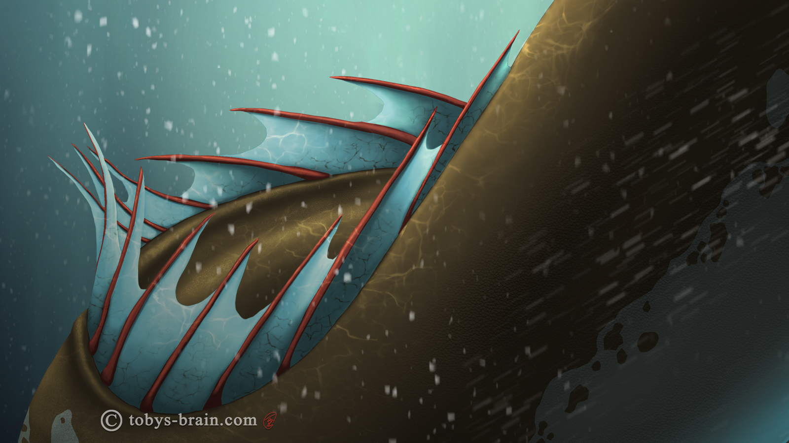
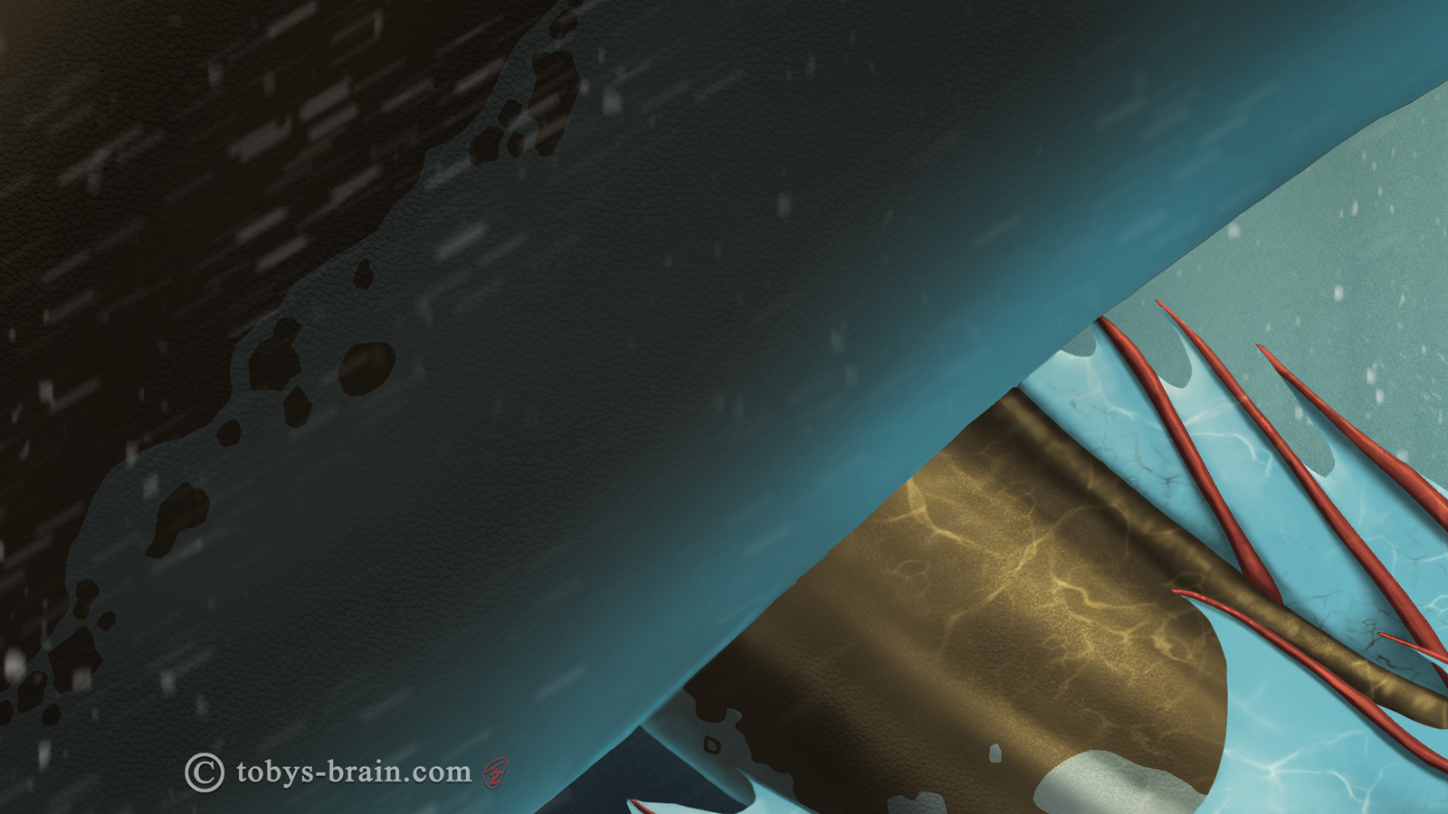
Here’s a close up of the back and finage. Procreate has a neat “water” brush that kind of looks like the complicated patterns created on the surface of moving water. I thought it would work well to create that effect reflecting off the dragon’s back. I also used it to subtly indicate some veinage in the fins. In hindsight, I should have mucked around more with the opacities, colors, and positioning of some of these strokes to make them conform to the volumes better.
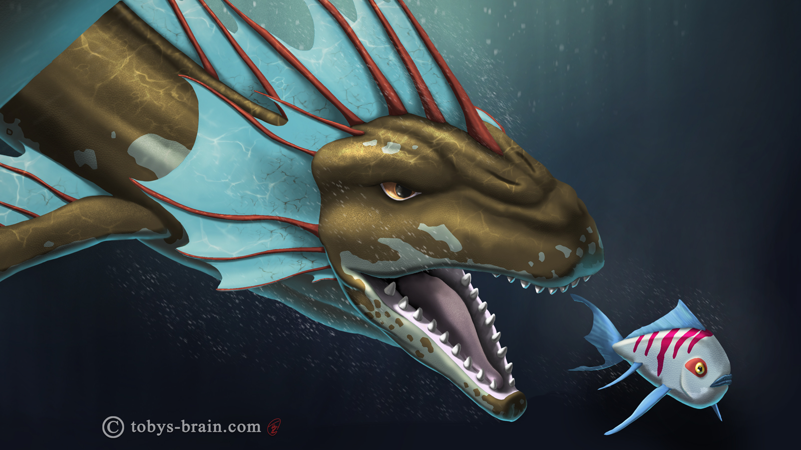
Face close up. I put some thought into what a water dragon would actually look like. I obviously didn’t want to take a stereotypical terrestrial or avian dragon and stick it underwater. That wouldn’t look right. I enjoy creature design and thinking about evolution, so in addition to the legs and arms and wings evolving into various types of fins (the back legs are more sea lion-like), I moved the nostrils on top of his head like a whale. I also referenced Orcas for the mouth and smooth skin, rather than standard rough dragon scales.
Without zooming in so much that it becomes pixelated, here’s a shot where you can sort of make out the skin textures I brushed on. It’s also a good shot of the motion-blurred “bubbles” (or skin flakes, as we previously identified them as…).
So, what’s next? As usual, too much. Working on this particular image gave me some ideas that I’m going to kick around and see if they could turn into something. I’m hoping to finish the next shirt design soon (I’ve only been pretending to work on it while I was working on this. It’s tough to make art for your wife when she also works from home and frequently walks through or into the room you’re working in. It’s tough to keep projects secret). There’s IPMDT and ITB and Revery and 10 Things and more shirts and…you get the idea. I’m also giving some thought to translating some of my images and designs into bandannas, stickers and patches, since having a lower cost item (compared to the shirts) for sale would probably be a good idea. I’ve also got several YouTube videos to finish editing…
Speaking of YouTube, while I leave you now so I can go edit together the timelapse video of this here image, why don’t you do me a solid and migrate over to my youtube channel? You see, I’d love to give my channel a custom URL, but in order for “the man” to let me do that, I need to have 100 subscribers. As of this moment, I’m at 26, which is great, but still a long ways from 100. Here’s the deal: you don’t actually have to watch my content. I mean, I’d love it if you did. I’d love it if you loved it and shared the love with people you love. But, not everyone has the time to sit and watch me draw (even at 600% speed) and listen to me drone on about…whatever it is I try to fill the silence with. I get it. I’m also realistic.
So, at no cost to you other than a mere 30 seconds or less of your time, head over to the YouTubes and give Toby’s Brain: The Movies your…uh…subscription? The grammar is a little wonky there, but, please, just subscribe to my channel. Make my brain happy. My wife likes it when my brain is happy, and it was just her birthday, and I bet you didn’t even get her anything…

Please let me know what you think, it makes my brain happy.