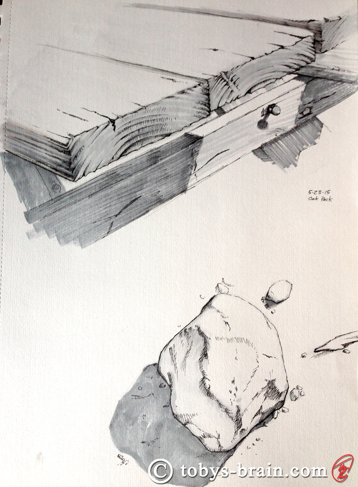
I got to do a bit of non-digital drawing this weekend, which is always nice. I’ve been wanting to get outside to do some drawing again, and I finally had an opportunity/excuse. My generous and awesome wife took the kids to a local park while I did some chores before meeting up with them and their friends. Once I got there, they ended up taking off to sell some popcorn for Cub Scouts for a short while, leaving me at the park with my sketch book, pens, and markers. It was really nice to just sit, observe, and draw. I didn’t get as much accomplished as I would have hoped, but even a little bit is great. It’s been so long since I’ve used my Prismacolor greyscale markers that many of them have dried out. Typically, the last several years I only use them when I make my annual Mother’s Day Card for my wife, so that’s to be expected. It’s also not surprising that I’ve forgotten to replace them, since I never use them. I have a set of warm greys and a set of cool greys, but I prefer the warm. Of course, those are the ones that are dried out. Enter: my amazing wife…
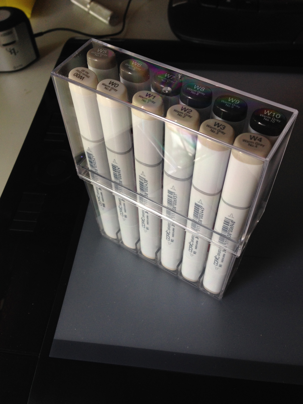
A full set of warm greyscale Copic markers!
These are some pretty awesome markers, widely used in the manga world but gaining traction in “the west” as well. They apply nicely and you can even blend them, it’s like paint in a marker in some regards. Plus, they are apparently refillable (though it seems to be tougher to find refills in the states vs. Japan). I’m very excited to play with these.
Anywhat, over this past holiday weekend, we also found ourselves at a local diner with only 2 out of 3 kids. In order to keep the monkeys somewhat in control, Lee reached into her purse and pulled out 3 pens so they could draw on the back of their place mats. Did I mention we only had 2 kids with us? And that she had 3 pens? I kept myself out of trouble doing this…
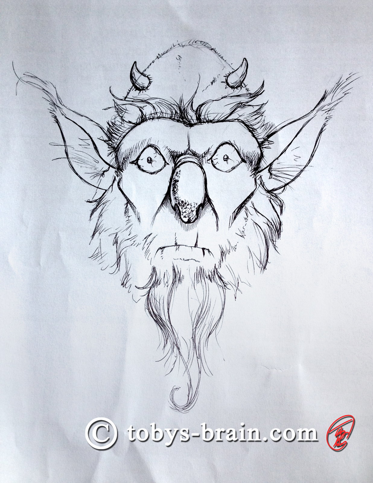
I call him Koalanose McBeard…
I started doodling the nose shape randomly and this face grew out of it. My meal came a little too quickly, I would have liked to have continued a little longer to see where this would have gone while I was “in the zone”. I was reminded how fun drawing with a simple ball point pen can be, I think I’ll have to clip one to my moleskin and start carrying that around with me again.
As far as actual work that’s occupying my studio time lately, I feel like I’ve been slogging through a ton of “real life” obligations and house issues, as well as coordinating the printing of some tshirts for my son’s Boy Scout troop. When I’ve actually been able to sit at my tablet, I’ve been chipping away at my own tshirt project I keep mentioning. I’ve got all the designs together that will be in the first batch to be on sale. Some of the designs are getting some minor tweaks. I did run into a problem that had me grumbling and muttering to myself. I have a few designs that have a translucent glowing effect to them. As I was mocking those designs up onto a shirt template, it dawned on me that the print company prints an all white underbase (for the same reasons you prime a canvas or a wall: so the material doesn’t absorb all the vibrancy of the applied colors), which would likely screw up that glow effect. After a quick exchange of emails, I learned that was indeed the case. Crud. So, I wondered if putting my image on it’s own colored silhouette that I tried to match to the shirt color would solve the problem. Printer guys said they couldn’t offer support for that because it would be a huge challenge, but I decided to mock a design up just to test it. At first, I plan on having all my designs on black shirts, just to keep things simple, so I used a black silhouette. It looked okay on a black shirt, so I decided to try it out with a different color shirt. As I was changing things and reorganizing layers, there was a moment where I had my image with the black silhouette on a red shirt…and it looked cool! Happy accident! So, with the handful of designs that have the glowing edge problem, I’ll put them all over a black silhouette, regardless of shirt color. I even went and changed the silhouette to match the red shirt, but it looked much better with the black.
Anysquid, since you’ve stuck with me through my babbling, here’s another peak at a shirt design that will help make your torso that much more awesome:
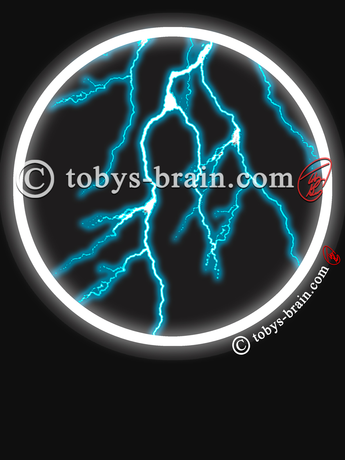
There’s no better way to start your day than a bowl full o’ blue lightning!
Please let me know what you think, it makes my brain happy.