I’ve been back tracking and posting about art that I created around xmas 2016, but let’s do a little time traveling to before that, to Novemberish. Those who know me well know that I have two main passions: art, and “exercise”. I put “exercise” in quotes, because that’s not an entirely accurate label. Movement might be a better term, I simply like to move, whether it’s hoisting weights and odd objects, gymnastics and handbalancing, calisthenics, snowboarding, hiking, bike riding, kayaking…if it involves moving through space and physically challenging myself, I’m excited about it. One subcategory that I’ve devoted a considerable amount of time to is the study and practice of martial arts. I have trained in Shotokan karate for, as of this writing, 21 years (my martial experience is old enough to drink). I’ve dabbled in other arts in that time span, like kendo, iaido, a little aikido, some tai chi and kung fu. Geography has forced me to spend a lot of time training on my own, but a year and a half ago, I stumbled into yet another martial art and a school that I can call home: Ten Tigers Honto Jutsu, a Japanese (as opposed to Brazilian) jiujitsu school. The group meets just 20 minutes from my house (which is significantly closer than the 1:15 to the karate dojo, a trek I just don’t have the schedule to make these days), the people are skilled and fantastic to work with, and the overall art has shed tremendous light onto my continuing karate practice.
So, I titled this post “Passions Collide”, but why?
How nice of you to ask! The jiujitsu school was/is looking to attract more members, so they were looking to develop some promotional materials. Images for posters, business cards, and a website, basically. I offered my talents and had a lot of fun. I had a few goals in mind. The first was to develop some generic, iconic martial arts silhouettes that anyone walking by them on a poster could readily identify that the poster was about martial arts. The second was to create some more specific imagery that would give people a more clear idea of what the focus of the school actually was, namely joint locks, grappling and self-defense. The third was to recreate the school’s logo digitally and to come up with some alternative logos. I’m relatively pleased with the images I designed, and somewhere down the road I may tweak some of them into t-shirts (for that fabled Etsy shop I keep teasing) either directly related to the school (if they want them) or just as generic, martial arts related shirts.
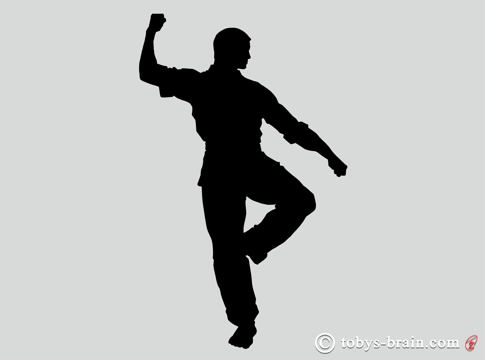
This silhouette was inspired by one of my favorite Shotokan katas: gankaku, which is sometimes translated as “crane on a rock”. I’m not sure if that’s an accurate translation, but it’s an understandable one.
This is a fairly iconic “pose” that is usually misinterpreted and misrepresented as a double block, in which the individual is blocking a low attack from one direction and a high attack from another, which makes no sense. I don’t care how long you’ve trained, if you think you can block any attack without seeing it coming, you’ve watched too many movies. A much more sensible application of this move is a high parry as you move forward and deliver a low strike.
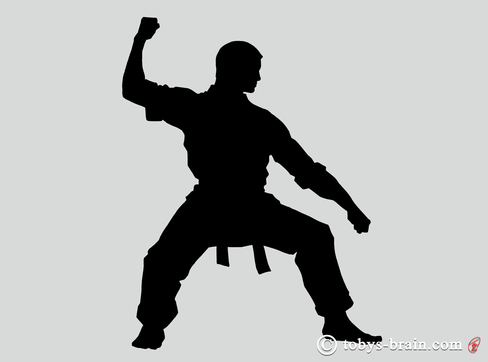
Another classic karate “pose”-the shuto, or knife hand.

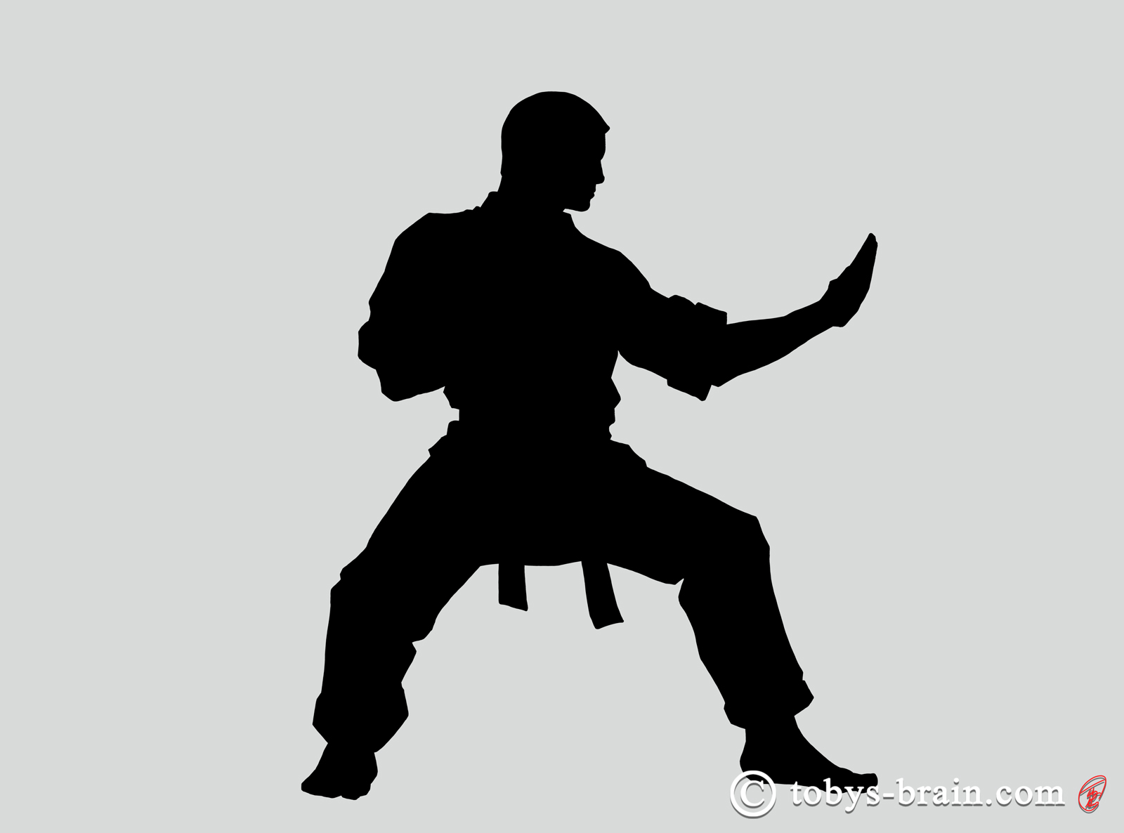
The good ol’ side kick.
These silhouettes were both fun and challenging. Fun, because illustrating martial action is just fun, I like trying to capture and emphasize some of the important elements of the movements (there’s a whole digression I could go into about stances and why these postures are important but not static, and how that directly relates to art and the teaching of movement, but I’ll spare everyone). It was challenging because I was trying to capture subtle details without the benefit of refined interior lines. Negative space was very important, but so was contouring. I had to tweak all of these images because initially my contours were too pronounced, making the overall silhouettes too cartoony and blocky. There are still some areas that are problematic, but I think they work.
Next I developed some illustrations based on some of the more common techniques we employ in the class. I did a mini photo shoot with some of the students for reference material. Finger locks are painful, by the way, and they don’t require much force. A child could bring an adult to his/her knees very easily when done properly.
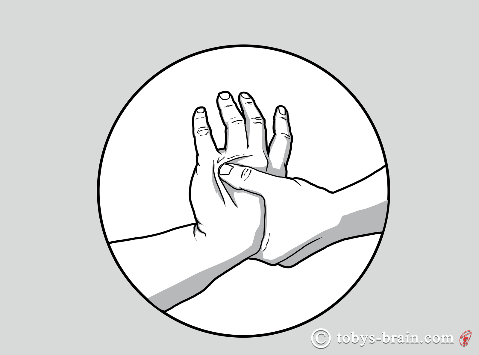
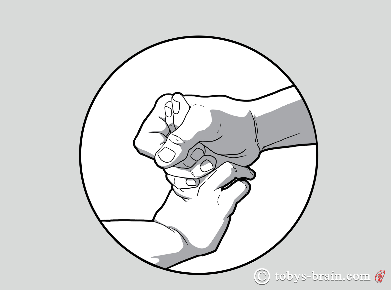
The wrist is another great place to attack. Circular movements play a major role in many martial arts, but they are very important to applying joint locks and redirecting momentum. I thought it would be a cool idea to place these illustrations in circles, but I was somewhat surprised, and very pleased, to see the impact that made on the “feeling” of these movements.
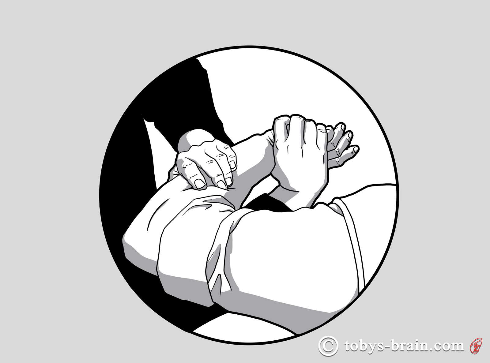
I don’t know if I can explain just how painful some of these holds can be…
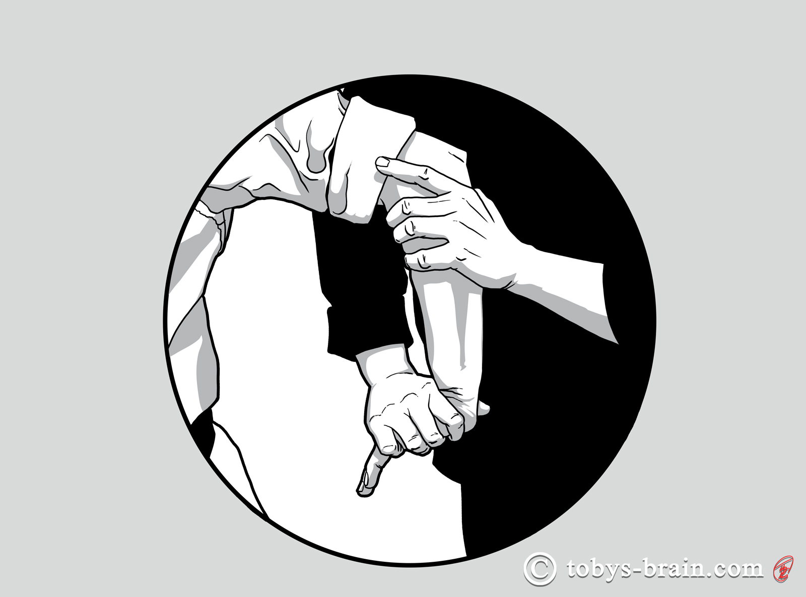
This is fantastic way to spiral fracture the bones of the lower arm…
I was really happy with the way the joint lock illustrations turned out. One of the goals of any illustration is to communicate clearly something that doesn’t get conveyed in photos or words. I simplified a lot of the shapes and forms, removed the distraction of color and stuck with sharply contrasting tones. I think the end result was that I was able to get closer to capturing the underlying principles of the movements as well as emphasize the painful nature of the locks.
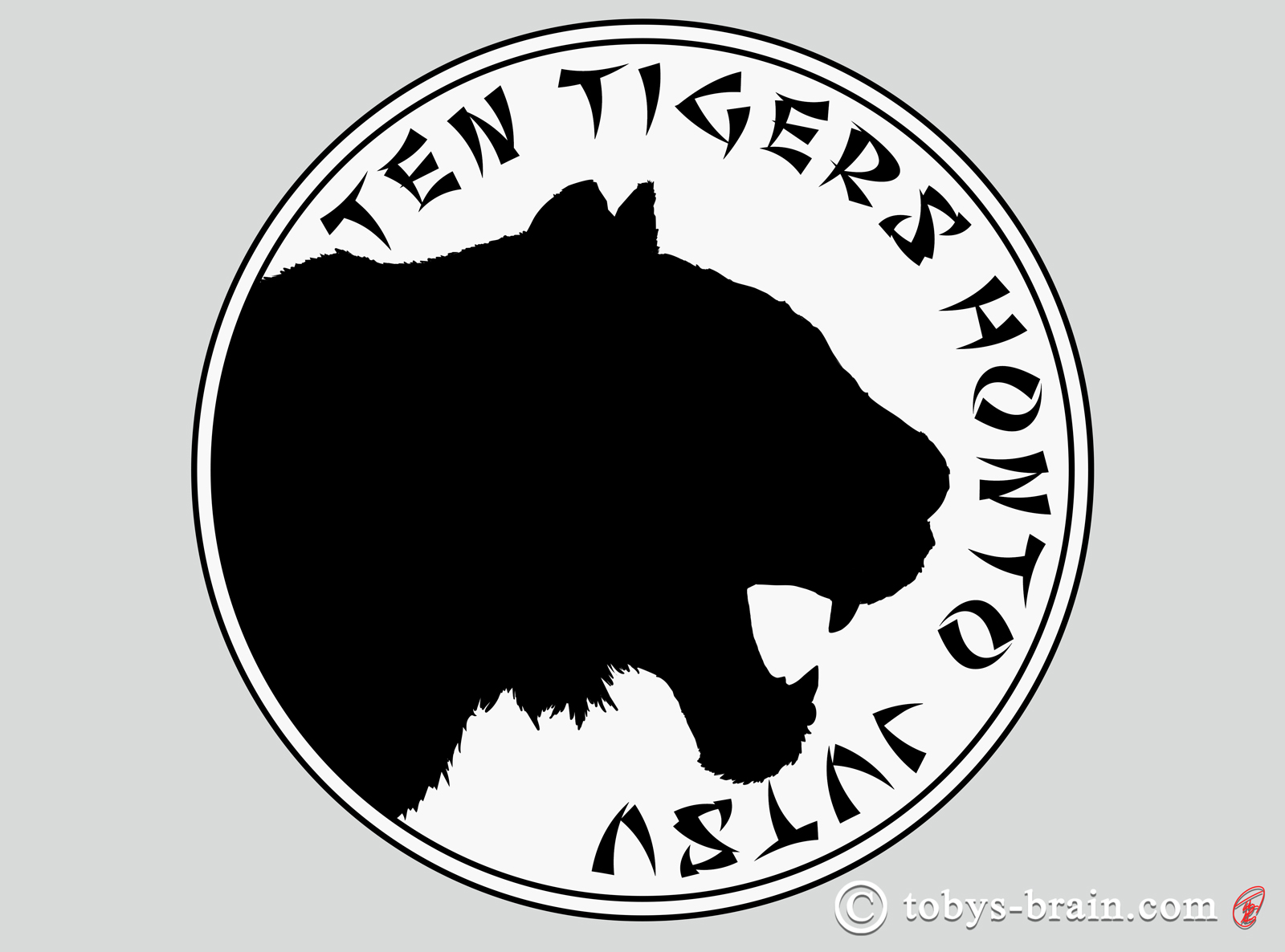
The only existing copy of the school’s logo anyone had was on old photocopy of the techniques list and some tattoos some of the long time students have. I attempted to recreate that logo so that it can be used for other things in the future. It’s a really nice design with the focus on circular movement and different planes. The one thing I’m not happy with is I made the “ovals” a bit pointier than I think they were originally. I may go back and tweak that if necessary.
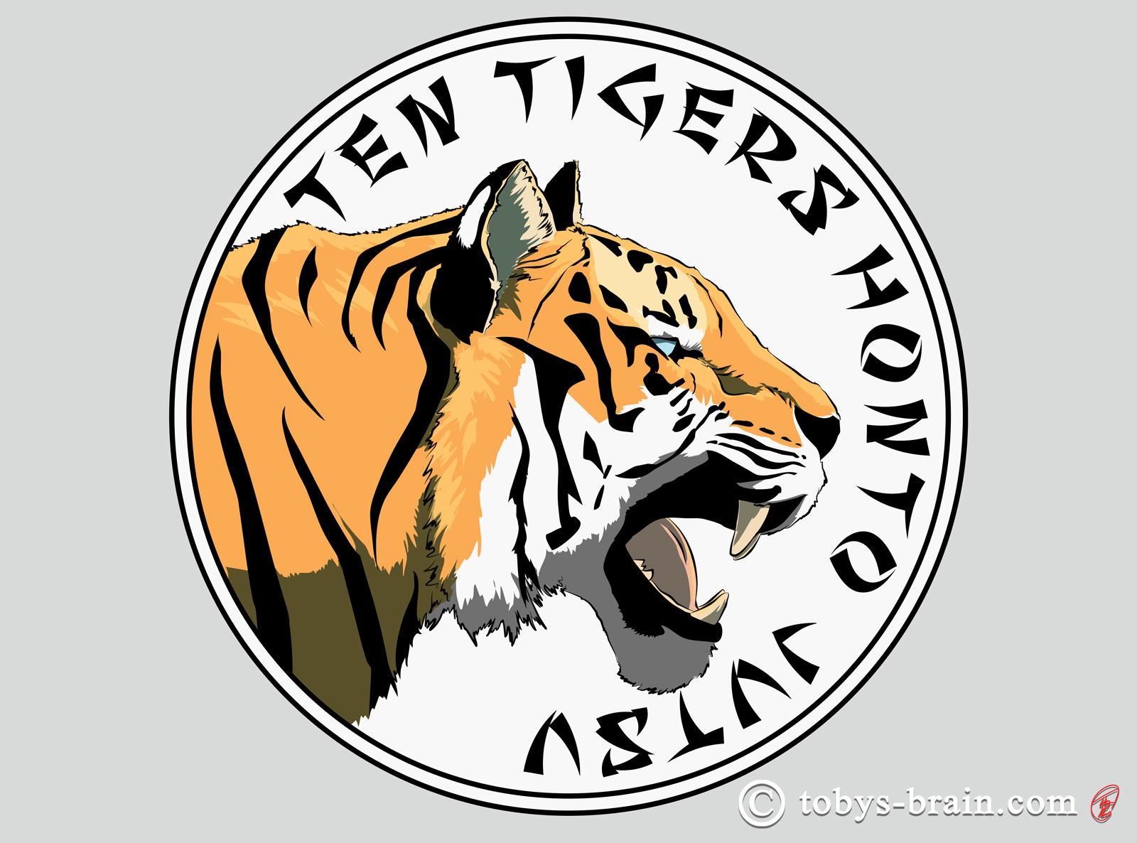
The Ten Tigers name was just begging for a tiger-related alternative logo, so I came up with a few.
I thought the tiger profile would work great as a silhouette, especially for printing on shirts. One color printing is much cheaper than even two color. Plus, it’s kind of reminiscent of the Thunder Cats, and who doesn’t love the Thunder Cats?
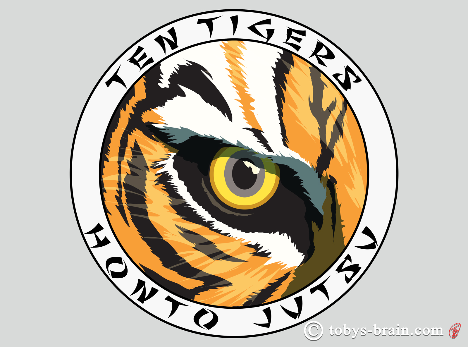
Tigers and martial arts have gone together since the beginning. I once saw an interview with the amazing Jet Li, describing the fierce look he puts on during his fight scenes. He said he imagines the look in the eyes of a tiger about to pounce. I’d say he nails that look. A fun little anecdote about this particular image: I posted this on Instagram with the tag #eyeofthetiger or #tigereye or something like that. It got liked by some guy called Jim Peterik…you know, from Survivor? Your welcome for getting that song stuck in your head.
Anytime I have the opportunity to try out some new Photoshop techniques and tools is a good time. I’ve messed around with the pen tool before, but this was the first time I played with some of the settings to draw colored shapes. This made adjusting colors and tweaking shapes super easy and it kept the edges nice and sharp, the curves silky smooth.
There you have it. We still don’t have a website up, but we are leaning towards a FB page at the moment. This project was a blast, I’m very grateful that I found such a great place to train and that I was able to use my skills/talents to help out.
In other news, I finished up the story illustrations I was working on for L.S. Gagnon’s The Witch Series, which should be making their debut at Boskon this weekend. I was able to do a few new IPMDT panels recently, and I’ve just started working on a book cover for another author. Once that cover is done, I plan to spend more time on IPMDT, make a push to get 10 Things done, then focus on getting the Etsy shop going as well as start some concept work for that collaboration with my wife. Oh, and if you head over to my FB page you can read the anecdote relayed to me by my aunt about Plunger Monkey’s spreading fame…it honestly made my day.
Please let me know what you think, it makes my brain happy.