I’m still trying to catch up to current projects in these blog posts, which I’m making more challenging for myself by continuing to produce work…which is a good thing. More on that subject later.
Hot on the heels of finishing the cover for the fourth installment of L.S. Gagnon’s Little Witch Series, I was asked to come up with four story illustrations, one for each of the four original books. I had some general guidelines about what scenes to represent, but was otherwise left to do what I do. This was a very interesting and fun exercise. The images were intended to be printed out at 11″x17″ and put on display at a book convention to help attract attention to the series. Both the finished print size and the overall proportions for these illustrations was larger than the book covers, they needed to be portrait orientation compositions, and I didn’t have the constraints of trim margins, titles, blurbs, etc. That left me with more real estate to plan and use. It also allowed me to be a bit more dynamic with the compositions. Throughout the process, I tried some new techniques and built several brushes, and I was able to produce them all in about a month and a half (which isn’t easy when your primary function is stay-at-home dad)!
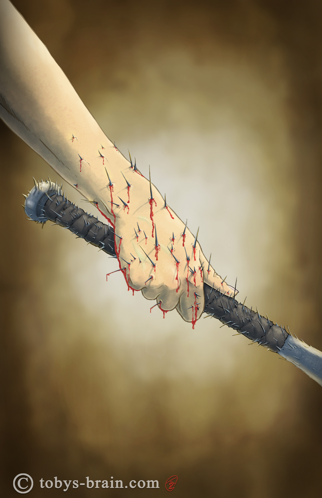
This scen from book one is a painful one. Thea grabs a cursed bat, which promptly turns into metal splinters that flow into her body. This one was the quickest turn around, but I could have kept noodling away at it for a while. More splinters, more blood, more pain…I kept the background intentionally very vague to highlight the action (the scene takes place in a barn, so I went with some warm, wood type tones for the background). I used my wife’s hand hold a bat for reference for this (I refrained from insisting that she stab herself with needles and sharp things though).
This was the first version of the illustration for book 2. Thea’s face isn’t quite right…
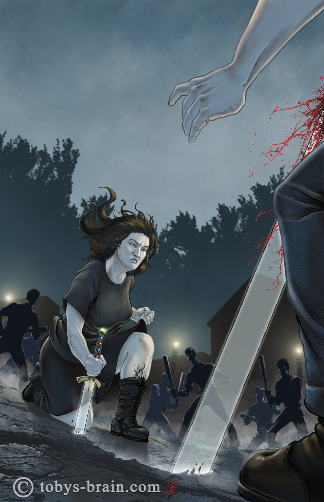
…and this is the second version with some tweaks, though Thea’s face probably still isn’t quite right. I really like this image. This is a moment when Thea is surrounded by warlocks and decides to try out a new skill, namely plunging her magical glass sword into the ground and making it pop up into her adversaries. I knew fairly early on that I was going to employ a tilted horizon line for this image to emphasize the action. I’m really happy with the mood set by my choice of color palette, and how I managed to indicate the setting with limited detail. It helps put the focus where I want it. I’m pretty happy with this image overall. One of the new techniques I tried out was to make a copy of the “flats” layer and hit it with a hue/saturation adjustment, making it more blue and dark. I then applied a mask to it to reveal the areas that are hit by light. It’s just one of a billion ways to deal with light and shadow in Photoshop, but it was a good method for this night time setting.
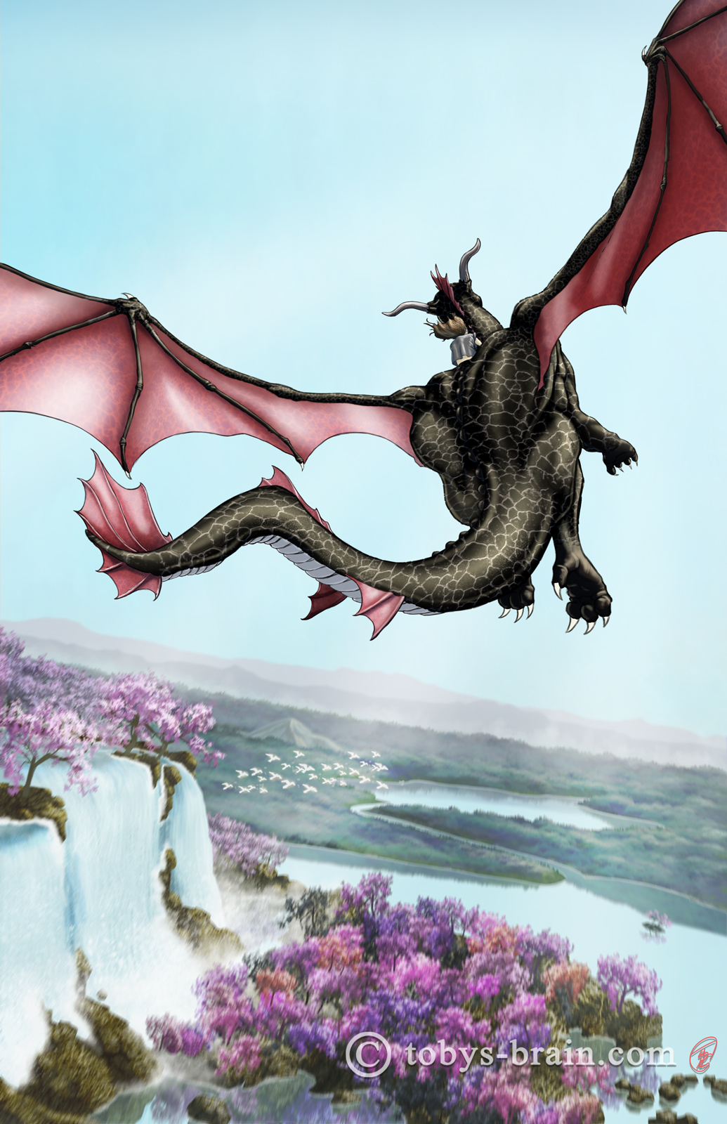
For book 3, I once again had to try to bring the magical world of Magia to life (I already illustrated it on a smaller scale as seen through the portal on the cover for book 2). This image was very challenging for me because a huge chunk of it is landscape, which is a weakness of mine.I built and used several custom brushes to create this world, and overall Im pleased with it. I made use of a tilted horizon again to accentuate the flight of the dragon, and I also threw in a subtle motion blur tto the landscape. I think I tend to be much stronger with pencil and ink, my use of color always feels hit or miss to me, but given the subject and setting, I like to think this one is a “hit” (actually, it has replaced Willy McEyeballs as my home and lock screens on my phone). The dragon anatomy could use some work, and I could have spent weeks getting into scales and wing veins and other details, but I’m happy with it.

In this scene for book 4, Thea stands outside of Simon’s hideout, ready for a confrontation. The structure is based very closely on a photo of Fort Rodman that Lisi sent me. I built some brick texture brushes to create it’s appearance, and learned some new options to play with when creating them (like texture and dual brush). To the best of my knowledge, Photoshop doesn’t have an interactive perspective grid like I’ve seen in some other programs, but I did learn a super simple “cheat” involving the pre-built star shapes with the sides option maxed out. It was very simple and very useful. I also put my cloud/fog brush to good use, I think. Another image I’m pretty happy with.
There they are. If you’ve read the books, how do you think I did? I’m curious.
With those wrapped up, I moved on to complete a cover commission, but this time for a different author, which you’ll read about in the coming weeks here. Right now, I’m on to some of my personal projects that have been waiting patiently for me. I’ve banged out a few IPMDT panels, as well as plotted and thumbnailed out a few strips. Also, I may have actually done some work on 10 Things. DUN DUN DUNNNN! I know! Crazy. I’m actually hoping to have it done before summer. I’ve done some tablet drawing at night over the last few weeks. I finally finished up a concept piece that I’ve been working on intermitently for several months (I have a put together a process GIF to go along with the eventual post about it, too). I attempted to start some concept sketches for the short comic book project with my wife, but I was very unhappy with them so they were scrapped.
I still have tons to do on my To Do list, but I’m looking forward to shifting some of them (finally) over to the Done list over the next few months. But before any of that happens, though, I should probably go to sleep…I like working at night, but I’m not sure the disruption to my sleep is helping me achieve my goals in the long run…
Please let me know what you think, it makes my brain happy.