Project Description
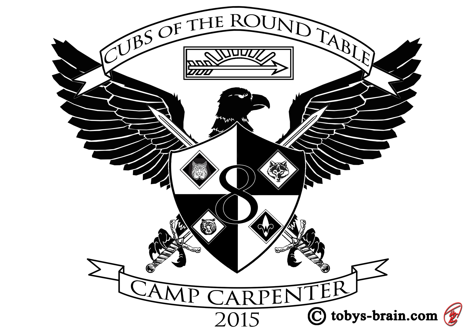
2014 was the first year I designed an image based around the theme of summer camp for the boys in our pack to wear while attending. Having all the boys in the same shirt, different colors for different days (to make sure they were putting on clean clothes) really helped us keep track of them amongst the throngs of other scouts, but also I think it helped them have a sense of being part of something together. The theme for 2015 is Cubs of the Round Table. I played around with a few ideas before settling on a coat of arms. I tried to incorporate some of the basics, like the title of the theme, the year, standard scout symbols (the badges), the pack number etc. The eagle is not too uncommon in “real” coat of arms imagery, but I liked it because of it’s significance to scouting and the hope all of us adults have that our sons will strive and finally attain that rank. I also added the graphic for the Arrow of Light award, the highest rank you can earn in Cub Scouts. Aside from the obvious reasons for adding it, I liked the fact that the graphic is slightly reminiscent, in this context, of a crown, which is another common symbol on coats of arms. I placed it above the eagle’s head to emphasize that a little more.
Please let me know what you think, it makes my brain happy.