Project Description
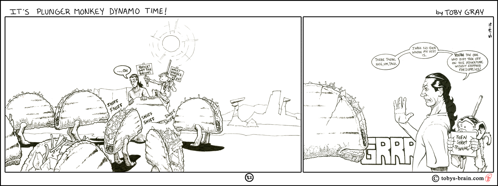
Drawing the panels on a slightly larger scale allowed me to “breath” with my art and details. I’ve really been trying to experiment with line quality and thickness, using thicker, bolder lines for major shapes and contours while reserving thinner, finer lines for other details and hatching. I’m also playing with adding little jaggy bits to some of the contour lines to help indicate volume. It’s a technique I’ve seen employed by various artists, but the one that made me want to try it out was Frank Cho, who is a fabulous artist and his ink work is spectacular (though, to be critical, many of his women look the same but with different hair colors and styles, though I appreciate the way he draws them. And, to be fair, it’s not like I’ve demonstrated a great ability to draw male characters that don’t all kinda look like me…). My work got a bit cramped on the first panel, the dialogue/signs are tough to read (I may go back and correct things like this, maybe if I ever turn this into a book or some other format…). For (I think) the first time, I drew each of these panels on their own page, but I was still having issues figuring out how the panel size would translate once I popped them into the strip in Photoshop, which is why I had issues with the “font” size.
Please let me know what you think, it makes my brain happy.