I don’t even know how long it’s been since the last post. I’ll refrain from “lying” and saying I hope to be more consistent starting now, because I know that’s unlikely. I mean, I want to be productive and focused, but I’m also aware of what my real life schedule is over the next few weeks. On the upside, summer camp is around the corner, which will hopefully mean being out in nature with my moleskin. I’m not quite sure how camp is going to be this year, with it being the first time since my son’s type I diabetes diagnosis. I’m not sure how much time I’m going to spend shadowing him to make sure he’s safe, whether I’ll need to or whether I’ll feel obligated to.
Anytacos, the reason for this post was to talk about my latest commission: a new book cover for Maryellen Worrell’s Sonder.
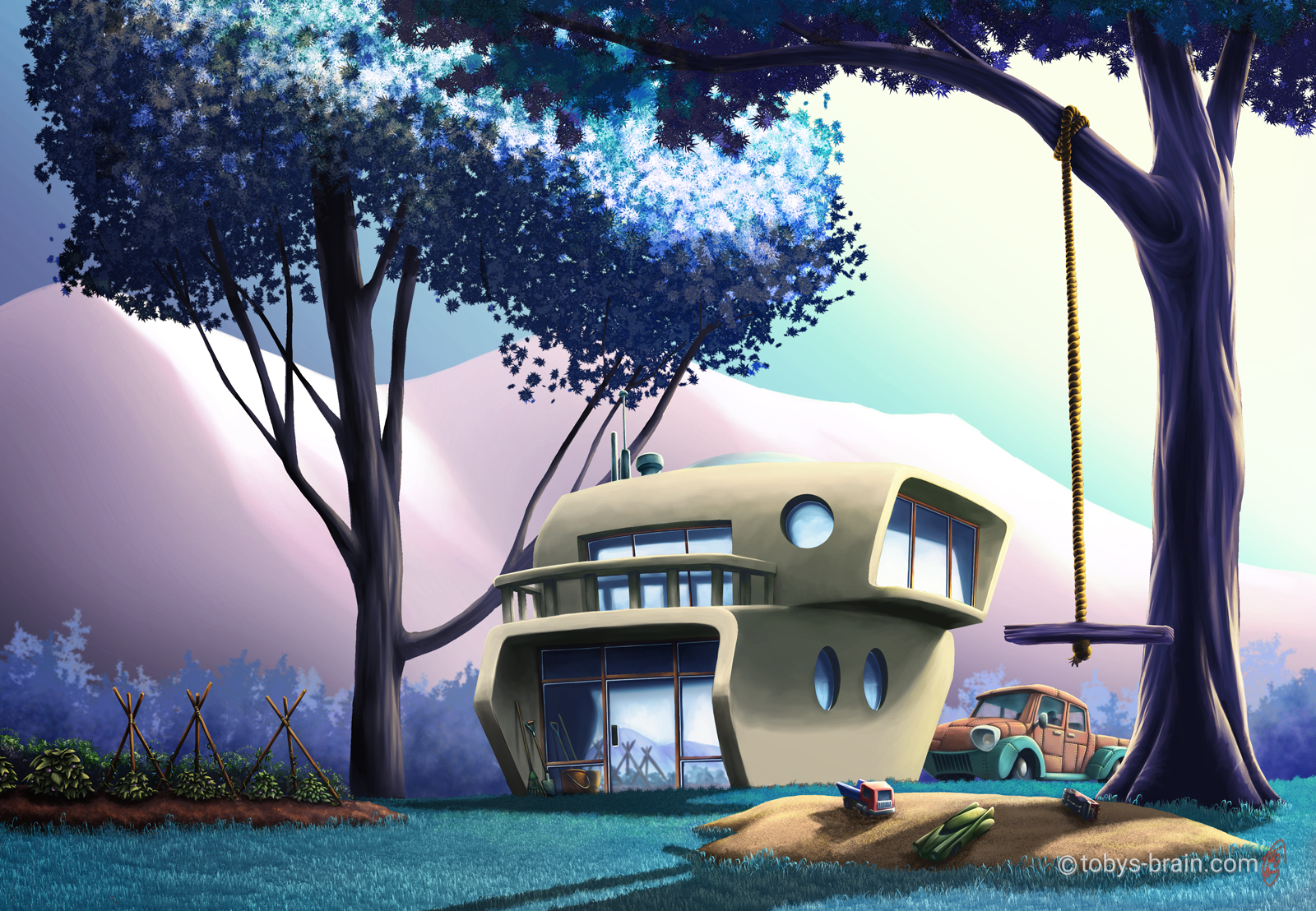
As is always the case, I learned a lot working on this, I had moments of being really happy with what I had done, but I can’t escape seeing all the flaws and mistakes. The story is set on an earth-like alien planet (with blue flora) with a retro-futuristic look to all the man-made elements. As usual, I got lost in details that no one will ever see, except here…assuming you continue reading.
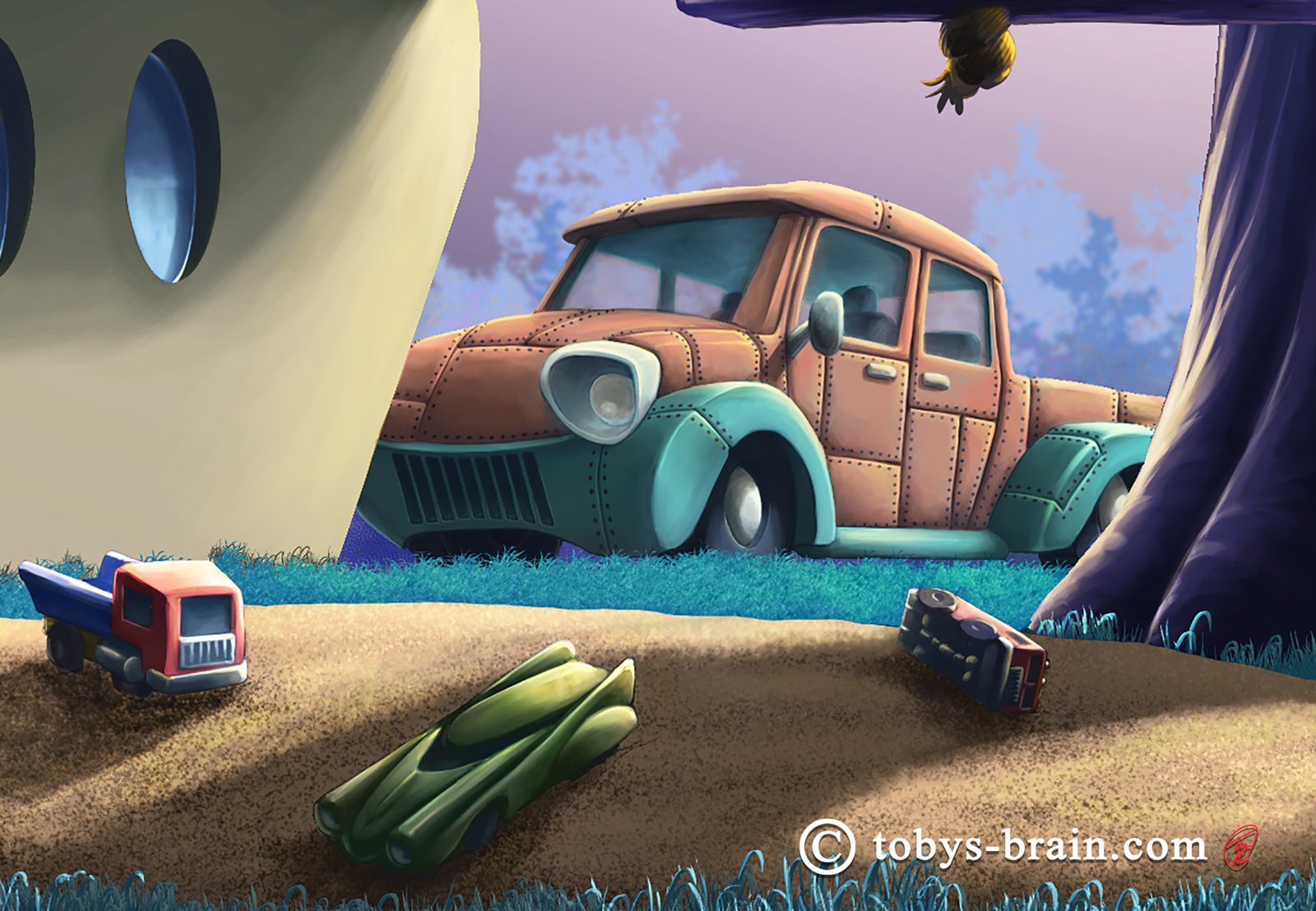
That truck was one of the first elements I worked on in this illustration. It’s loosely based on a 1950s Ford truck. The author wanted that retro-future kind of look that was popular during that time frame, but it needed to look like it was built out of scrap metal (though not junky). The color is a little “Mater-ish”, but I was relatively happy with the way it turned out, especially since I’m not a car guy and don’t spend much time drawing vehicles. I spent a great deal of time detailing this truck, from the rivets to the translucent windows that reveal the seats inside, but viewed at normal size, you don’t really see them. My brain wouldn’t let me not cram in that level of detail, though.
I struggled with the toy cars a little. They needed to look slightly bigger than, say, Matchbox car size, but have that same retro-future look. They also were supposed to look like they were built from scraps, but due to their size and the other challenges I had with their design, I opted not to focus too heavily on that. One fun little factoid: that green car is a representation of an old toy car I used to love playing with at my grandparents’ house as a kid (I think my memere still has it, actually). It was a cool, futuristic, sleek looking sports car, right out of that same 1950s futurism vibe.
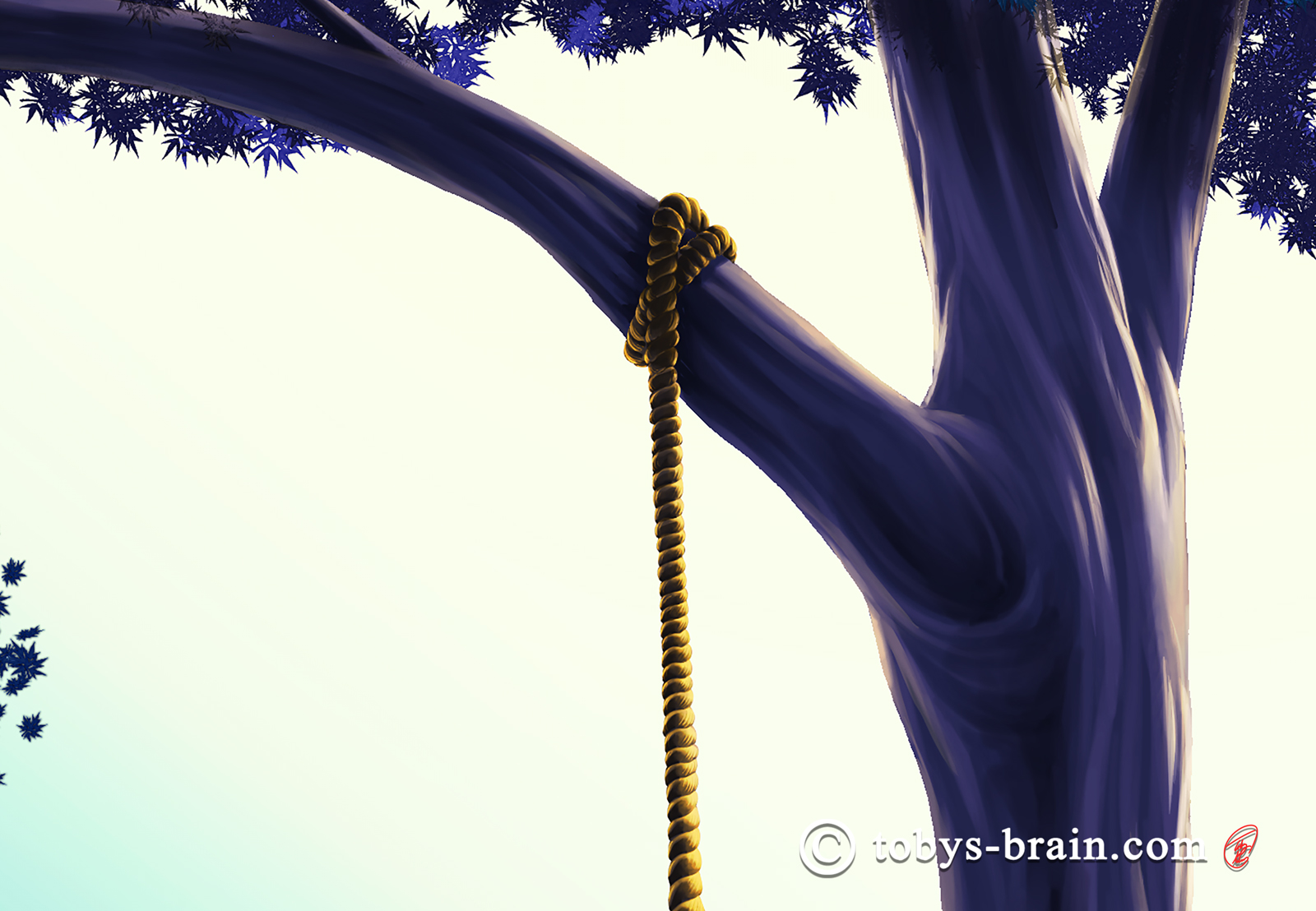
Another key element to the cover is the rope swing. I don’t think I’m giving anything away by revealing that the story revolves around a family on an alien planet coming to grips with the death of one of their children. The empty swing and abandoned toy cars, as well as the overall color scheme and lighting, are meant to be a bit somber. The rope itself is a bit “bloopy”, but, once again, I probably needlessly sat and drew all the little details. I managed to restrain myself when it came to the rope fibers themselves, at least.
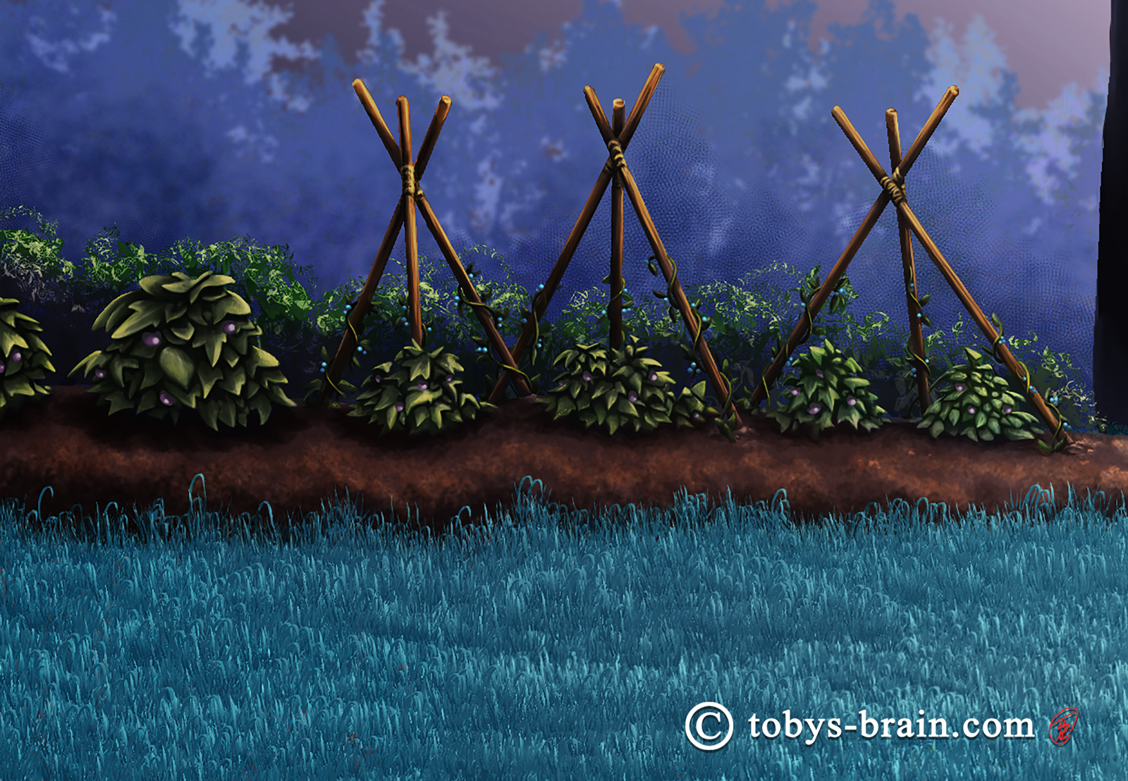
Here’s a shot of the family garden. You can’t see them hardly at all at normal size, but there are fruits on those plants. I used a stock vine brush in Clip Studio to indicate the rest of the garden behind the main elements, which I think worked out nicely. That part, at least, wasn’t too time consuming. I’m reasonably happy (I say that phrase a lot) with the tripods themselves, though they could use more work. However, at normal size, they work.
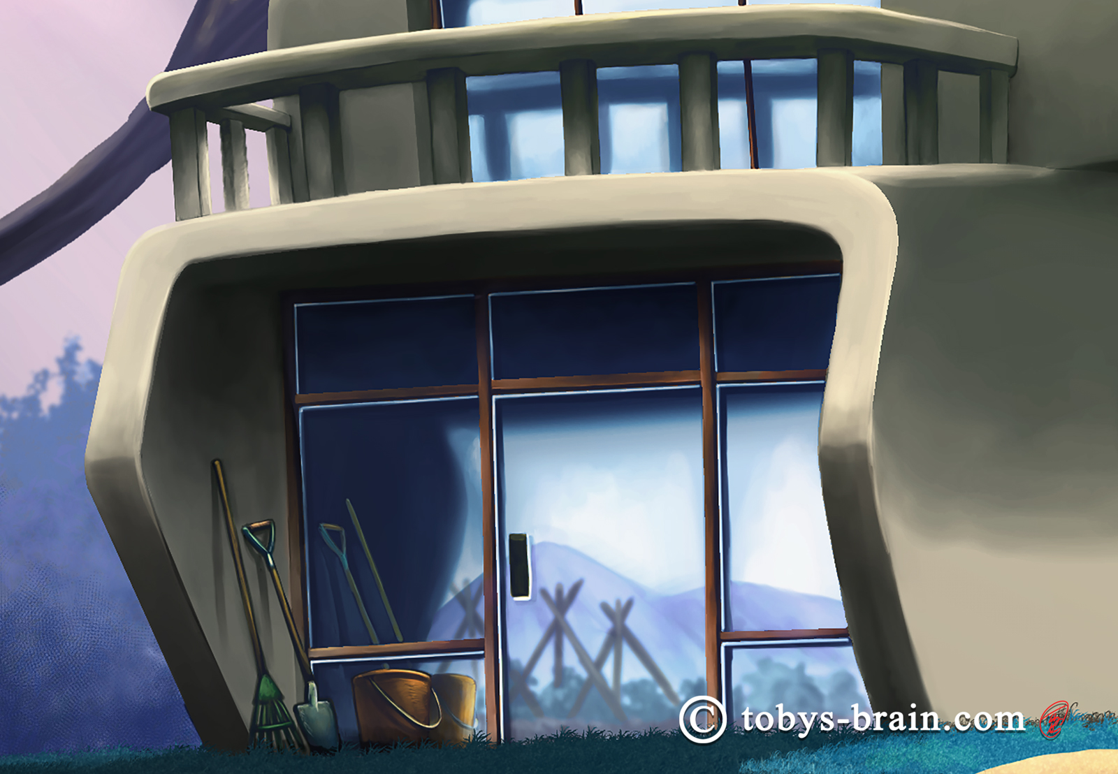
I initially had the rake, shovel, and bucket tucked under this overhang with the vague reflection of those tools and the house walls, but on the last day before I decided it was done, I realized there needed to be something else reflected in the window. I was able to refrain from getting too detailed in the reflected garden, but I added a bit of a blur for good measure.
This was a fun cover to put together, the first one using solely Clip Studio on my iPad Pro. That’s huge for me, to be able to work “professionally” but mobile. The vast majority of the 30 or so hours I spent on this cover were spent comfortably lounging on the couch. It really saved my back, neck, and joints. I still need Photoshop for a few procedures and tools (text especially), but if I can do the majority of certain projects while sitting some place comfortable or inspiring and then do some final tweaks and preparations at my desk, I’ll be a happy camper.
In other stuff, I’ve sold a few more shirts to family members, which is cool. I greatly appreciate the support I get from friends and family for what I do. I couldn’t do it otherwise. The two “customers” recently were from my wife’s side of the family (who were just here visiting) and they live in different areas of the country. Hopefully that translates into some word of mouth (word of torso?) advertising. I need to go through my shirt designs waiting in the wings and decide which one is next, then I need to take advantage of the iPad and Clip Studio to start banging out some new ones.
I’m still dreaming about making my perfect EDC (every day carry) bag. I’m struggling with the design (which I’ve been working on in Sketchbook Pro on the iPad), as I don’t have quite enough experience sewing things. I’m trying to keep it simple and functional, and I keep getting hung up on the “hows”. I think I need to spread out all the gear I normally carry and arrange things logically on a big sheet of paper and start coming up with pocket arrangements and such. My goal was to build it before summer camp, but that’s looking less and less likely (I still need to decide on the material, too).
As always, 10 Things sits in limbo. Maybe I’ll decide what to do with it by the end of summer…
I intend to start working on some of the comic ideas that are waiting for me, as well as continuing with IPMDT and putting videos up on YouTube. The list of stuff to do is paralyzingly long.
Please let me know what you think, it makes my brain happy.