Four weeks into 2021, four new blog posts?! Yeah, I don’t know what’s up with that. I can tell you right now I already don’t have a plan for next week, so my streak likely ends right here. It was good while it lasted, at least, though, right?
These posts also have been taking a considerable amount of time between editing/prepping files to upload, captioning them, waiting for sluggish load times, and getting into fights with technology in general. I have spent four hours so far (as of…this word) putting this all together, which is fine. I still count it as “work”, but it’s not making new art (or sewing…I’m really itching to sew some things again), which usually means I get a little frustrated and feel unfulfilled. But, self-promotion is part of this game. I can’t make PMD a pop-culture icon and build my own theme park by being a complete hermit…
Anyway, the last idea I had for a post so far this year was to do a break down of my entry for Clip Studio’s “The Best Smile” illustration contest. It was a lot of fun for me to do, and it really helped me iron out some kinks in my illustration/comic workflow that I’ve been developing. Have a look (and if you make it to the end, you’ll get to see the obligatory close ups and a process GIF):
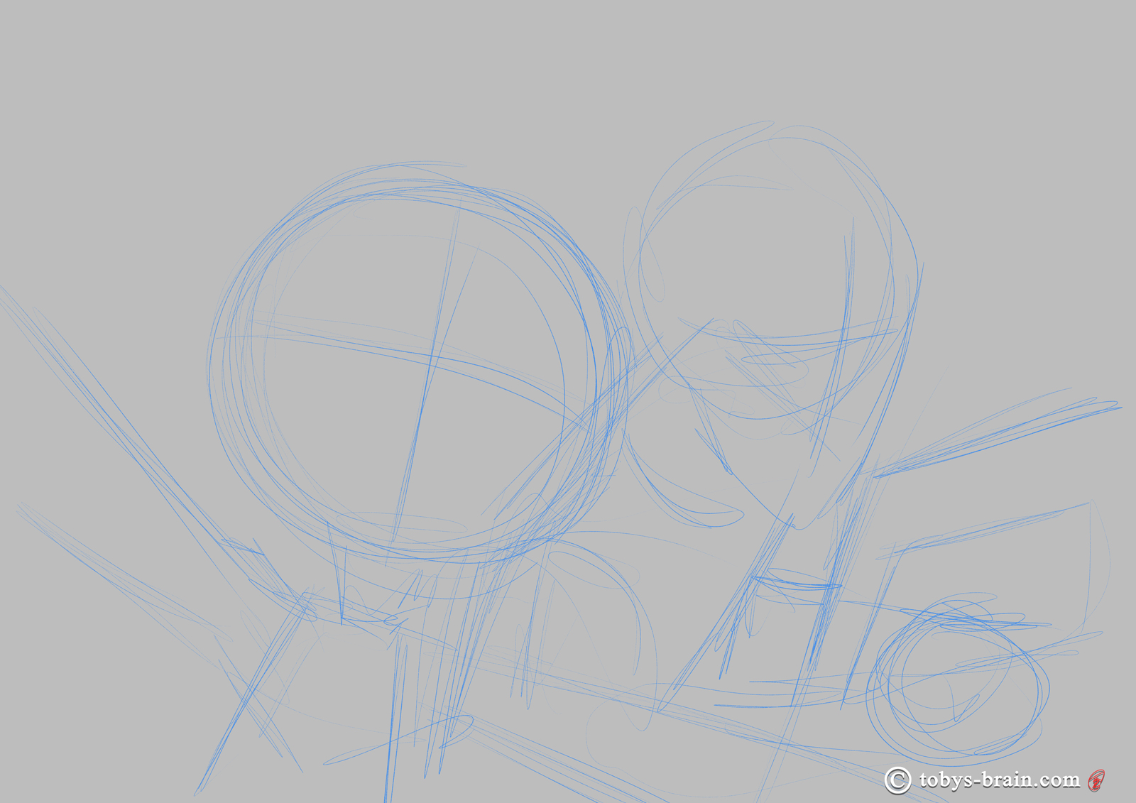
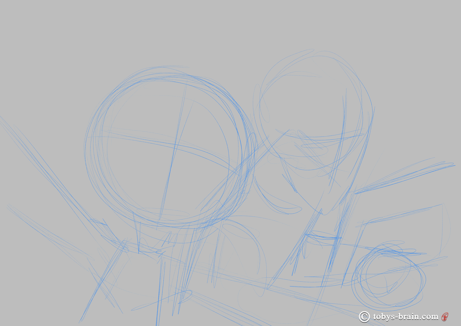
The VERY rough layout sketch. It served as the idea, the jumping off point, but the perspective of me in the background wasn’t terribly accurate.
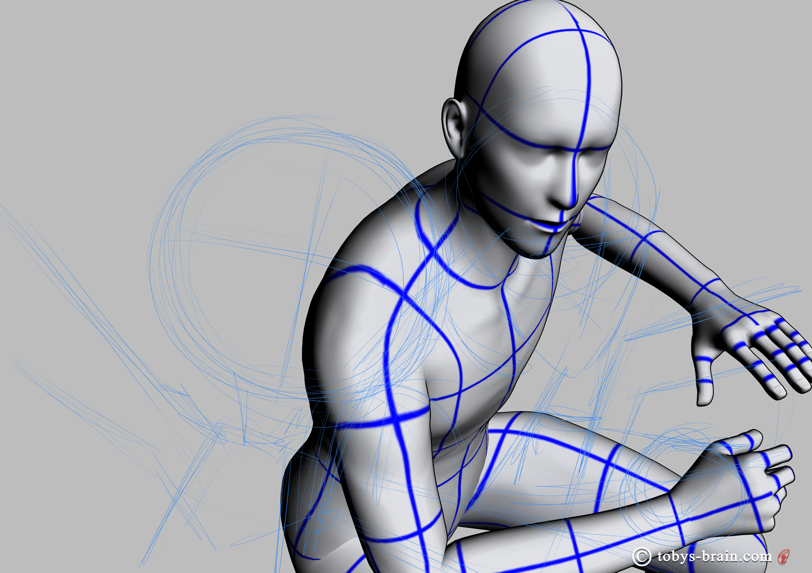
After throwing down a very rough layout, I took advantage of Clip Studio’s built in 3D models. You can see that my original composition didn’t quite meet up with the actual perspective of a 3D object, so I tweaked the sketch.
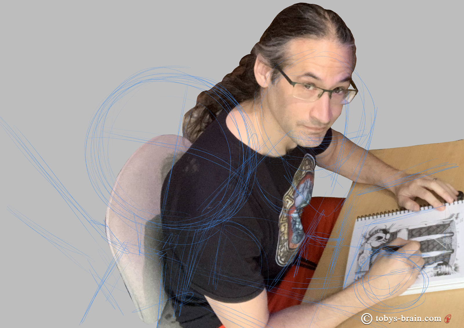
After the rough sketch and messing around with the 3D model, I decided I needed a good reference photo for myself. It took a bit to rig up my camera in the right position, but I was able to refer to that 3D model to get it worked out. I dropped it into the original rough sketch so you can see how off I was. I could have traced the photo and rendered right on top of it, it would have been faster and more accurate, but I doubt I will ever be able to bring myself to do that (it’s cheating!) outside of specific anatomy drawing exercises.
After tweaking the layout based off the 3D model and photo, I got to drawing. It’s one of my favorite stages of illustrating because, especially when working digitally, I’m less worried about mistakes. I can be looser, more free, and I just really like the subtlety of pencil textures. I drew myself and PMD in separate groups with separate layer structures. This made it easy to resize or more the elements around later if I needed to (which I think I did a little bit at some point). I also wanted a fully finished illustration of myself that I could use for other things.
The full body tight sketch. There’s actually quite a lot that gets covered by PMD, but I wanted to be able to use just me for other things (like social media profile pictures).
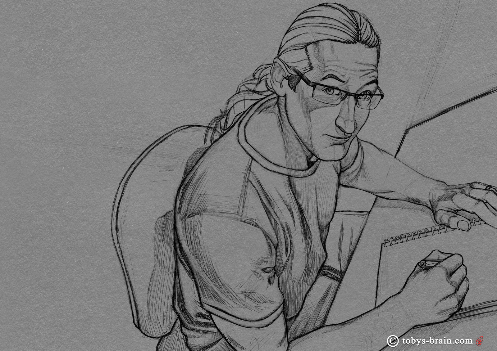
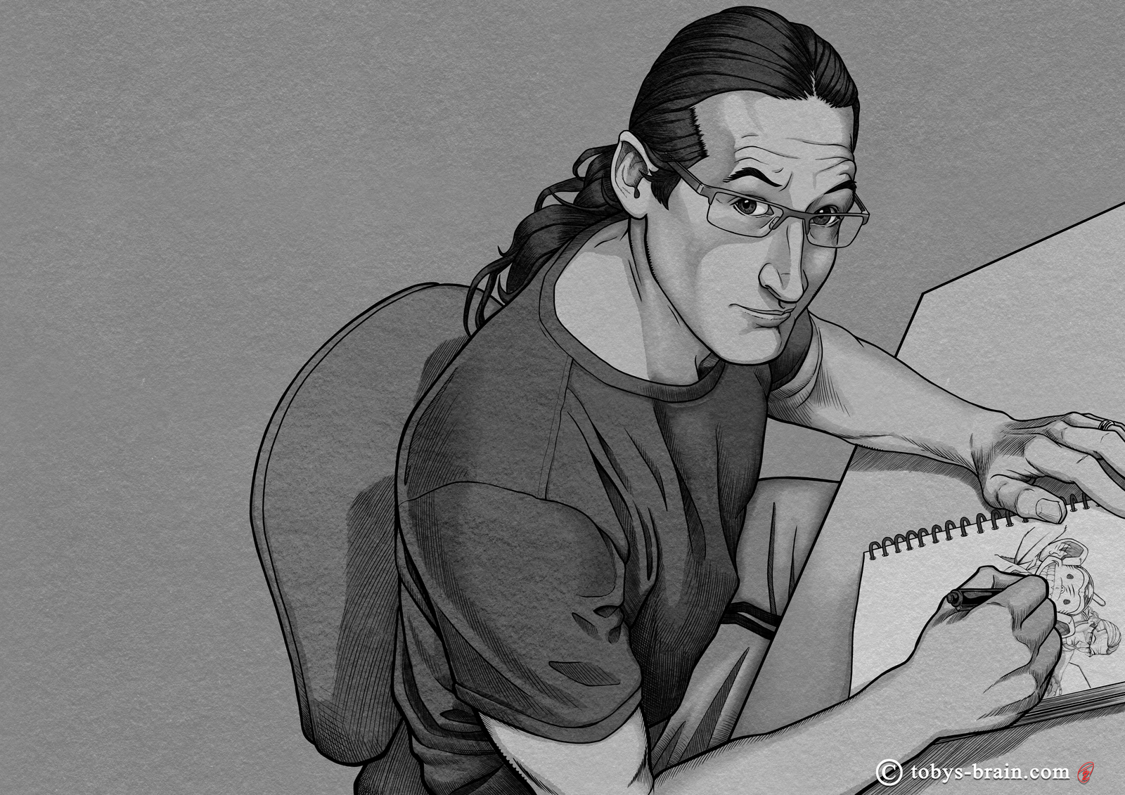
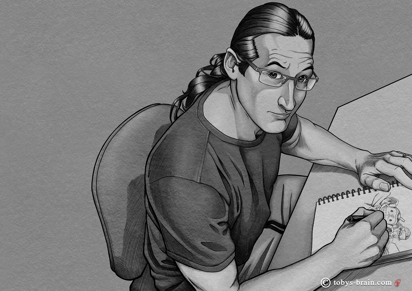
I really enjoy crisp, accurate inks. I also really like adding texture and shadow with hatching. I can get carried away, especially when I’m doing a piece that’s essentially “multi-medium”, as the end goal is to create a ink, watercolor, colored pencil kind of look. I’m still learning ways to add texture and volume with the hatching, trying to find my own “style”.
Flatting is more commonly done in color, at least in comics. It’s used as a means to distinguish objects or elements and make it easier to select them later while rendering and adding special effects. They could be random colors, or they can be the local color of the object (for example, red for an apple) to give a bit of a head start on the rendering. I recently started using the process with my black and white work, as it’s much easier to logically organize my values without the distraction of color. It’s also helped me separate elements better.
This is a little tough to see, but you can kind of make it out on my shoulder. I used to add my pencil textures to the shadows only, but I decided I didn’t like how it washed the shadows out. Applying them to the flats layers produces a better look, I think. It’s subtle, but it makes a difference.
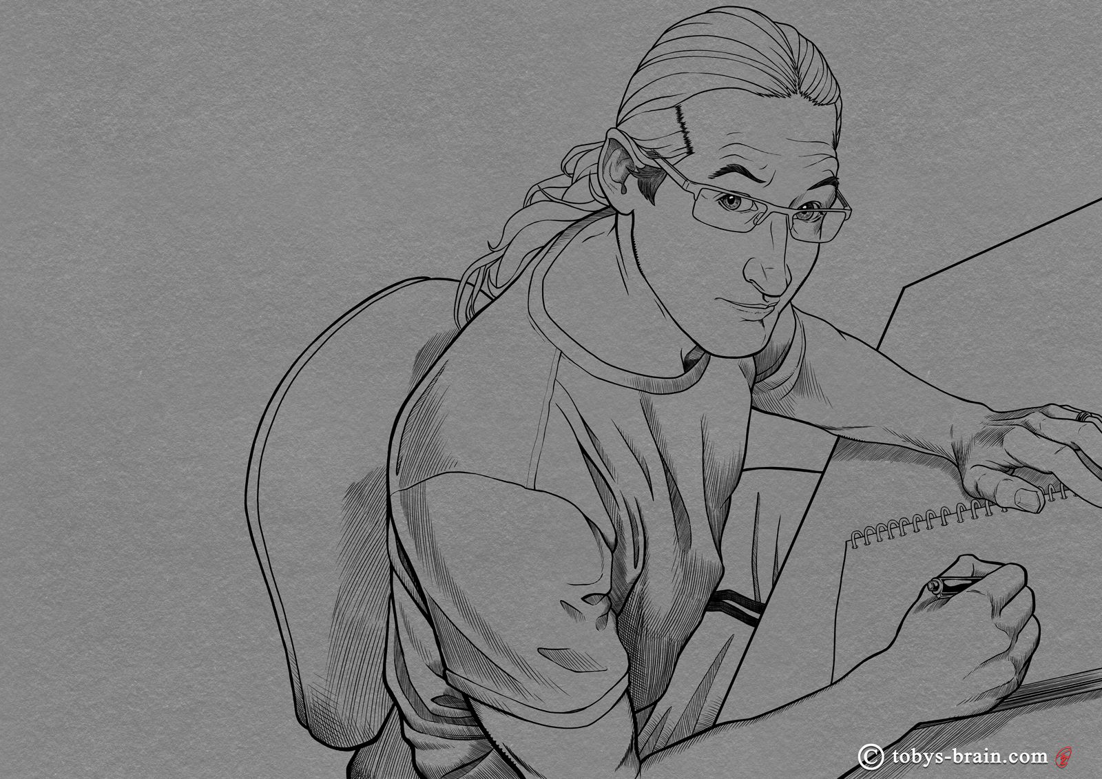
I’ve been pretty happy with the way I have been able to combine my custom, hand-made textures with some rough edged digital brushes to create a watercolor/ink wash look. I draw them on their own layer, set to “multiply”. I start with one solid color (30% grey). When I’m happy with the location and shapes of all the shadows, I lock the pixels on that layer and start adding brighter and darker areas (locking the pixels constrains all additional painting to those pixels, I can’t “go outside the lines”).
Adding highlights on another layer, trying to create volume and turn forms.

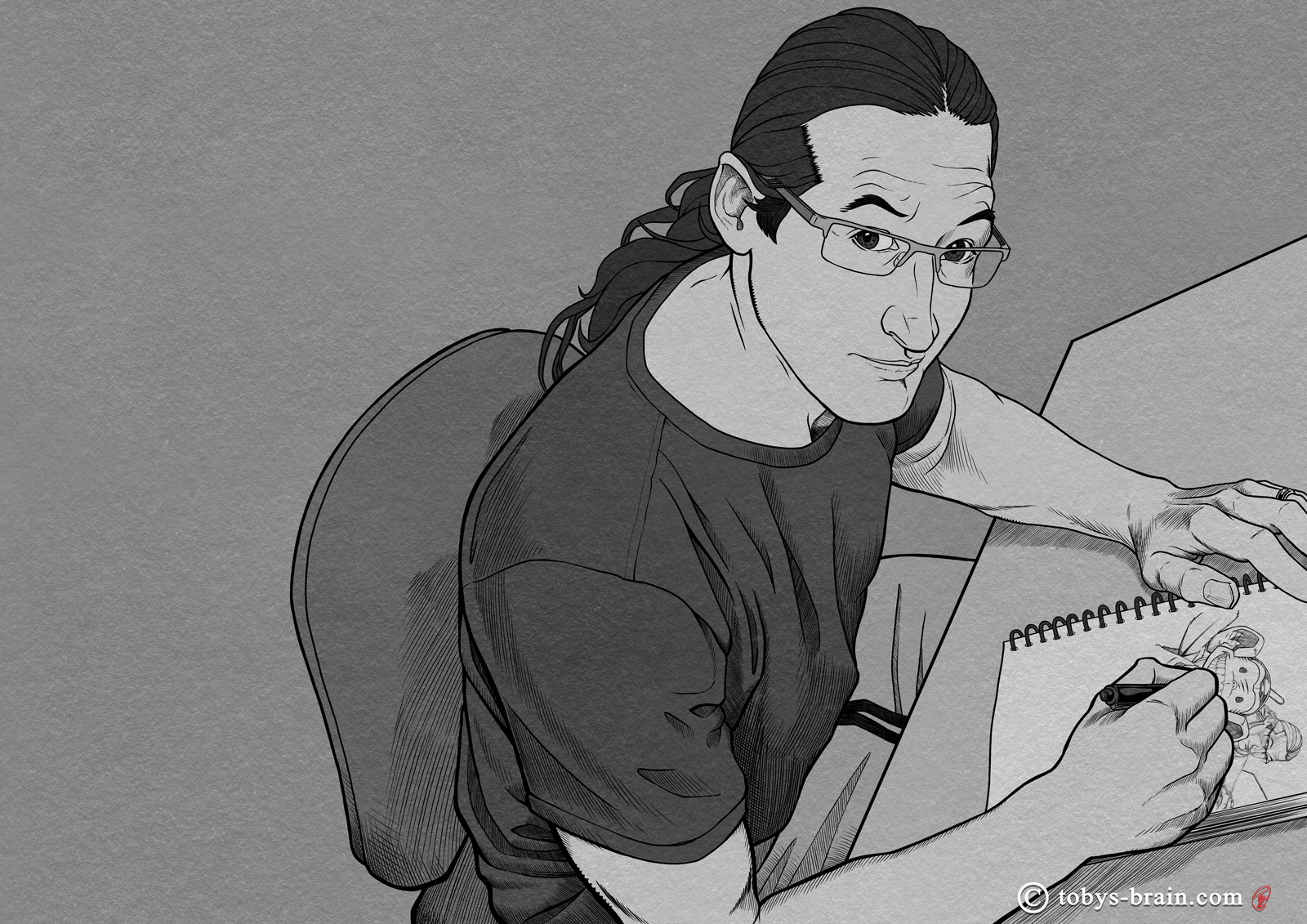
I’ve taken to coloring using gradient maps more and more. It’s a great way to lay down large areas of color that I can easily adjust. The color maps to the underlying tones, so you can quickly get more realistic colors than simply painting a color on top. You can add “stops” to the gradient to shift the colors. For example, 50% or so would be the local color, so a desaturated orange/sienna for my skin. At the black stop, I can add a bit of color to the shadows, and similar for the white stop. I can also add as many transitions in between as I want, and slide them all along the scale to control how quickly the colors transition into each other based on those underlying tones. But it’s just a start, though.
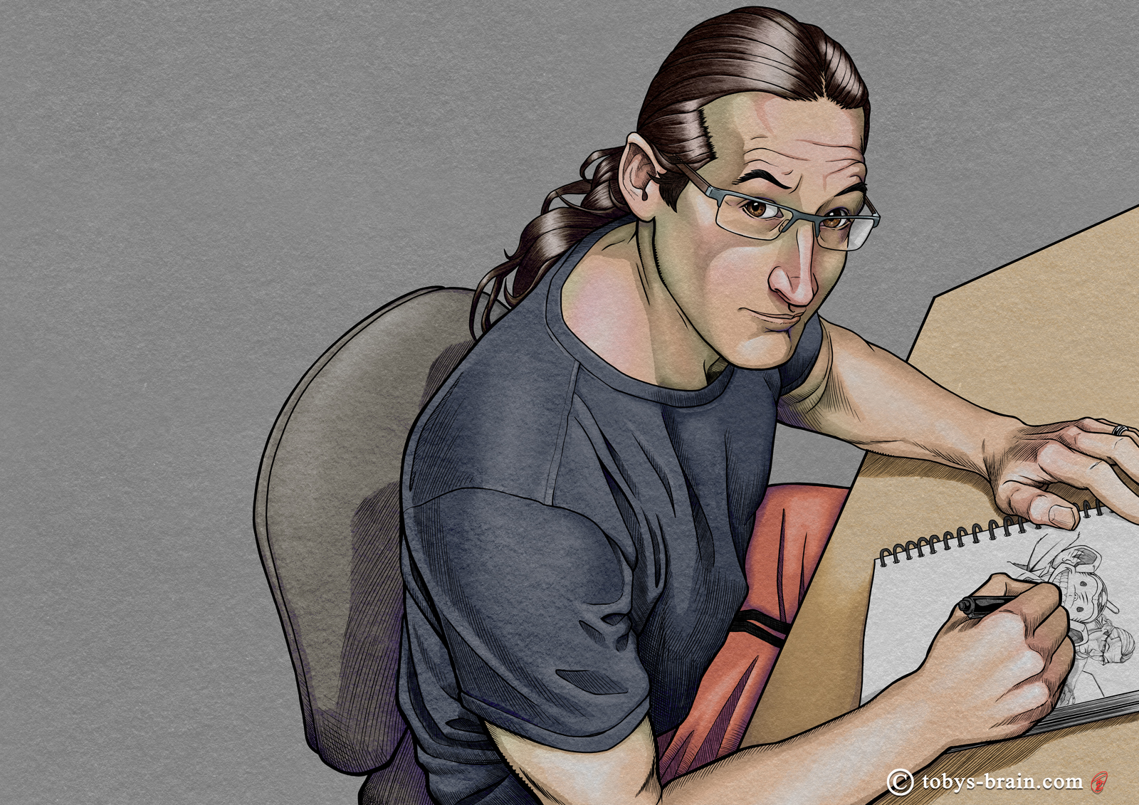
Nothing, especially organic things, are just one flat color. Things like skin of subtle color shifts depending on base skin tone, thickness of skin, and other factors (for example, forehead skin is thinner, and can show a reddish tint due to the blood there. Cheeks, noses, and knuckles also are common areas for color shifts). I notice an olive/greenish tinge to my overall skin tone, especially under certain lighting conditions and in shadows. However, if I tried to color my skin uniformly that color, it wouldn’t look right.
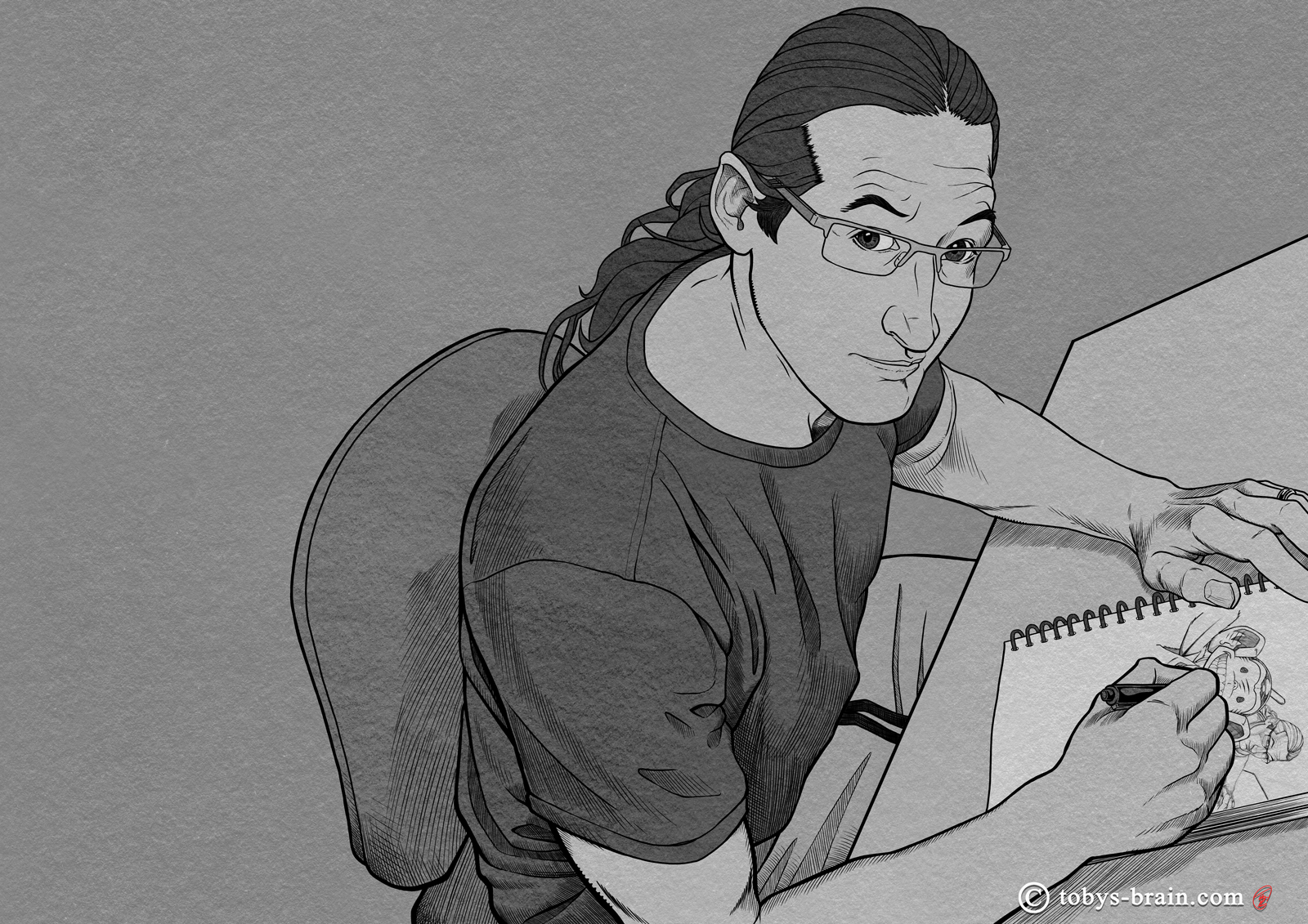
So, I should note that I didn’t quite work on this image in the order I’m laying it out, but that’s the easiest way to show the process and highlight some of the details and steps I wanted to. I went back and forth a bit between working on PMD and myself, I didn’t fully finish myself and then start PMD, though once things were far enough along, I focused that way.
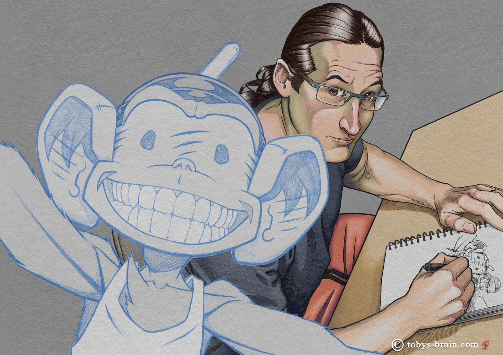
I think inking PMD is one of my favorite things for some reason. I experimented with more hatchmarks than I usually use when drawing him, with a much finer line. I like the result.
The tonal flats, as well as a subtle pencil texture on top.
The shadow layer creates most of the volume. I have taken to using a “real” G pen in Clip Studio, which just means it has a rough, randomized edge, rather than a smooth, sharp one like I use for inking. This kind of creates a watercolor/ink wash look that I like, especially when combined with my paper and pencil textures.
Highlight pass on PMD. In general, I’ve been using rim lights for him and letting the “flats” serve as the base light area in conjunction with the shadows. I may start experimenting with some more bold highlight planes to give him more shape, but I haven’t quite figured out how that would look yet.
Splashed some color on PMD using Clip Studio’s gradient maps.
Subtle, but I added my custom pencil gradient to the background. I like gradients and all, but I really like texture, too. My attempts to create them digitally always felt too mechanical (in spite of CSP’s robust texture assets). I ended up scanning some sketchbook paper as well as hand-drawn pencil gradients and fills, which I then used Photoshop to turn into seamless textures (by using copy/paste and the Clone Stamp tool around the boarders to make sure the texture repeated). I uploaded all those to Clip Studio, and they are a regular part of my work flow now.
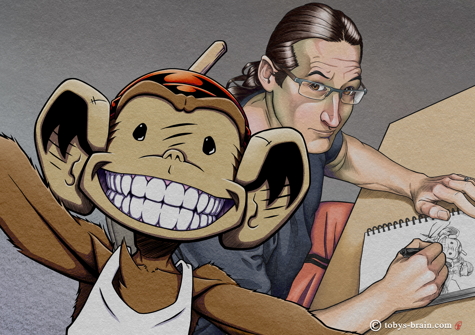
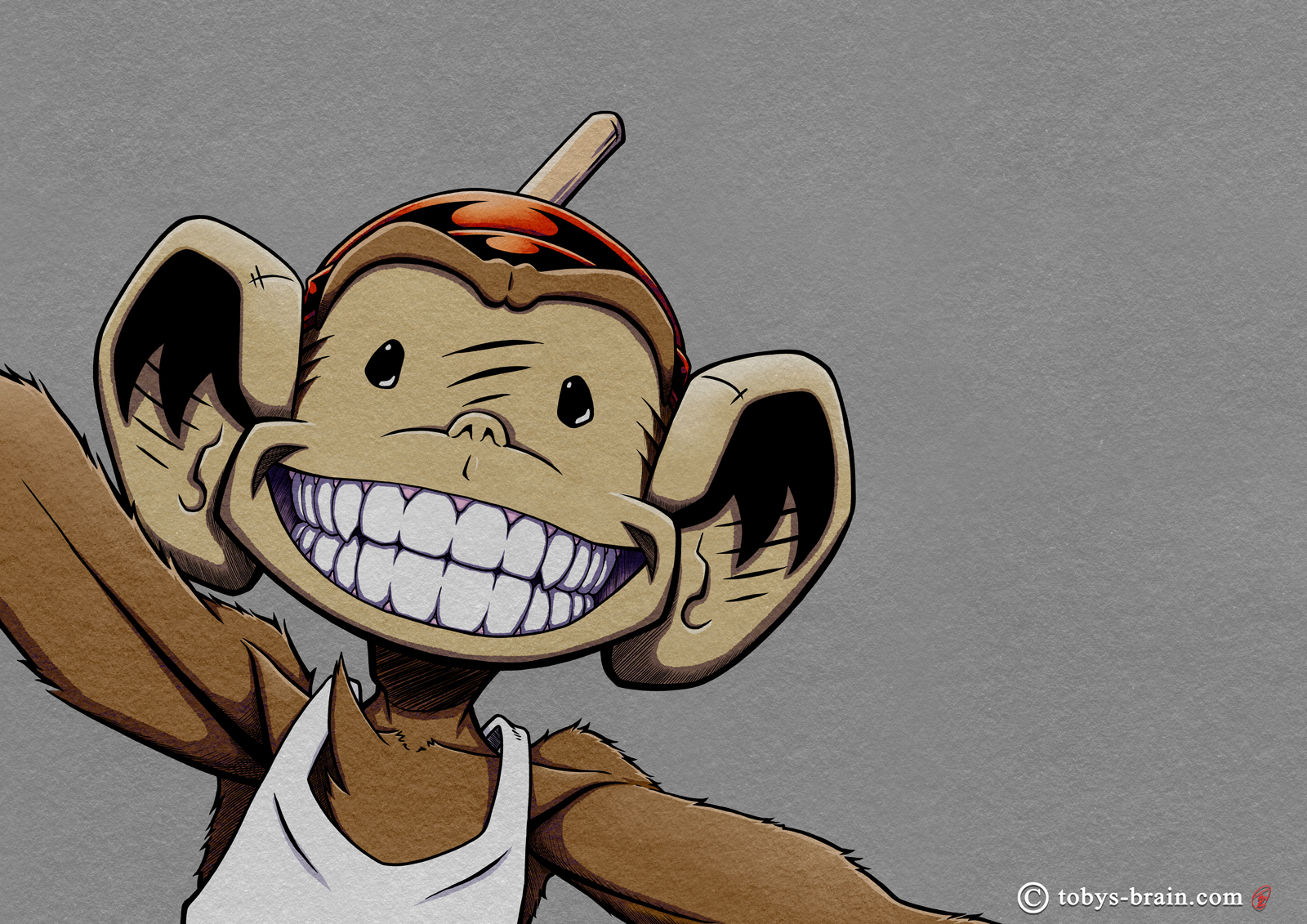
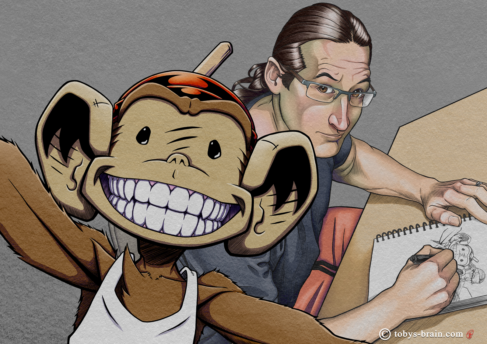
A couple of weeks ago, Clip Studio Paint announced one of their semi-regular illustration contests, with the them “the best smile”. I don’t enter hardly any contests (I can’t remember any, really, unless you count submitting to Spectrum, but that’s not really a contest), but I figured “Plunger Monkey has a good smile…” Shortly thereafter, this image popped into my brain. It was a lot of fun to create, and something I could “noodle” away at endlessly. It really helped me refine my digital comic making workflow, which I just started to employ as I rework Inside Toby’s Brain. I did the whole image in greyscale first, making use of some of my custom paper and pencil textures, then I added color through gradient maps and a hand painted layer. I don’t know that I stand much chance of winning (top prizes include subscriptions to CSP for a few years, money, and I think a Wacomb tablet, though I may be getting confused with another contest that was announced recently), but there’s zero chance if I don’t enter. I learned some things and grew as an artist a little bit in the process, so it was worth it either way.
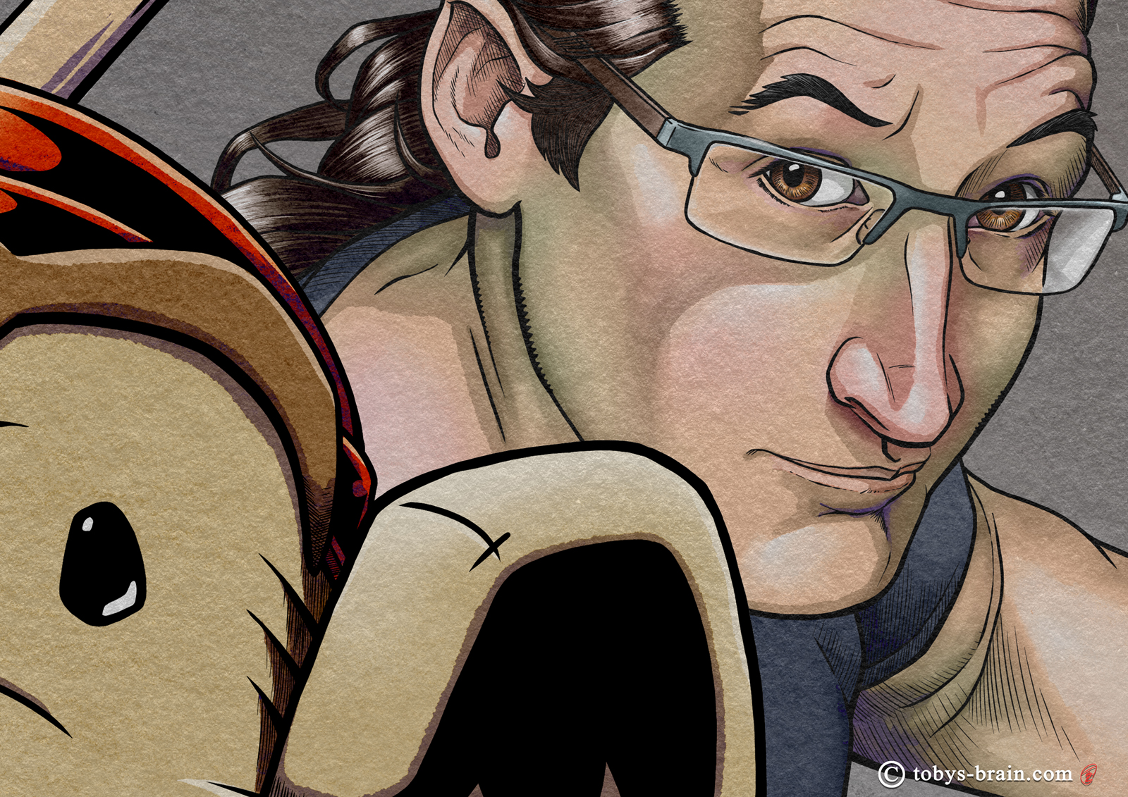
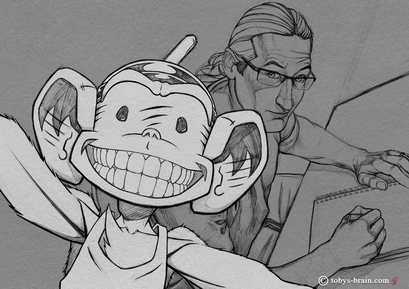
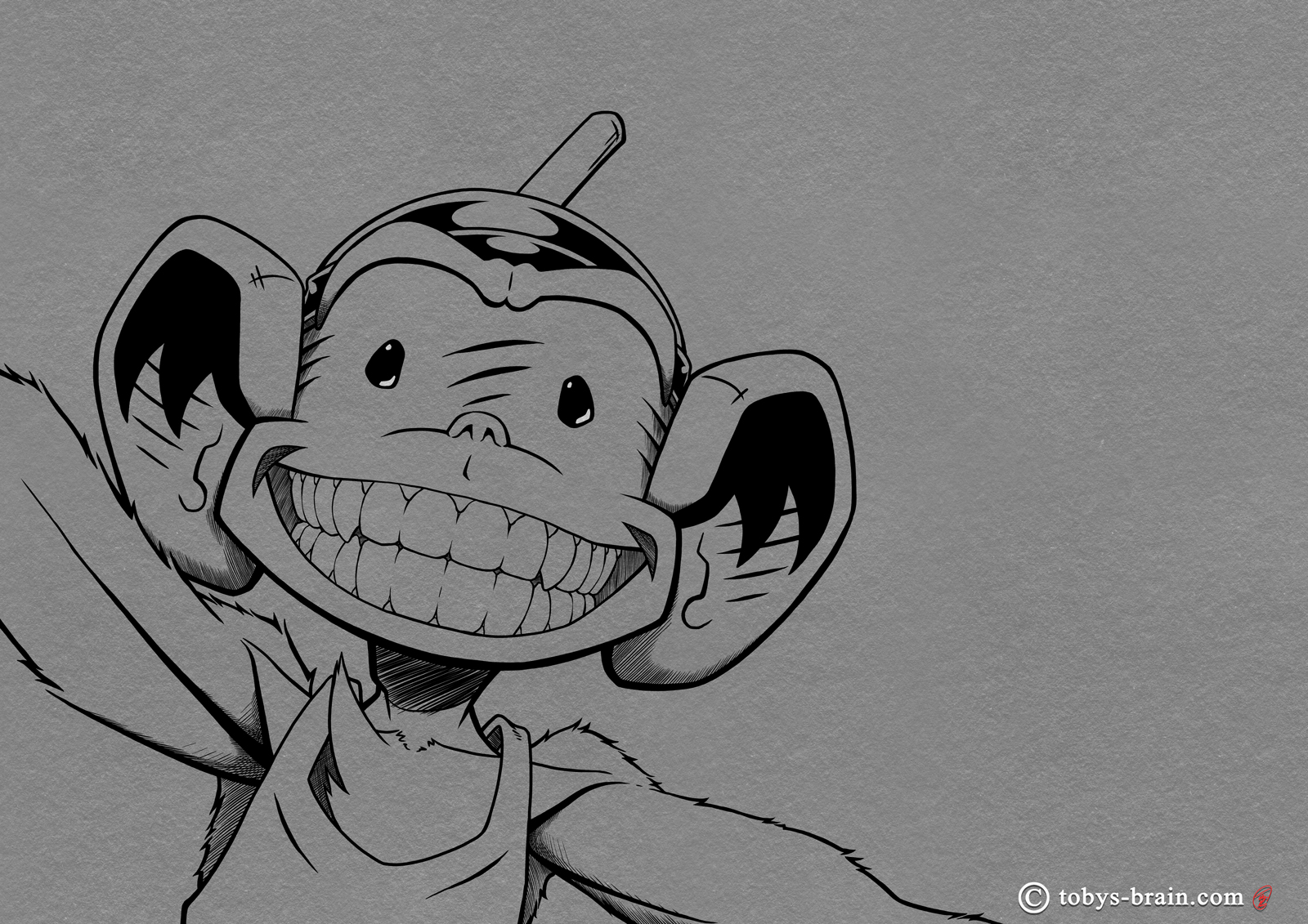
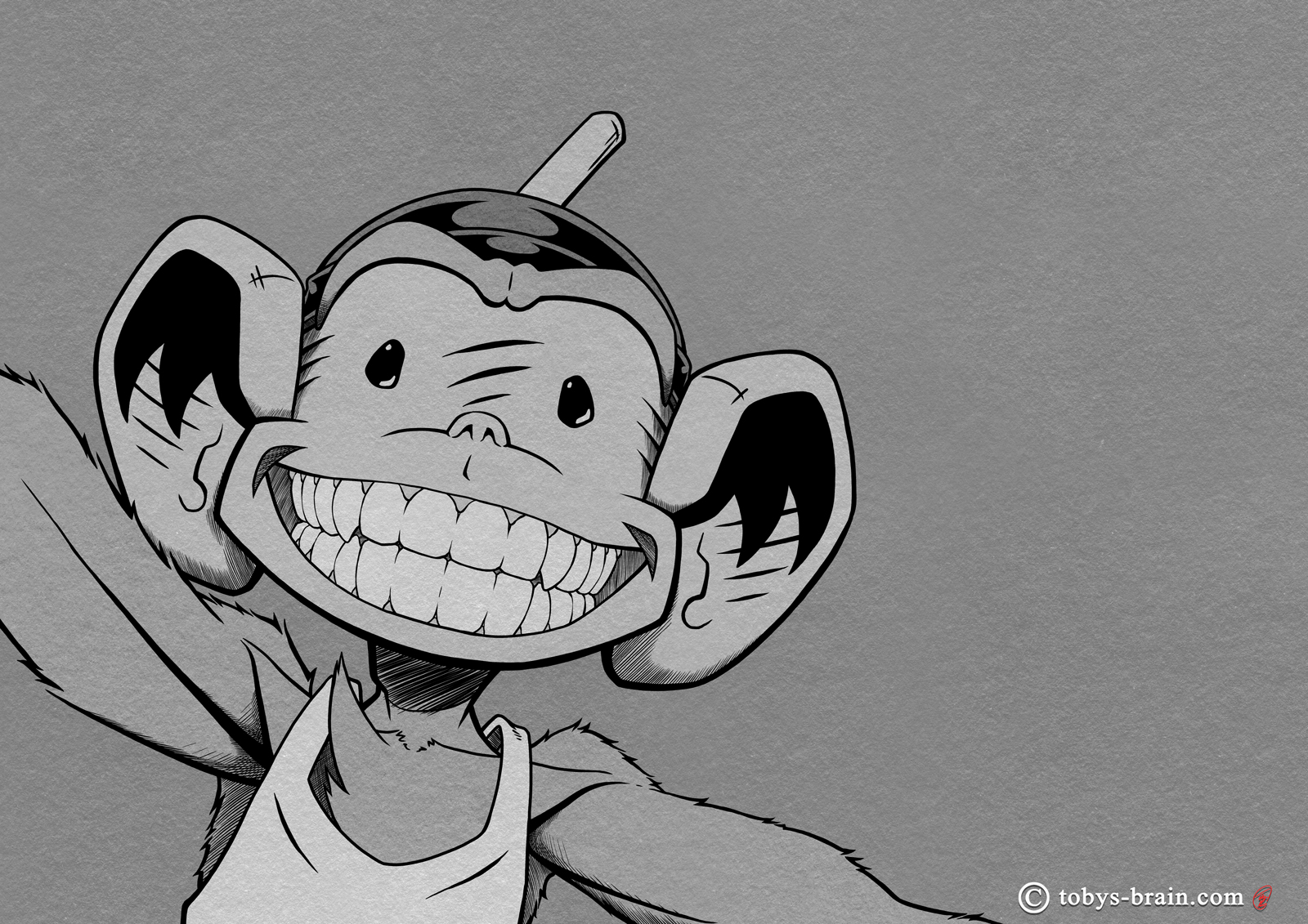
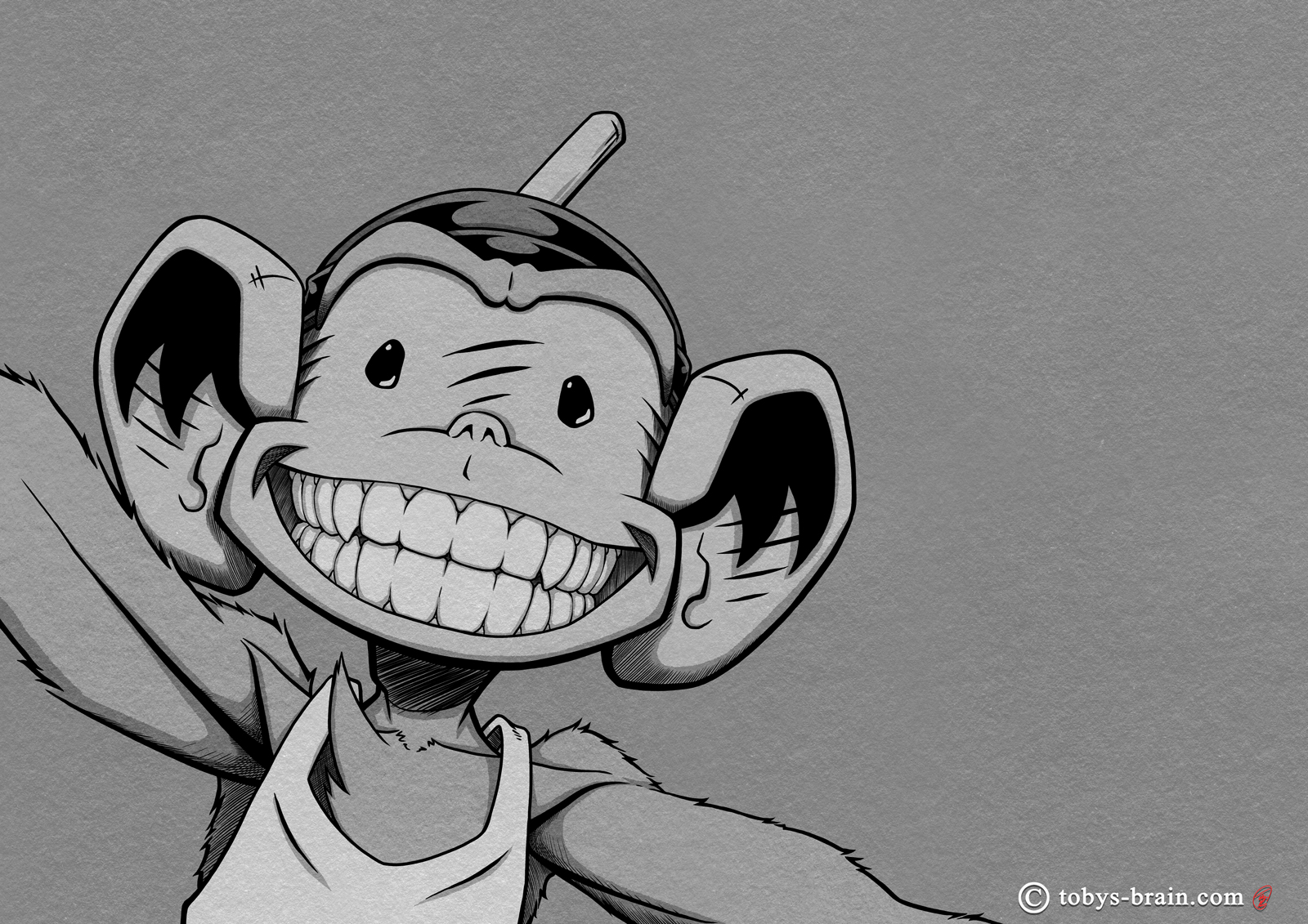
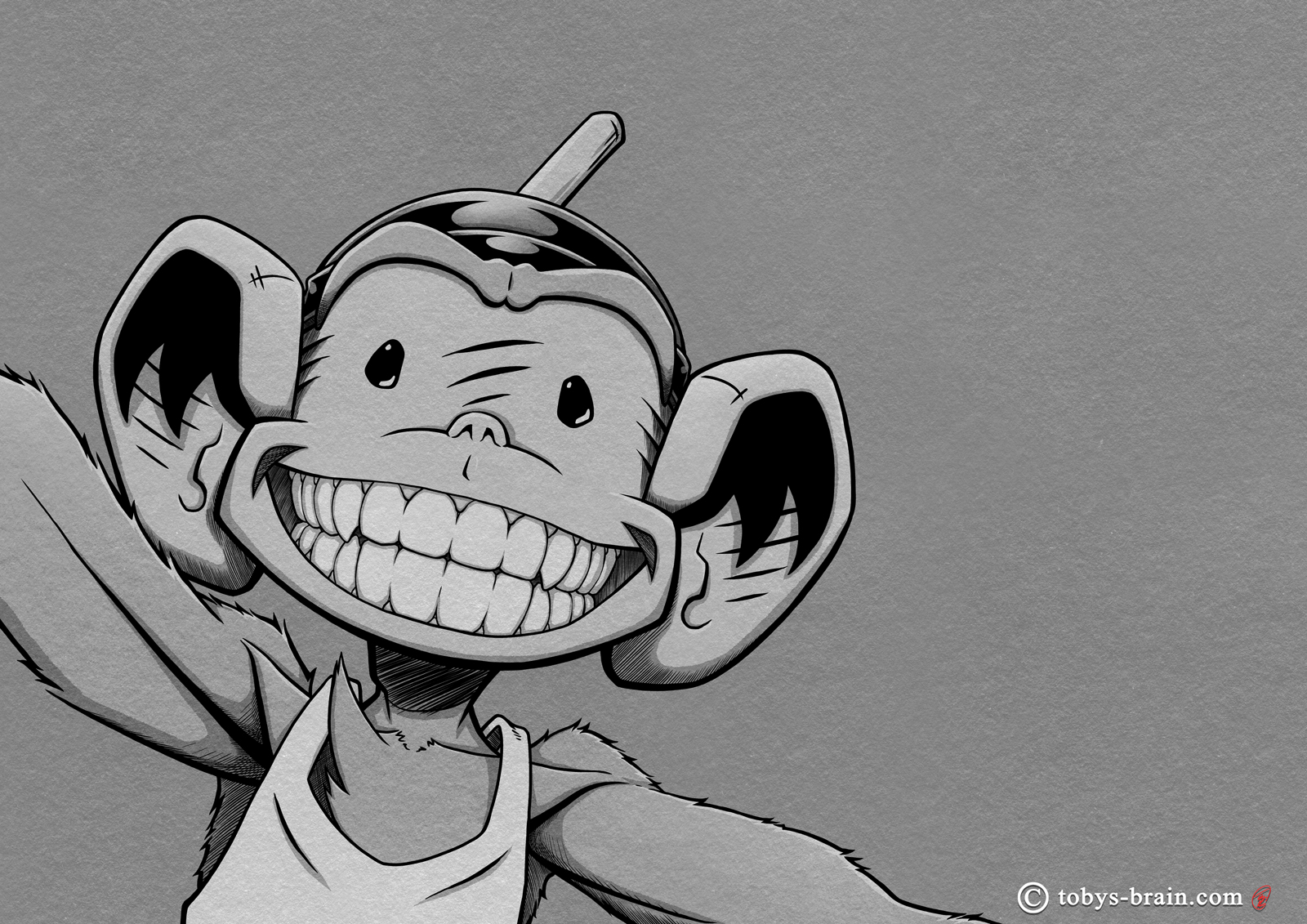
Close up of muh face, cuz everyone needs more of that. In all seriousness, though, you can get a better look at some of the details and the added colors, as well as that nice texture.
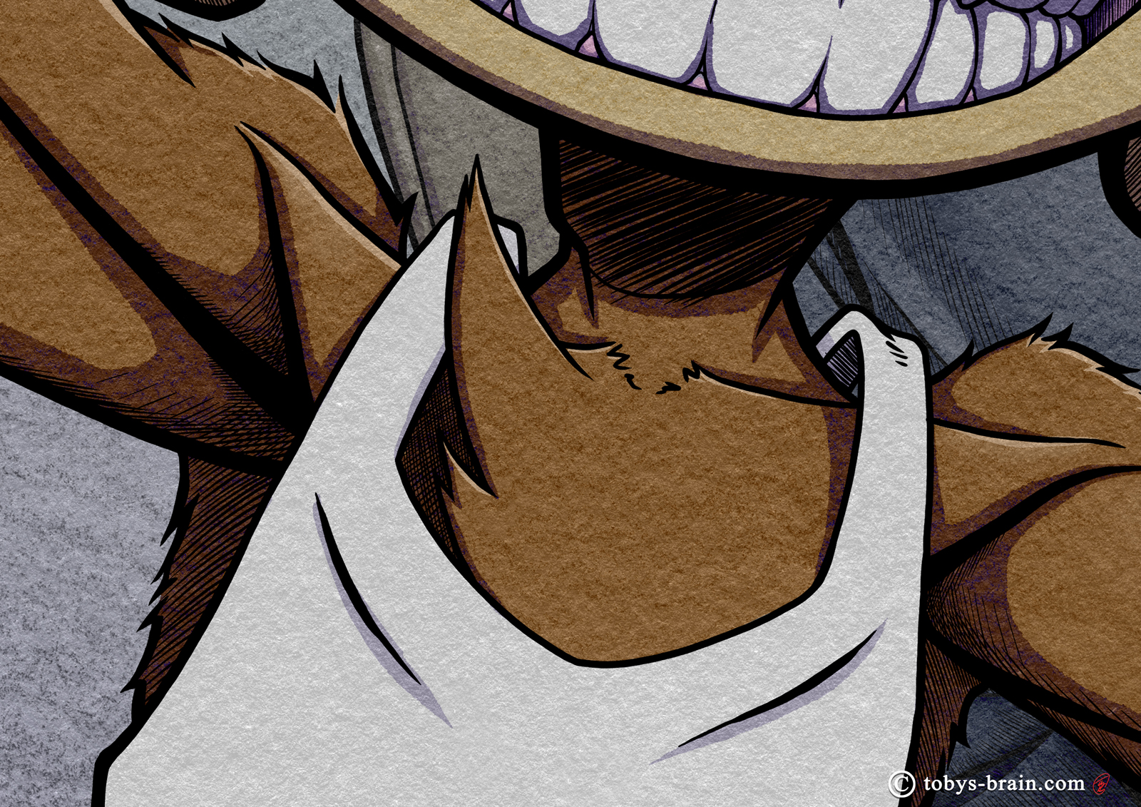
Who doesn’t want more monkey armpit, hmm? That’s what I thought. In all seriousness, I’m trying to highlight the textures as well as some of that finer hatching I was playing around with. You can also distinguish the subtle purplish color to the shadows, thanks to the gradient maps I mentioned.
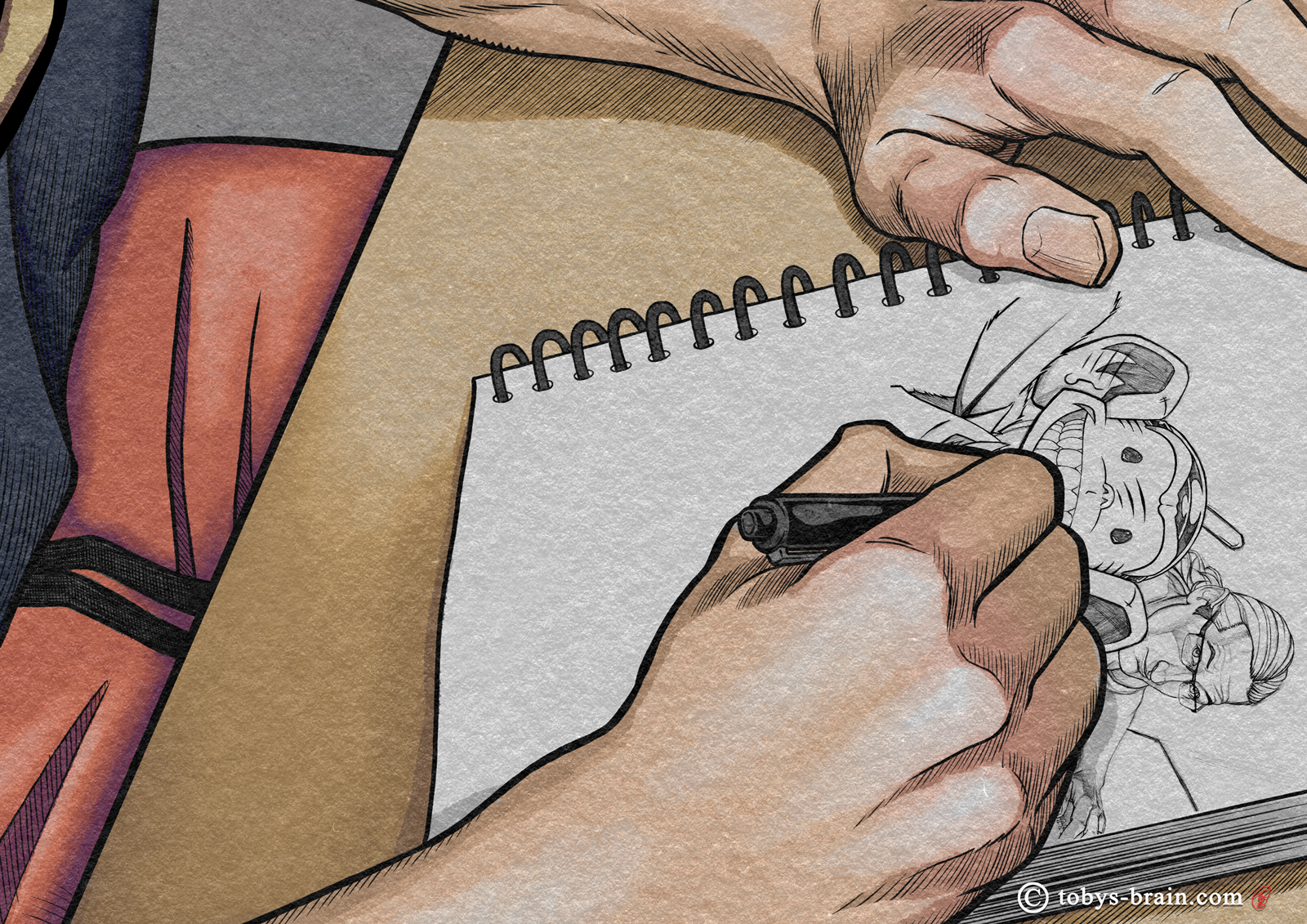
Closeup of my hands and sketchbook to show some of the finer hatching I did. Yes, I “cheated” with the drawing in the sketchbook, I just copied the tight sketch layer and used the transform tools to make it fit the perspective of the paper.
And now, the GIF:
Just a fun little thing: turning the process into a GIF.
Alright, this whole process of getting this post to your eyeballs has taken long enough. I don’t know if I’ll have another blog post idea for next week or not, but rest assured I’ll still be plugging away at projects. You can always keep tabs on my daily artings over at my Face Book page or on Instagram. Next up project-wise is probably finishing “fixing” all the Inside Toby’s Brain pages so I can focus on new ones, at which point I’ll probably turn more attention back to IPMDT as well. I do have some sewing projects I really want to get to, but I really have to finalize some designs and order some bits and bobs. I’m still thinking about that Totally Reasonable Uses for a Plunger book, too. I had a text conversation with my older sister about it all and she helped add several new ideas to the list, which is currently at or around 60. In the meantime, I need to post this and have some dinner, it’s getting late.
Please let me know what you think, it makes my brain happy.