Okay, it’s finally time to reveal the latest series of commissioned work. Back around October-ish 2022, author L.S. Gagnon-The Patron Saint of My Art-reached out to me once again about illustrating some new book covers for her. I’ve done her covers for The Witch Series and The Little Witch Series, as well as four story illustrations from The Witch Series. This time, she has a new series of books in the works (some of which are out already), the first cover of which I had illustrated a few years ago (someone else did a few of the follow ups).
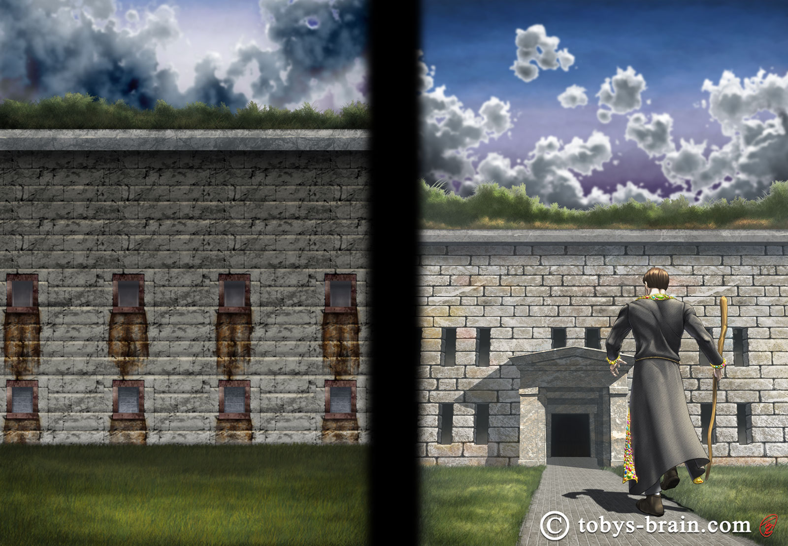
This one…which, after a thorough search of my website, it appears I never actually posted? That seems odd. I guess here it is now…but it’s no longer the cover of the book.
After consulting with a mentor figure, she decided she wanted to have all 5 covers for the series redone to be consistent and to reflect one of the major elements of the series: the setting of Salem. We went back and forth a bit and came up with what I think was a really good plan for the series.
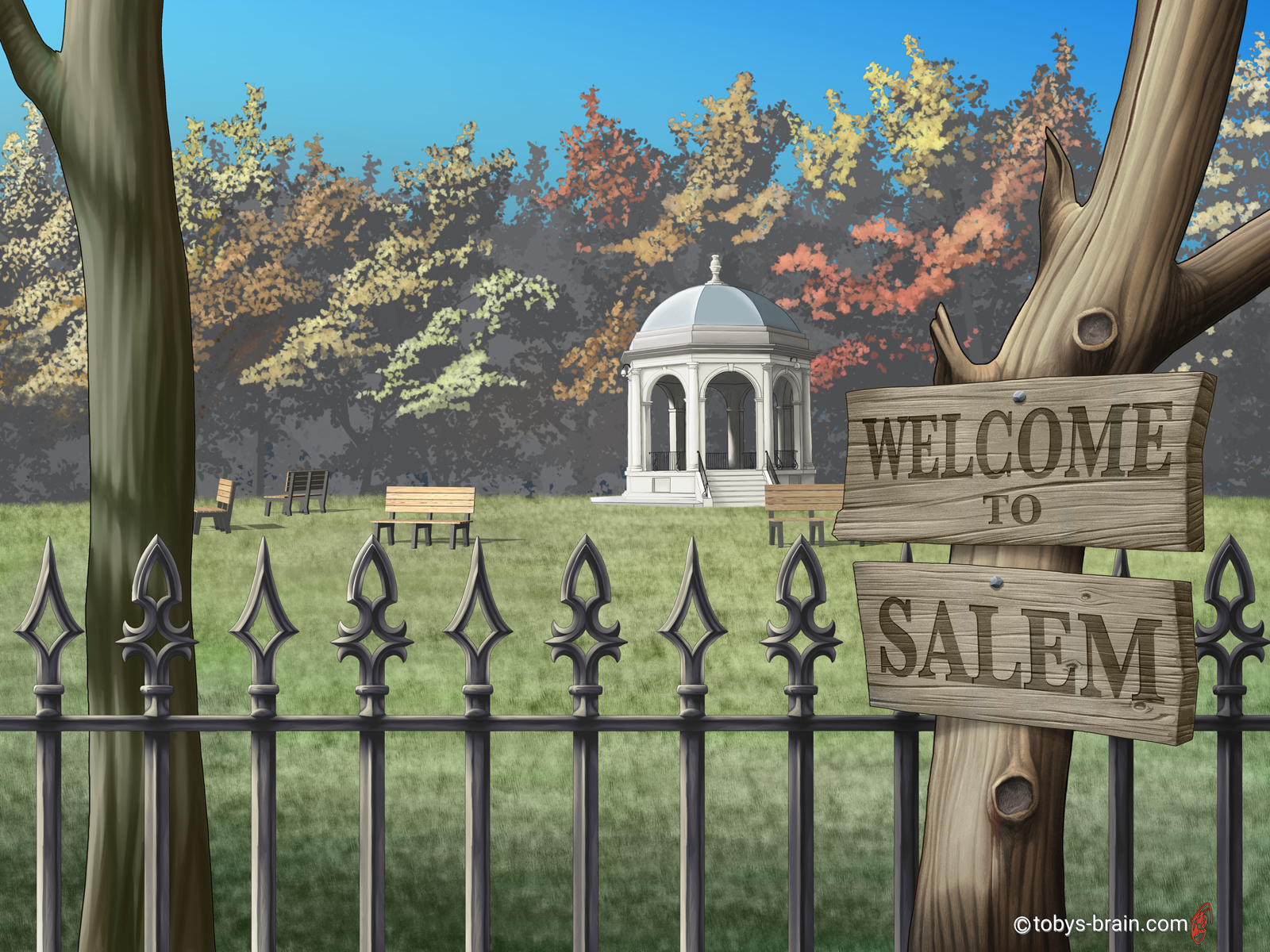
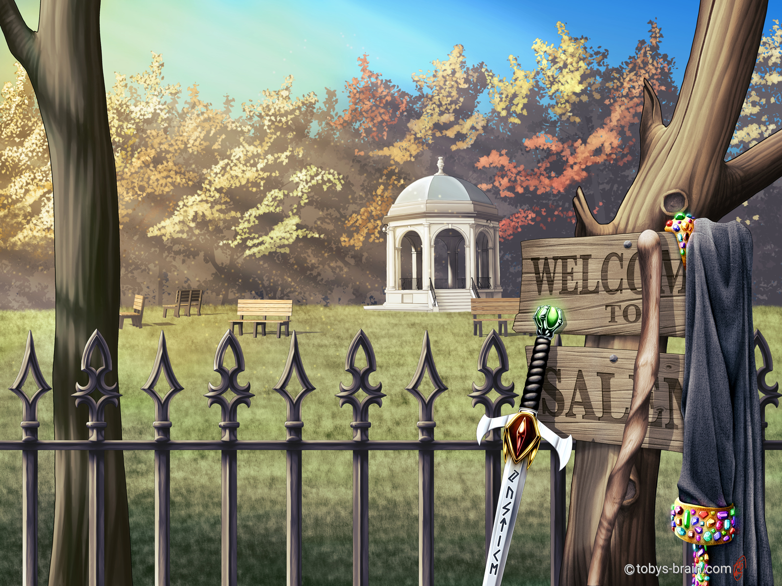
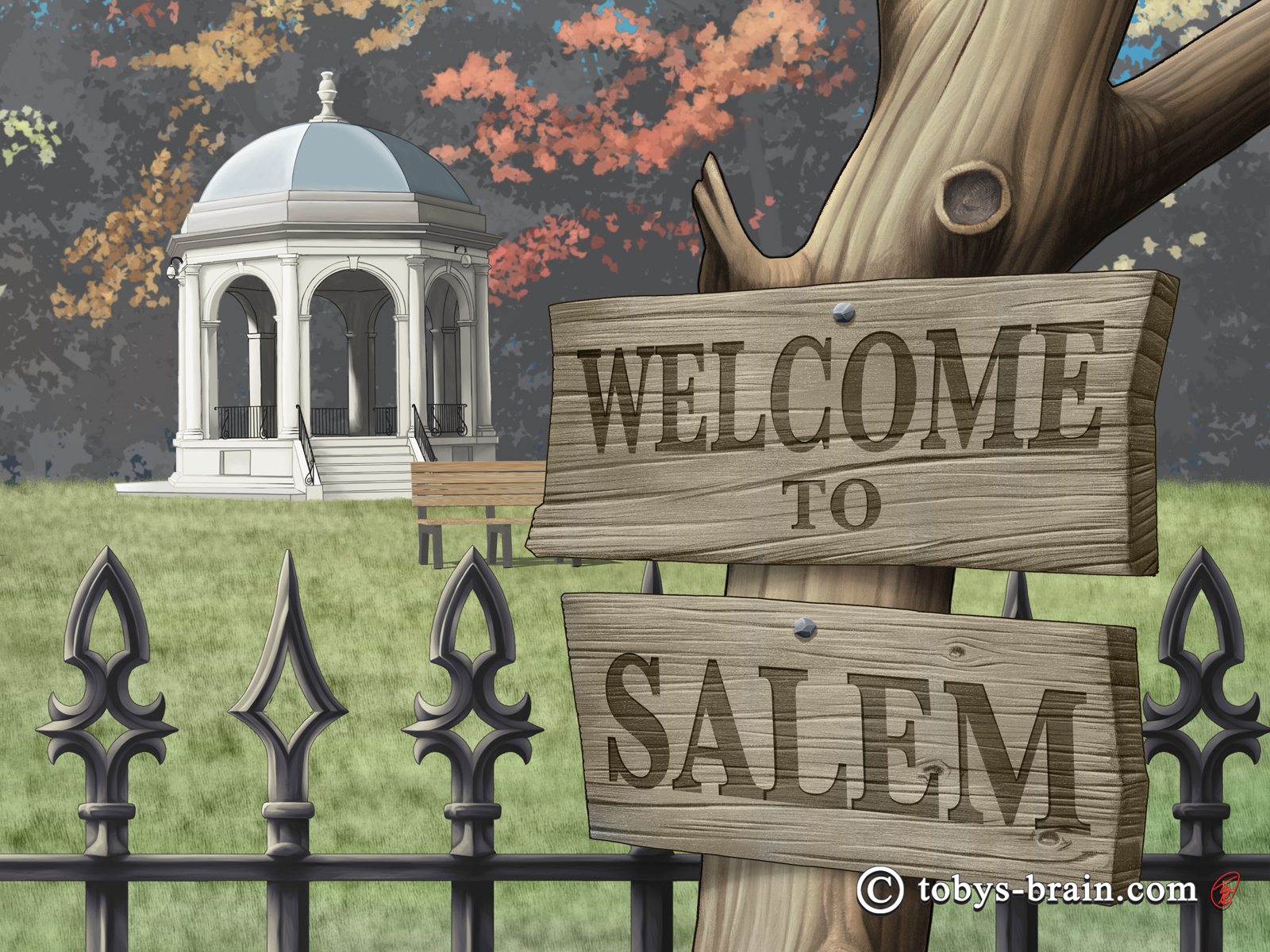
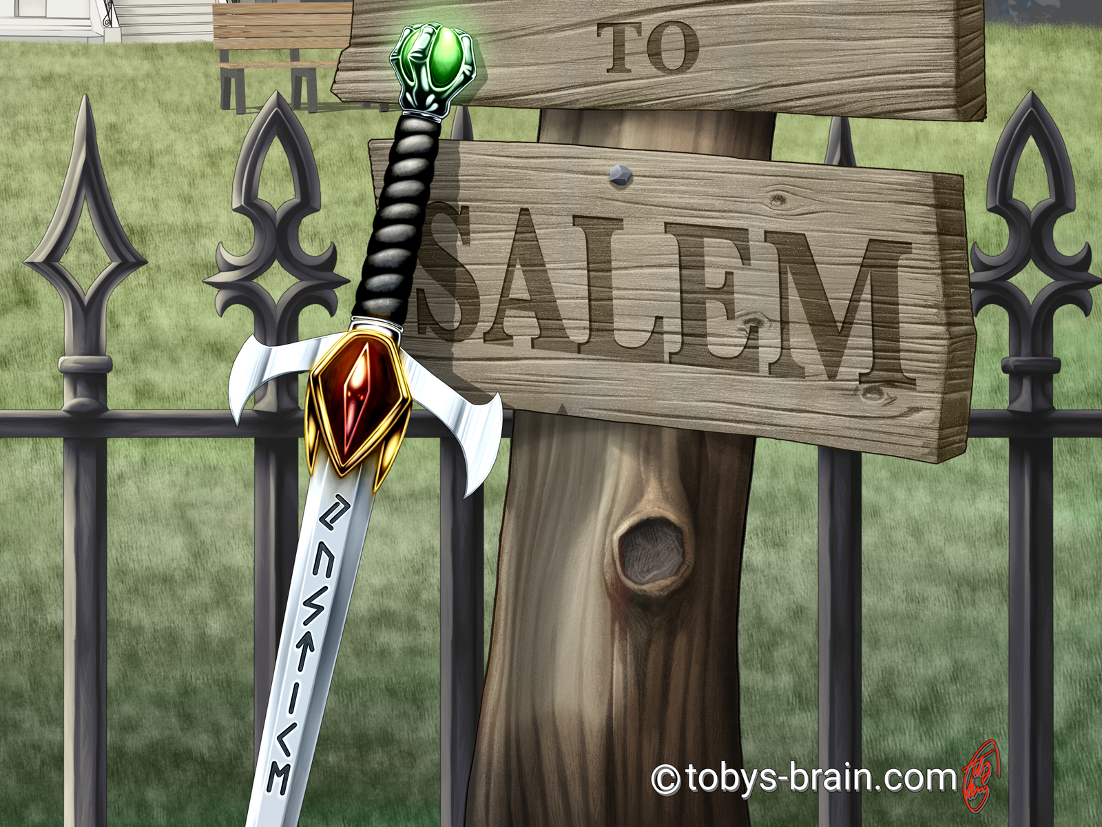
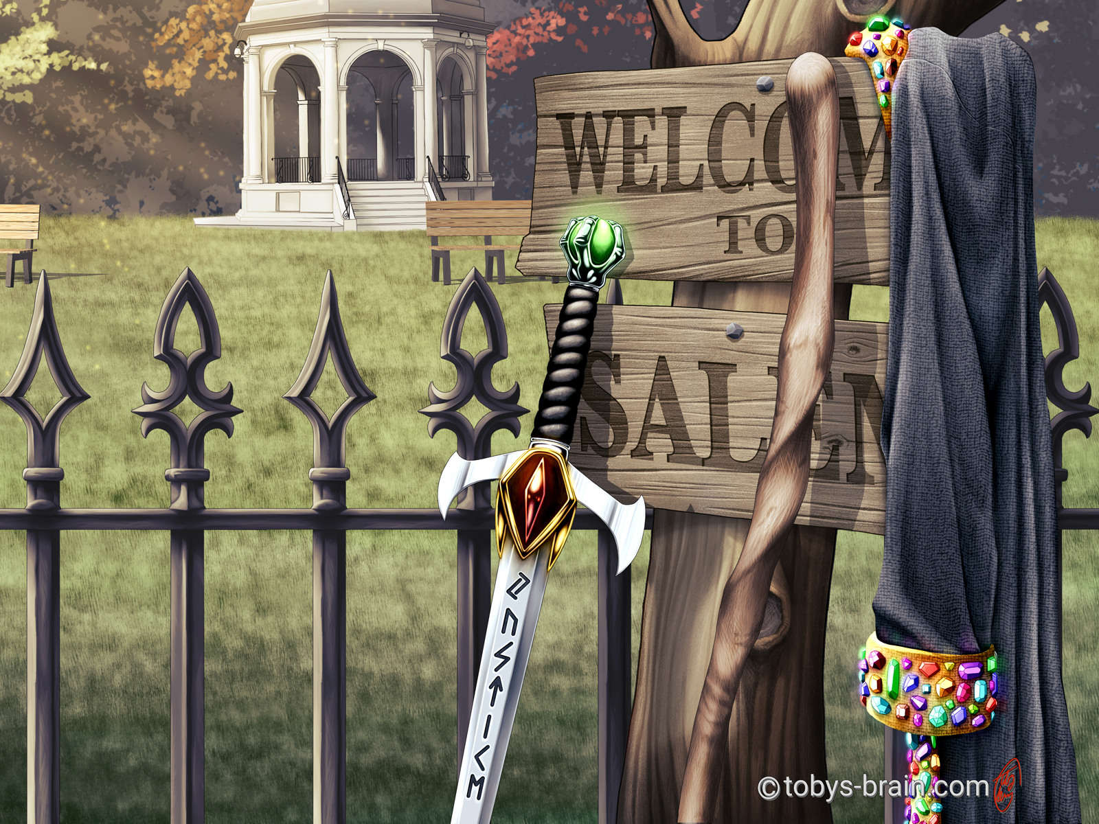
After much brainstorming, we settled on this connected series of covers and I’m really happy with that choice. The park and the gazebo are from a park in Salem where some key aspects of the story take place. I recreated the fence based on the actual fence and turned it into a tiling/repeating texture element in Clip Studio (you know, in case I ever need to use it again). The focus of the front cover for this first book (on the right hand side) is the “Welcome to Salem” sign, which is a revamp of the sign that appears on the final book of the Witch Series that the author really liked (which I also illustrated). I stumbled into a new work flow while working on this cover that I’ve started to adapt to some of my other work, which is always exciting and fun.
Because all 5 covers are the same “shot”, but with subtle changes (such as the time of day) or the addition of specific props that belong to the characters, I started running into issues with having too many layers. It forced me to delve into Clip Studio’s “file objects” feature, which is very similar to Photoshop’s “smart objects”. Basically, it allows you to display an entirely separate file with it’s own layer and folder structure as a single layer, thus cutting down on the number of layers in your working document and averting constant crashes. You double click on the layer to open it on it’s own, make whatever changes you want, save it, close it, and it updates automatically in the working file. This also allowed me to add all the elements easily and move them around without having to do too much repainting.
Yet another feature I got to toy around with was Clip Studio’s 3D objects. I built that park bench in the background using the 3D primatives, then colored and textured them with hand-drawn UV maps. I duplicated them, placed them, and lit them all with that 3D feature. There’s minimal “painting” on top (but there is some).
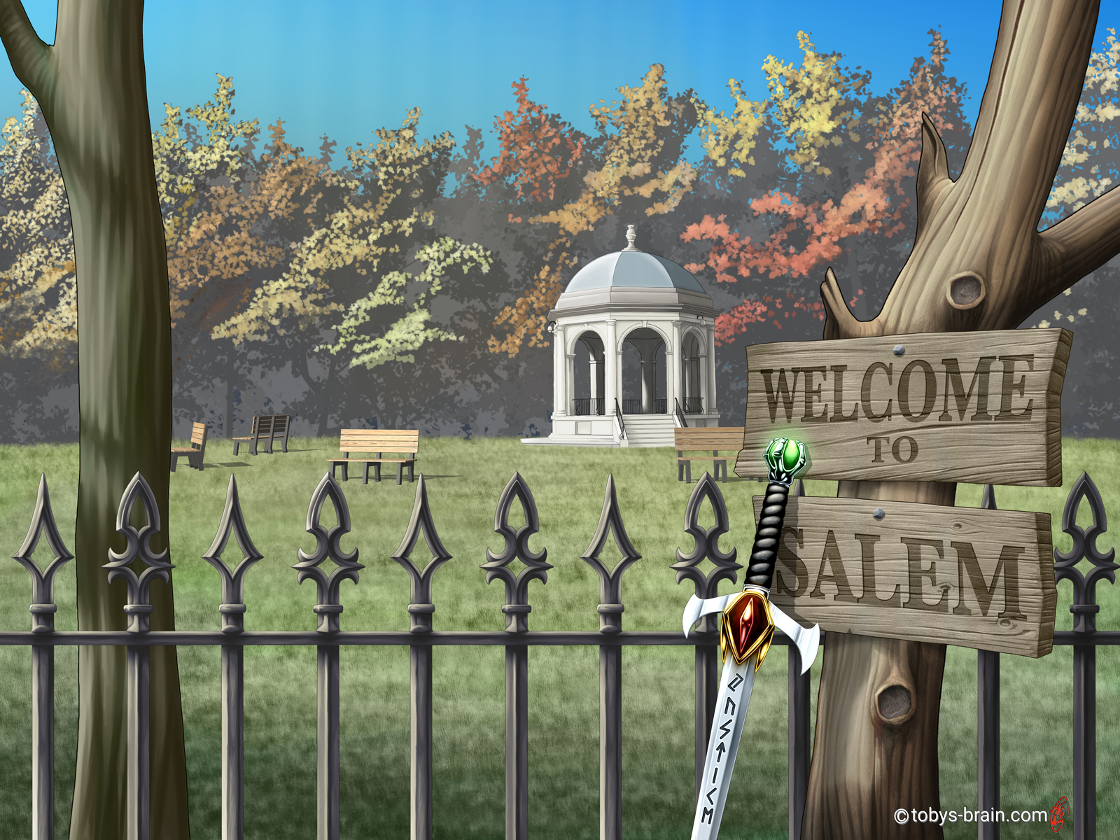
On book 2 I added the main character’s sword. The author sent me an image of what she envisioned it looking like, but I realized it was from an existing fantasy series. I asked her if she wanted me to design her a sword, and she enthusiastically said yes. I enjoy designing fantasy weapons, it’s one of those things I’ve always doodled since I was younger, so this was a fun challenge. She wanted it to have runes of some kind, so I asked her if there was a particular phrase she like or one that was relevant to the story or character. She gave me one, but it was far too long to fit on the blade, but the gist of it was simply “justice”. So that’s what the Nordic runes say.
It’s extremely subtle here, but there’s a slight shift in the daylight starting on this cover, as well. One of the things we discussed in order to create some differentiation between all the covers was having the time of day change. She tends to ask for a lot of night time scenes with the moon, so I thought we could do something cool over the course of the 5 covers.
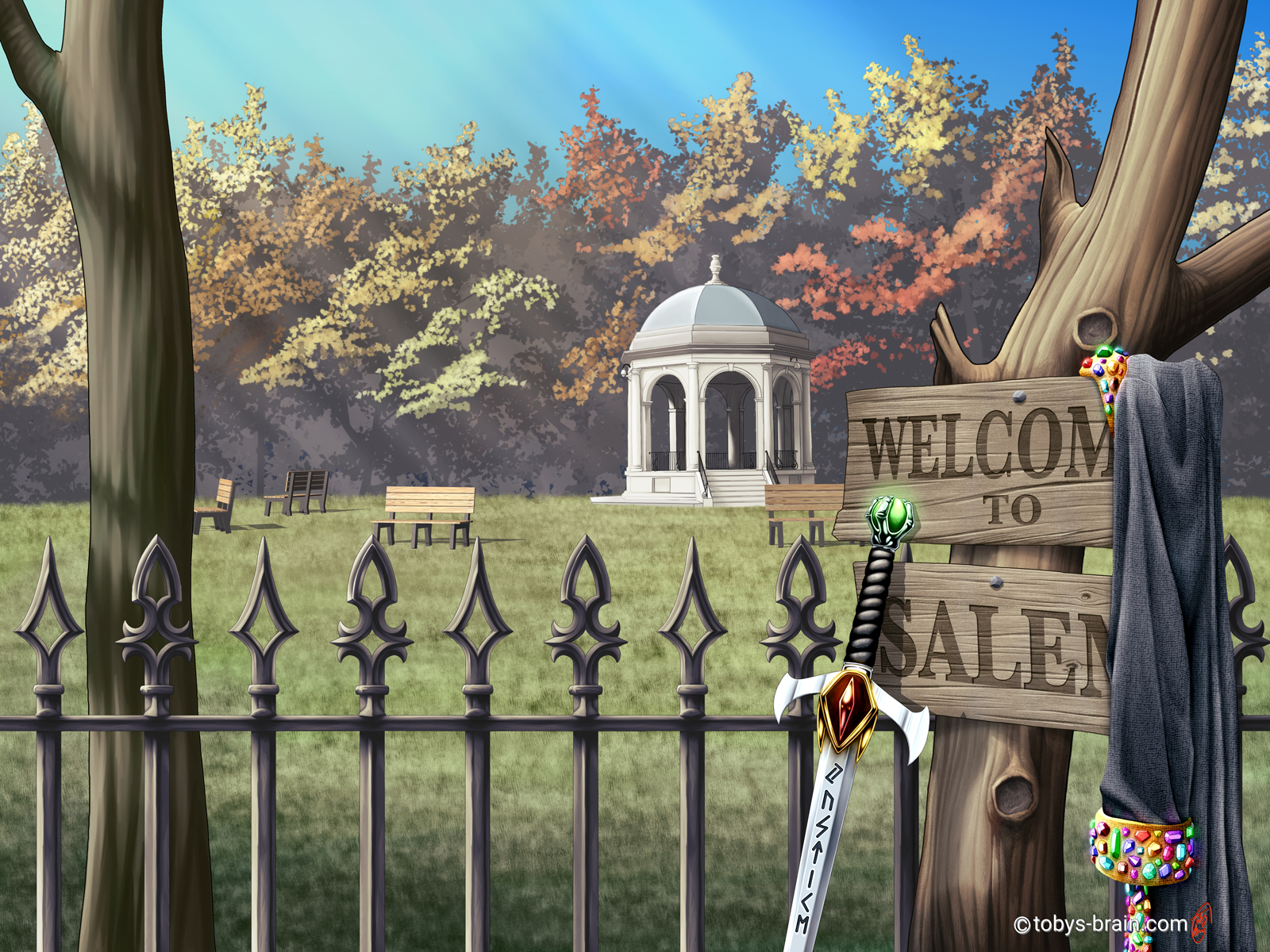
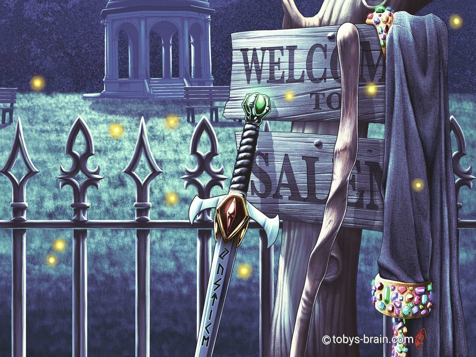
Cover 3 sees the addition of the main character’s robe. It’s the identical design to what I had drawn on him on the original cover for book 1 years ago (she was pretty specific about the way the robe looked). I got to explore some fun things with this one, too. I added a canvas texture that I manipulated and warped using Clip Studio’s new liquify tool, as well as tried out some different painting techniques. It was also a good excuse to play around with making all those gems shine and glow and reflect.
I also shifted the day a tad later, adding some warm sunset colors and lighting effects.
The staff on cover 4 belongs to the original main character from L.S. Gagnon’s first series: Thea from the Witch Series. It was on the very first cover I drew for the author waaaay back in…2013ish? I was fairly new to digital painting at the time, and her hiring me was really my first serious commissioned work (between that and how many times she’s commissioned me since, I refer to her as The Patron Saint of My Art). The staff itself is based off of one the author actually owns.
This cover has the most obvious time of day/lighting shift (other than the last one…which is at night). One of the things I am really drawn to in other’s work is their ability to capture light and make the viewer “feel” something. I try to study it, learn how they do it from their tutorials, but it’s still somewhat elusive to me. That said, I like the way this turned out, but it’s definitely an area I need to work on more. It has the ability to make or break an illustration, to make an image “pop”, and to really draw the viewer’s eye.
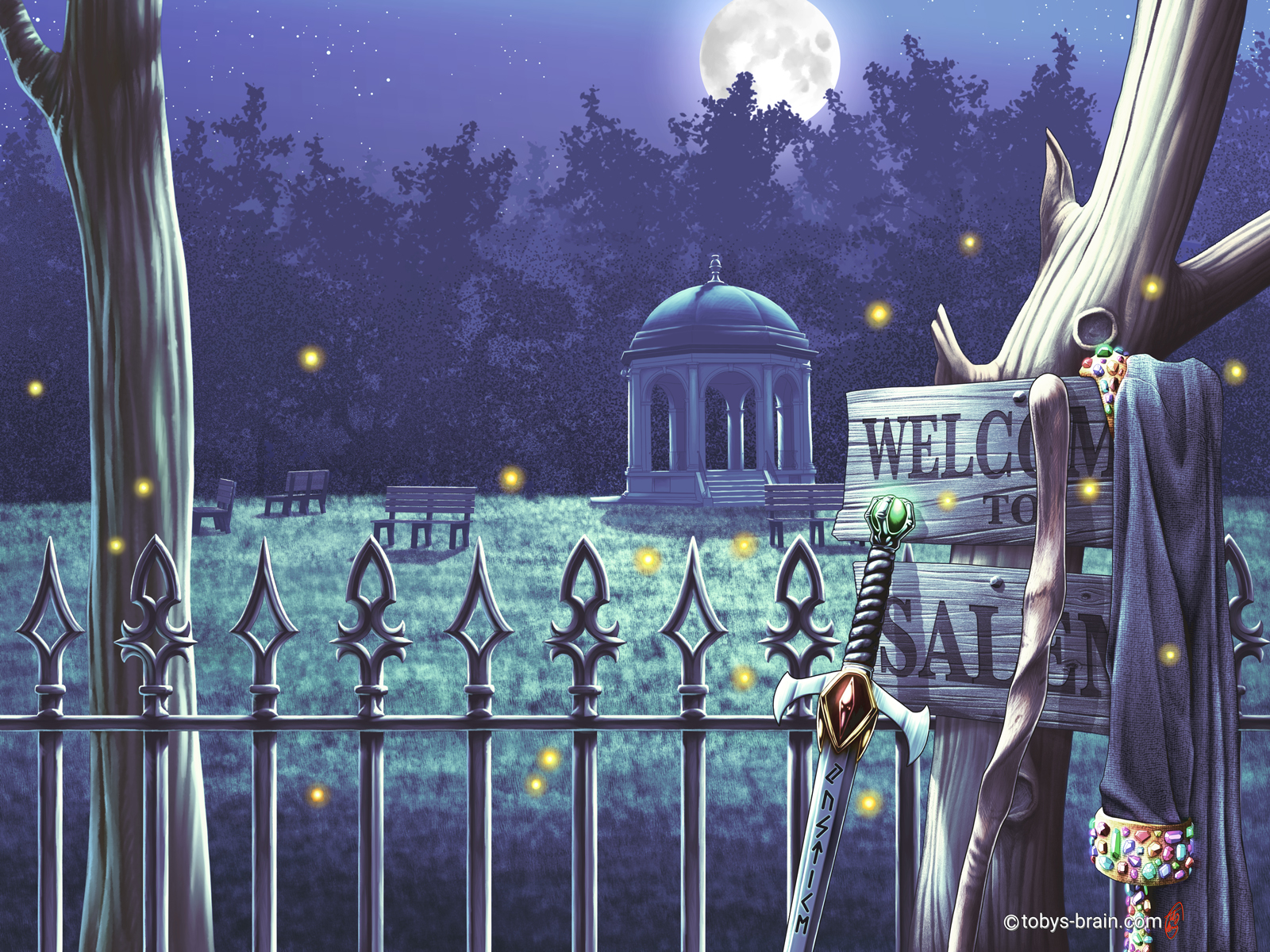
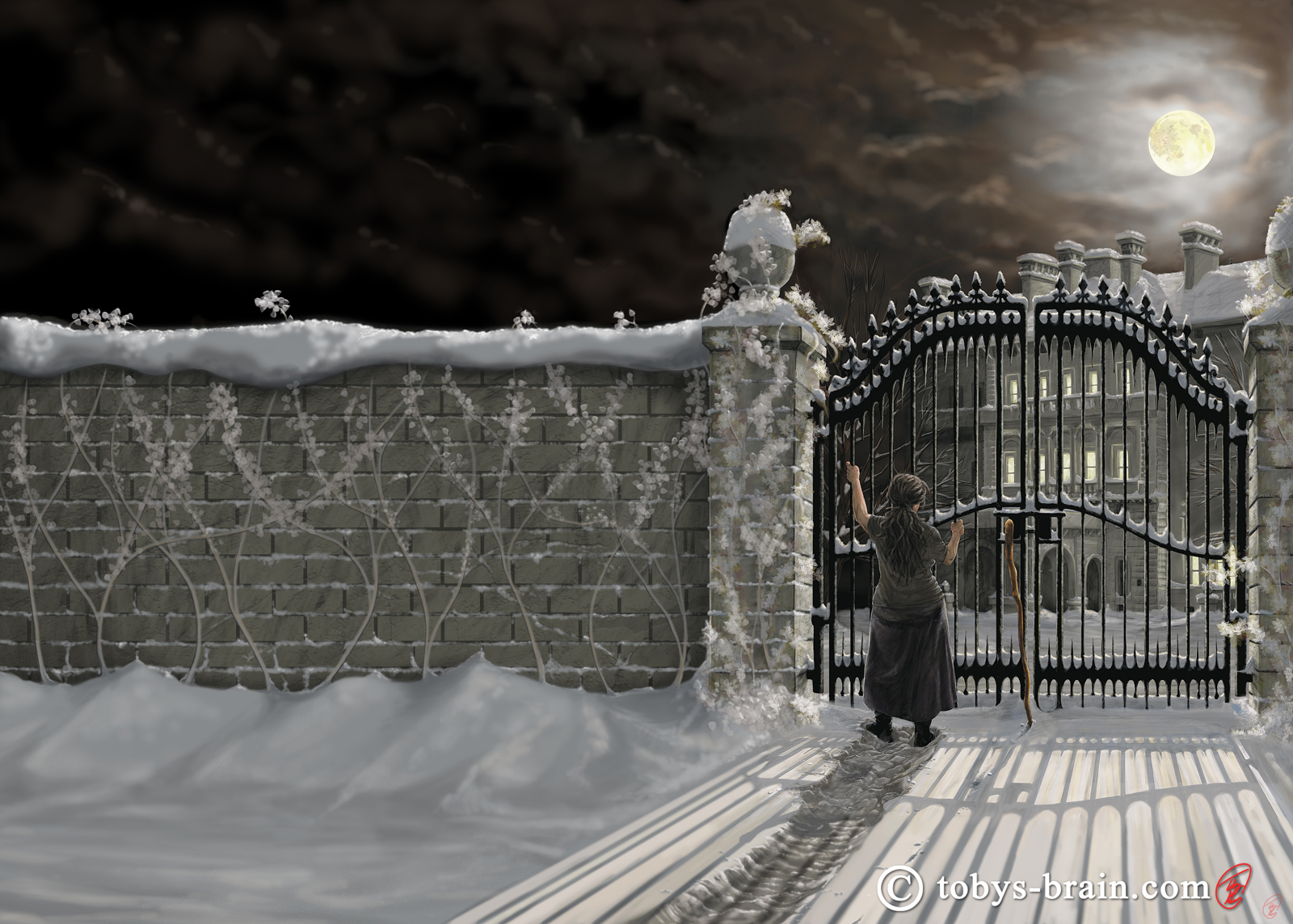
The final cover we decided to have at night. This one required a bunch of repainting, but not nearly as much as it could have, thanks to some of the other strategies I employed from the beginning (like the way I managed the layers and made use of File Objects). One of the challenges with these nighttime covers is that they can print way too dark, and it’s always a struggle to get them to print correctly. I’m still learning how combat that, but one of the strategies I tried here was to maintain some good contrast and to minimize how much actual black there is. Some of the colors and tones look dark because of the colors and tones next to them. The fireflies were an after thought, but the author approved. One of the thoughts I had had early on when we were discussing how to have these 5 unified covers without over cluttering them (the original idea was to have the sword on book 1 and add a new “prop” every cover, totaling 5. Despite my efforts, I couldn’t get 5 items in there without it being too cluttered) was to introduce some “magical” elements, since the books are about witches and warlocks and spell casting. The author didn’t have a strong idea for a particular spell that was visual, but the fireflies kind of fill that purpose for me (I wanted to try painting some glowing magical stuff, haha).
Can’t forget about the close ups:

And, since I referenced it, here’s the very first cover I ever did for L.S. Gagnon, which is actually the third book in that series (well, the “second addition” of it, after expanding it to include the back cover):
The 3rd cover expansion for L.S. Gagnon’s Witch Series books
And while we’re at it, here’s the fifth cover of The Witch Series with the original “Welcome to Salem” sign that the author liked so much and was the jumping off point for the new series of covers:
It’s kind of fun to look back at the earlier covers so many years later. I’m always super critical of my work, but I can appreciate what I was able to accomplish in them, and it’s good to see my skills have progressed. The one metric of that that only I could know is remembering how long each of those earlier covers took compared to the more recent ones. I work much quicker and more competently, which is what one would hope for after working at a craft for so long.
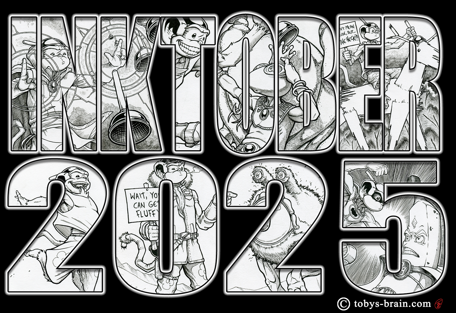
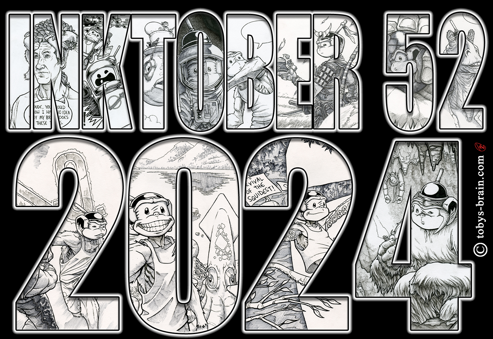
Now that the commissions are done, I’ve been turning my attention to some sewing projects that my Brain won’t shut up about, to developing a rendering style I want to use in some graphic novel work I have planned (you can follow that progress on Face Book, Instagram, or Deviant Art), and trying to get my Brain in order to wrap up Inklings (which I put on hold for the commissions and the end of the year craziness-Inktober, xmas card, envelopes, etc). I still haven’t written down my goals for the year, something I’ve made a habit of recently, but I have plenty. Time to get cracking on some of them.
Please let me know what you think, it makes my brain happy.