Hey look! A new blog post! And a new little logo title thingamabob!
But mostly: NEW REVERY CONCEPT ART! It’s been a minute, but I finally, randomly, decided to produce a piece of concept art for the story that I will eventually get off my butt and tell. There’s a lot of work to be done, more world building, updating and editing the existing story and thumbnails, and then actually drawing the thing, but a step forward is a step closer.
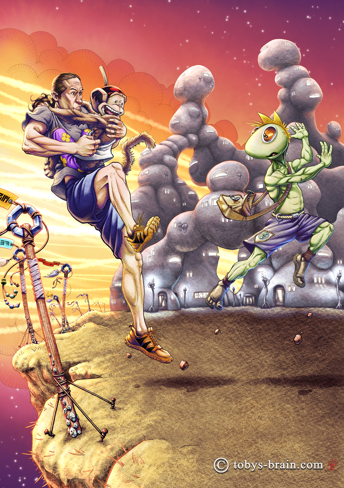
This is the first piece of concept art I have done for Revery in a very long time. About a decade, actually. This story has been in my head for a lot longer than that. The dreams that served as the foundation and opening for the story I had back in high school. I started building the world, drawing the concept art, thumbnailed the whole story, and penciled the first 15 or so pages 10 years ago-right around the time my kids were finally all in school during the day. As I’ve gotten older, theoretically wiser, have experienced more, and read more, there are changes I want to go back and make. When the idea first hit me, I wanted Revery to be a training exercise for a bigger, more epic story I had in mind that, at the time, wasn’t related. It was going to be a way for me to work out storytelling and workflow problems, something I didn’t need to take as seriously. It’s so much not that now. I have loose ideas for further adventures in this world as well as a bigger idea for how it ties all my other ideas together.
As far as the initial goal of this piece-trying to work out the kinks of my new work flow and continue to experiment with rendering/art style-…I don’t know? I like the look and the direction I’m headed. I definitely did a lot of two steps forward, one step back trying to get the hang of this process, which caused this to take WAY too long (89 hours and 13 minutes, to be precise). I think I can make the process significantly faster now that a lot of trial and error is out of the way, and I’ve started setting up shortcuts to the process (like creating and saving the color palette and gradient maps). I’m starting to identify some custom brushes I could make to help things out, as well. There are definitely things I wish I had handled differently, some things I should have worked out earlier in the process (like the lighting…), and overall it just took too long. So, I have mixed feelings about the end result, but I think I’m happy with it. Happy enough to move on to what’s next, at least.
And here’s the inspiration for this piece.
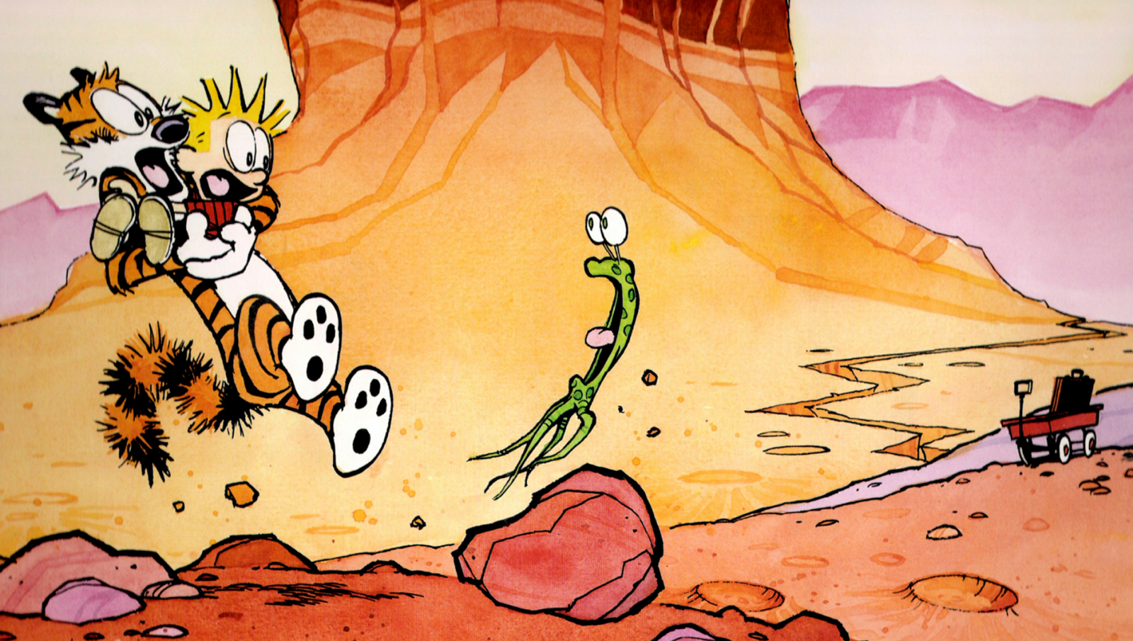
I absolutely love everything about Bill Watterson’s visual style. The energy of the gestures and ink lines, the look of the characters and world, the gorgeous color palette and watercolor textures. I devoured the daily Calvin and Hobbes strips, and particularly looked forward to the full color Sunday editions. I owned (because my parents are awesome) every volume of the collected strips published, including this one: Aliens from Another Planet.
When I decided I wanted to attempt a more finished illustration to work on my new rendering experiments, I thought I would do a full body scene of Plunger Monkey and I. I also started thinking, as I have for a very long time, that I ought to start working on some more concept art for my graphic novel Revery (so that I can actually go back to it, flesh it out, and, you know, actually make the darn thing). Within moments I thought of this cover and decided once again to pay homage to one of my biggest creative influences.
And now for everyone’s favorite part: the close ups! Plus, some insight into the world and story of Revery.
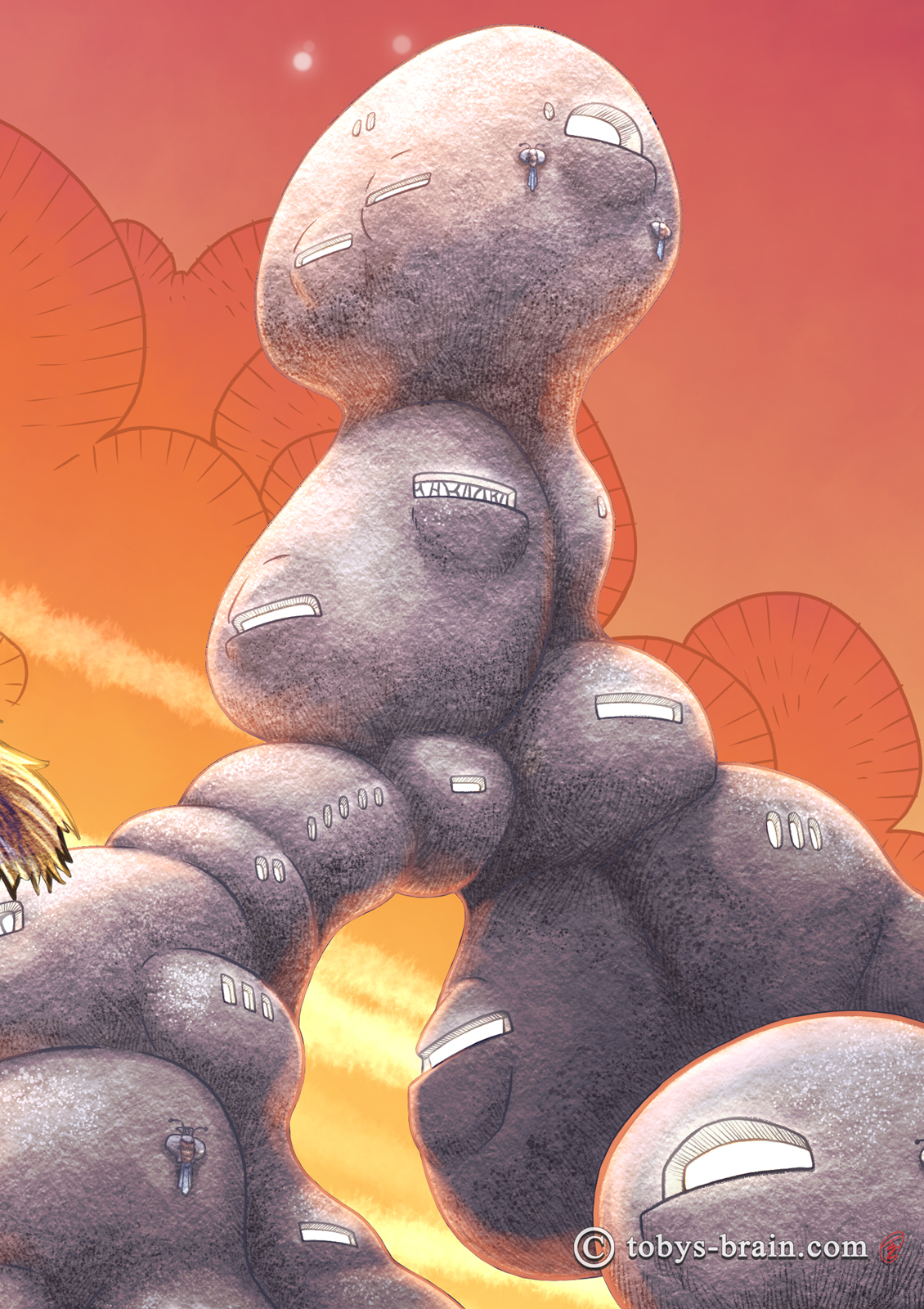
It’s been so long that I don’t entirely remember the genesis of some of the ideas I have had for Revery. I wanted the Cobblies, who live symbiotically in the realm where dreams exist, to be very in tune with their world. Nothing goes to waste, everything has an organic feel. I think at the time I was first developing the story and the visual look, I was really into an alternative, green building material called cob. It’s a lot like adobe-comprised of mud, sand, clay, and straw-but instead of being formed into bricks, its sculpted. There are some really beautiful structures made out of cob, and it has a lot of really cool properties. Somehow I connected that to my youth spent making “drizzle castles” out of mud at the beach I grew up on. I used to love getting my face up close and watching how the slurry of salt water and sand would drip from my clenched fist as a liquid and land in little, random, organic clumps that would pile higher and higher. I would experiment with making towers, see how high I could build them, and see if I could connect them with little drizzle bridges. I loved the texture of all those grains of sand held together.
So that’s the inspiration for the Cobbly structures. Over my adult years, since I had this idea, I periodically build drizzle castles (less now that my kids are older) and take reference pictures of them.
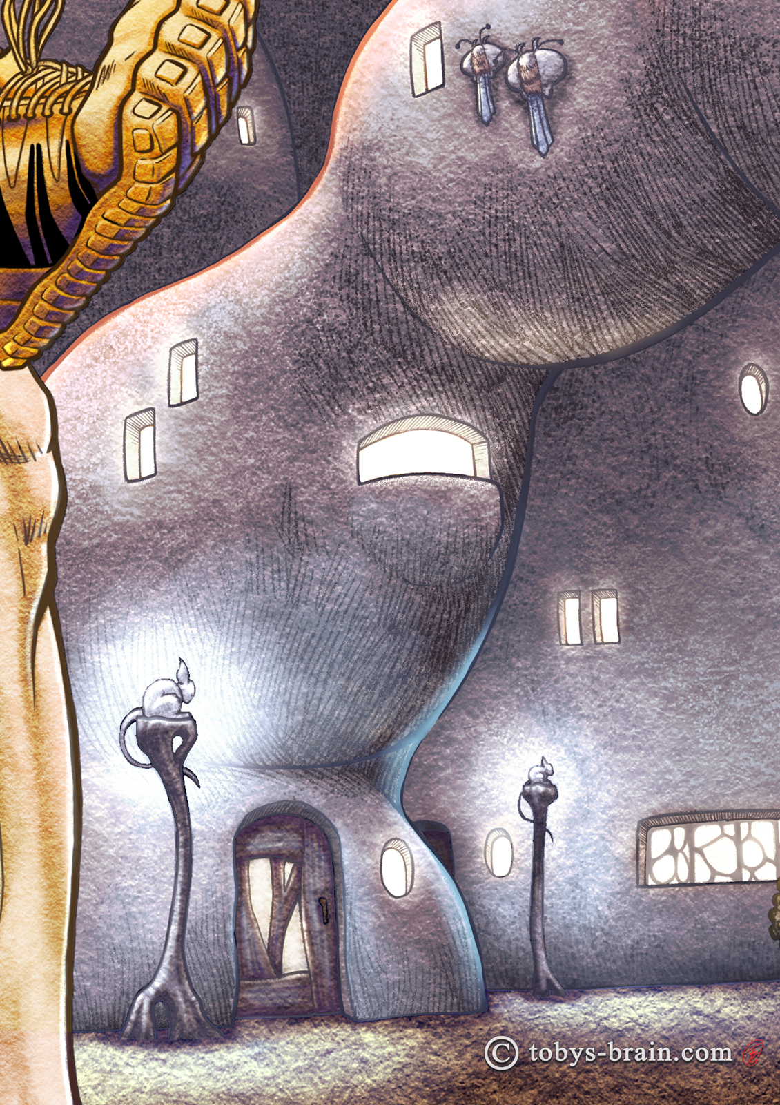
There are two types of critters in this closeup to mention. Up top, clinging to the side of the building are a pair of gull-rays. They are kind of like a mash up of stingrays, birds, bats…and bugs or something. They hang out near the “coast” (where the land drops off and the Dream Wave flows), gliding around on the energy radiating from the wave. They anchor themselves to the sides of the buildings for the night with claws and a little bit of suction. Younger, more adventurous (or mischievous) Cobblies sometimes climb out their windows and grab a hold of them for a little night time joy ride.
The other critters are the lamp-rats. They are bioluminescent cat/rat/rabbit things that turn their glow on when they roost for the night. The Cobblies erect posts around town to encourage them to light up the neighborhood while they sleep.
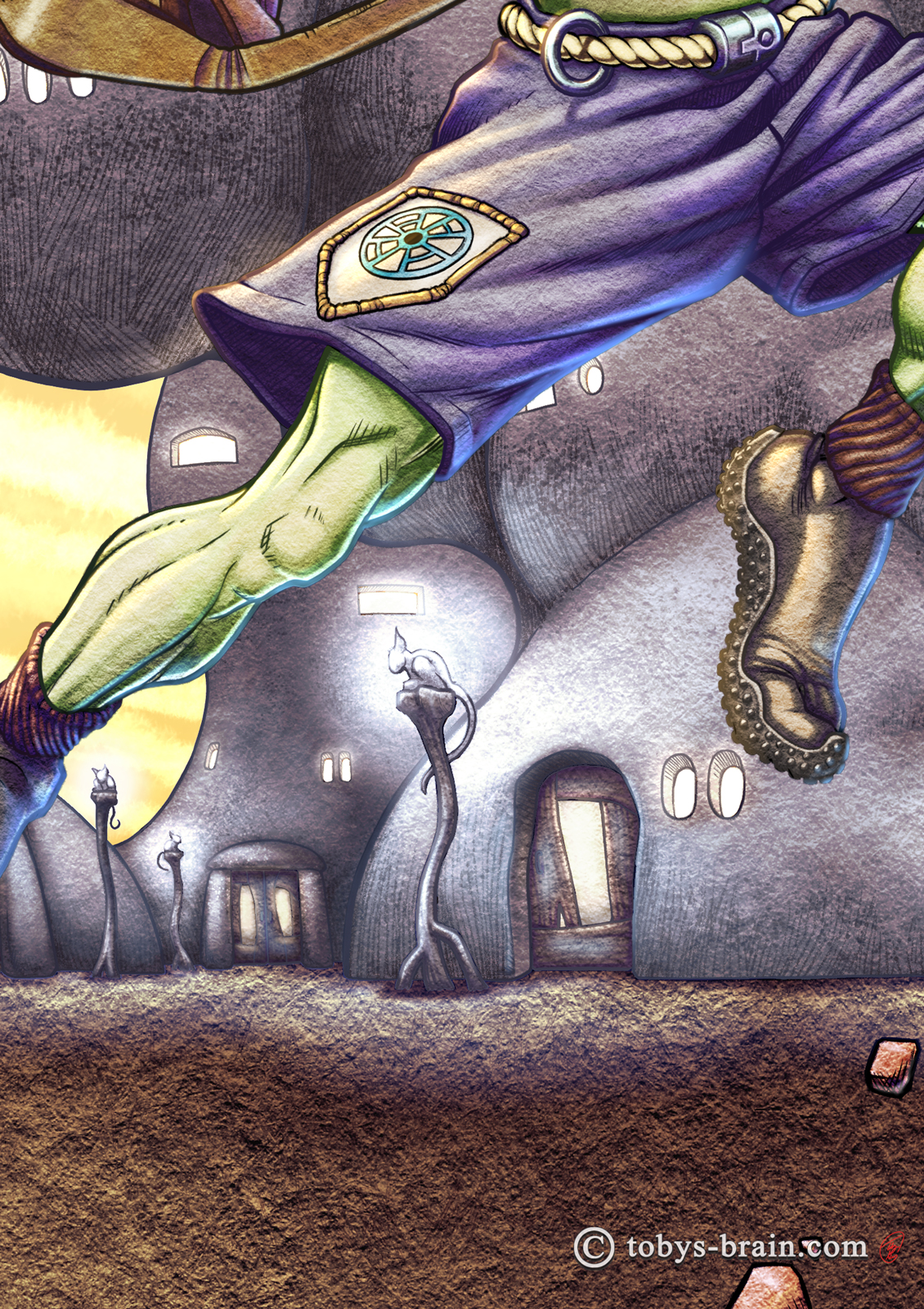
My original designs for Adarax were much simpler: just a pair of shorts and his bag. Almost two decades later, as I’m rethinking the world and deciding to do some more serious world building for future stories, I’m thinking more and more about the utility of clothes as well as fashion. All the Cobblies have some role to play. Adarax happens to be a “harvester”. He uses something like a surfboard to ride inside the Dream Wave, catching the concentrated orbs of dream energy that form with a dream catcher-like net. He then directs them away from the Cobbly side of the wave and plants them, where they slowly release their energy, which interacts with the consciousnesses of life from our world and causes dreams. I’m starting to think more about what equipment and clothes he would need to perform that task. The different dream-related roles all have badges to signify their job. This particular patch is a representation of a dream catcher, but I might change that in the future. He used to be barefoot, but now he has grippy shoes so he can stay on his board while wrestling with a captured dream orb. He has a rope belt with a ring so he can tether himself to his board and free both arms to use the dream catcher. While I like the look of the funky metal belt buckle, it doesn’t really fit with the organic vibe I want, so that will change. His footwear might, too.
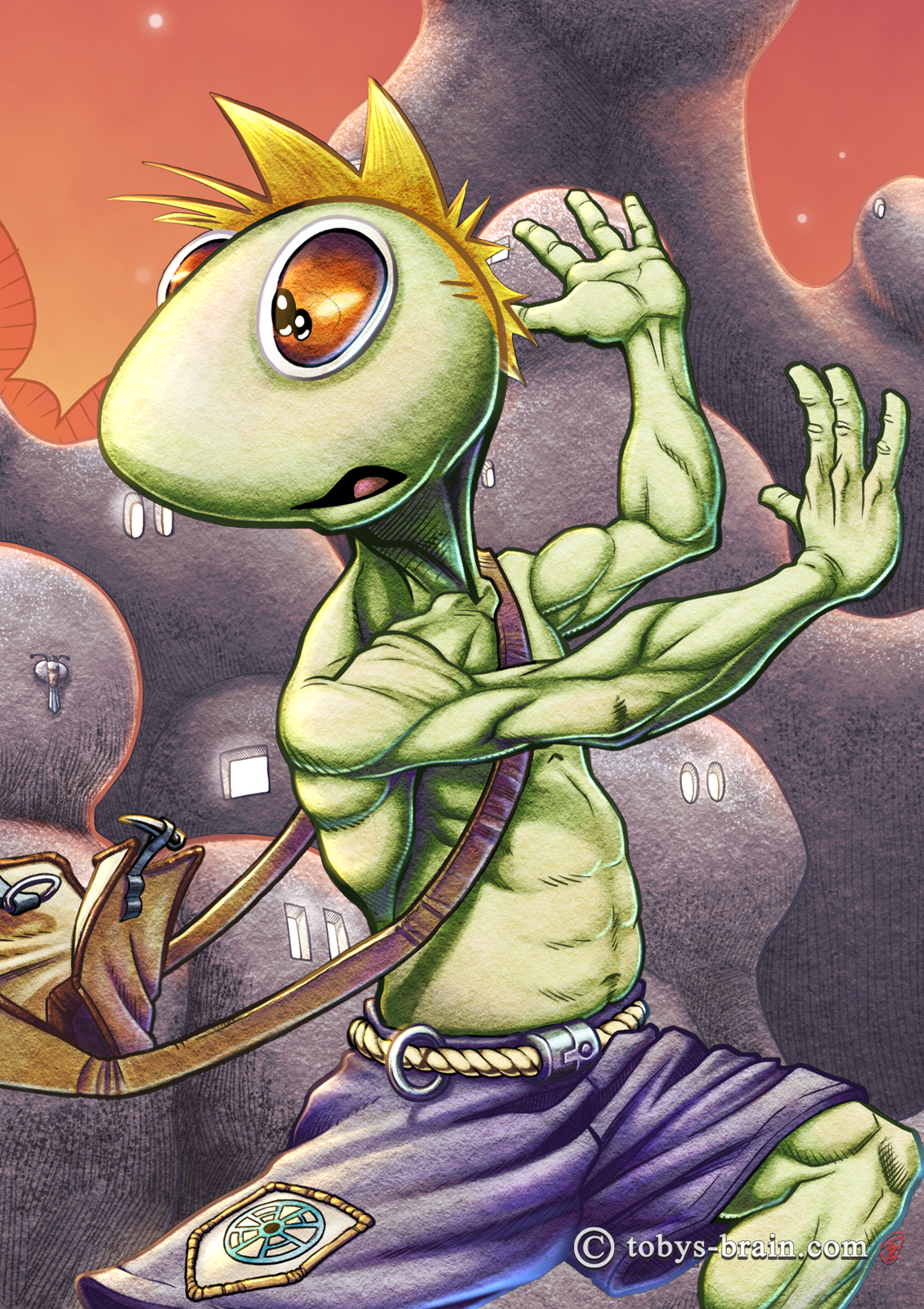
Good ol’ Adarax. I don’t remember how I came up with the name, or even the overall look, but the word “Cobbly” comes from a Clifford Simak book called City. It was an amazing sci-fi story I read back in the early 2000s, published in the 1950s. It contains 8 or so linked short stories that span a great deal of time and show the evolution of the world going on. At some point, there is talk of another dimension, and the beings there being Cobblies. There wasn’t a lot of detail about that that I remember, I think it was almost an off-hand reference. Either way, the story really struck me, and probably planted some seeds in my subconscious that mixed with everything else in my Brain to come up with Revery. I decided to call the beings Cobblies as a nod to that story.
I’ve always liked drawing anatomy, particularly defined muscles. I grew up reading superhero comics, and developed a passion for working out, what can I say? I think I got a little carried away with Adarax’s physique here, though. He’s a little too defined, I think.
As another nod to someone/something incredibly influential to me as a creator, I gave Adarax Calvin’s hair style. I’ve gone on at length many times about the influence of Bill Watterson’s art as well as the imaginative world he crafted for Calvin and Hobbes. I always related to Calvin because he was such a day dreamer (I wasn’t nearly as mischievous as him, though).
Adarax and the other harvesters carry around simple satchels to collect the spent dream orbs once the connected dreams end. Now, I have a side hobby of sewing my own bags and coats and things, and I have a particular geeky love for bags (and pockets…I love pockets…). I can guarantee I will be revisiting this design. It’s not bad, but it isn’t quite right yet.
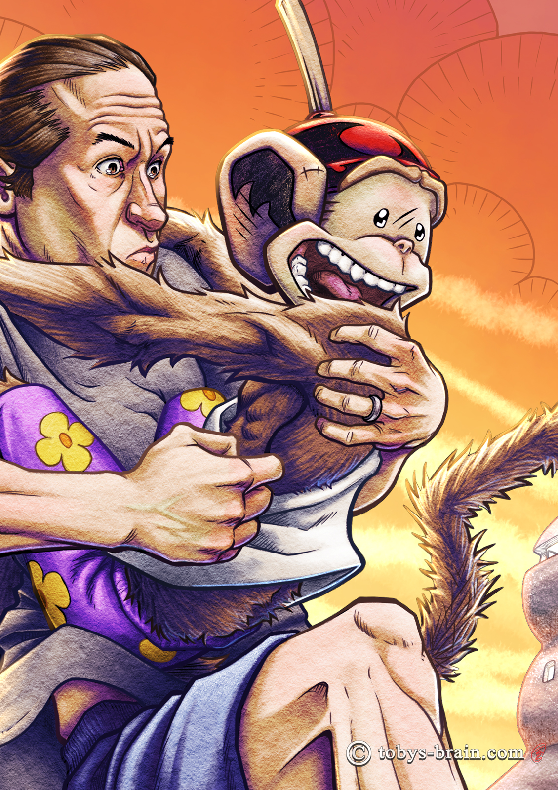
I’m always my worst critic, but there’s some stuff going on in this close up that I’m pretty happy with. First, I like the overall gesture of both PMD and I. I’m reasonably happy with my likeness. I did take some photo reference, but I honestly didn’t rely on it for drawing my face. I find when I use photo references, I skew too hard towards realism and I often lose some of the energy and gestural stuff I want to have.
I’m also pretty happy with PMD’s gesture and expression. He’s supposed to be more expressive and animated than me, but I don’t always push that enough.
I’m really happy with the textures going on here, and the colors (I like the subtle green vein on my hand, that was a happy accident). While it looks like I did a lot of pencil rendering, I didn’t have to. The paper texture I created, combined with the tonal painting and gradient maps produced this effect. PMD’s fur was a bit more tedious to paint, but I’m really liking the way it looks. I think this is the first time I’ve tried to render his fur, rather than just leaving it as a flat, almost cell shaded cartoony look.
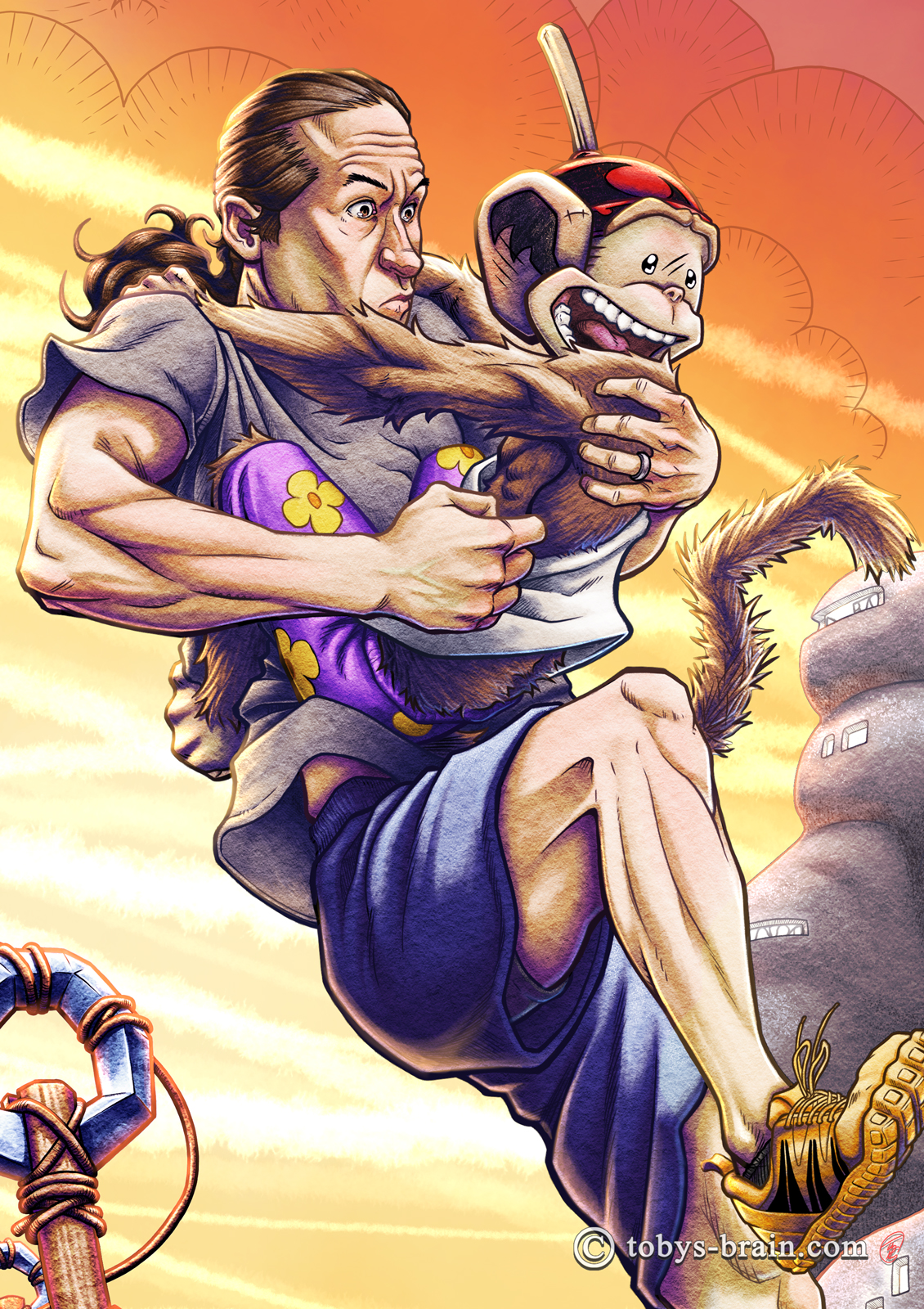
I made myself a bit more defined than I actually am, but otherwise, I’m pretty happy with the overall rendering I accomplished here. I need to learn more about lighting so it doesn’t break my Brain so much, but I’m content with the way it looks here (especially the bounced/strong light from the Dream Wave).
There’s not a really good, clear shot of the Dream Wave in this piece, but I spent a lot of time trying to figure out how to render it. It’s a very nebulous thing in my Brain. I kind of see it, but I kind of can’t. It’s energy, and it flows and emits light. There are things that live in and around it. It’s kind of fuzzy around the edges, but also distinct from what’s around it. A cloud, but not really. A liquid cloud? The bright streaks are kind of like comet tails, the energy flowing in the wave eventually “clumps” and coalesces into comet-like orbs that the Cobblies need to direct to the far banks and plant. If they land on the Cobbly side, the leaking energy causes chaos.
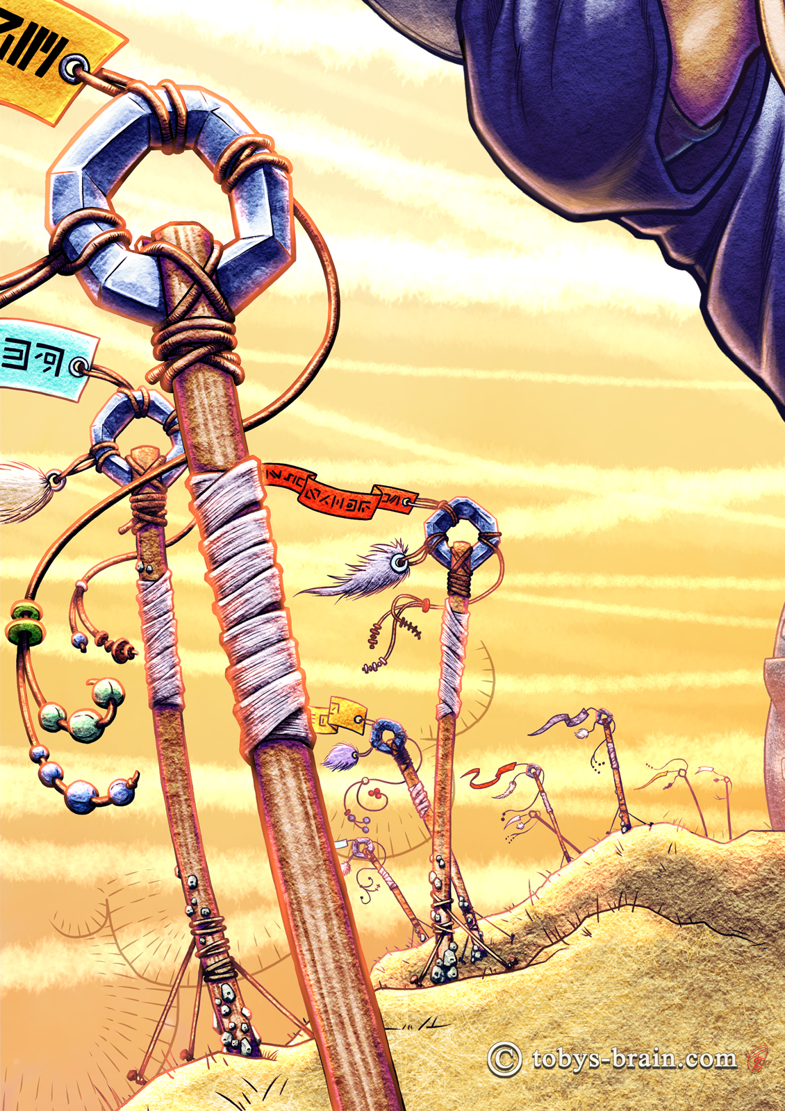
I don’t know what I’m calling these “sticks” yet, nor do I know their purpose. They were at least partially inspired by those Tibetan flags. They may represent Cobblies who have entered the wave and not returned. They may be good luck charms. They may be hold overs from ancient superstitions. They may make noise and be a visual deterrent to some of the nastier critters that swim in the wave. I don’t know yet.
I will likely translate that language on the flags at some point…because that’s how I am. There are some details I may change down the road, too.
While I like the look of these…things, and I’m generally happy with the underlying rendering, I’m not thrilled with the lighting. I was really struggling with how the Dream Wave throws light and how that would look here. It’s trending in the right direction, maybe, but it’s not quite what I see in my head, and I’m just not sure how to get it there yet.
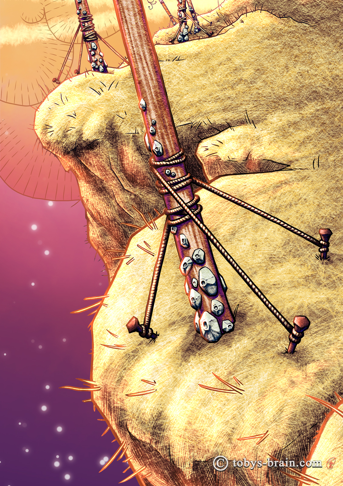
I had never thought about these sticks before this illustration, but I felt like there needed to be something here. I also never thought about the little barnacle things until there were sticks for them to cling to. Again, though, having grown up at a beach during the summers, I have some fond memories of barnacle encrusted rocks. Yeah, I know that’s weird, but I’ve never claimed to be anything else. I still need to figure out more about them here, what do they do, what’s their life cycle, etc.
The actual “earth” in the Cobbliverse is a growing straw-mud. It grows faster on the banks, nourished by the energies of the Dream Wave. It’s also softer there, so there are teams of Cobblies that continuously gather the overgrowth and use it as a building material. When it cures, it’s stronger than steel but also somewhat flexible.
There you have it, folks. One of my (many) goals for this year (and I did finally write them down) is to produce some more concept art for Revery. I have a few bits in mind already. But first, I need to return to Inklings (remember that project? That thing that consumed pretty much all of my 2022 studio time?). It’s fairly close to done. I have one more hand inked drawing to do, and then some little embellishments here and there. Then I need to do the unpleasant business of figuring out how I’m going to publish it…not looking forward to that part. Full color, high resolution art books apparently aren’t super convenient to self-publish. Who knew? I’m also planning to try my hand at Inktober 52 this year. It’s just like Inktober, except it’s one illustration a week for the whole year…and I’m already 10 weeks behind. Oops. Time to get to work…
Please let me know what you think, it makes my brain happy.