Happy Mother’s Day 2022 to all the moms out there, but especially my wife and my own mother. It’s been a little while since I’ve updated my website or posted a blog, but fear not, I have been busy in the studio. You can get near daily updates on what I’m working on by following me on Facebook or Instagram, but to sum things up, I’ve been working on a book project…but before I get into that, it’s time to debut this year’s Mother’s Day card for my wonderful, talented, hard-working, patient, understanding wife! I rely on her for so much, from being my IT department, to managing our family finances, to being a big source of my emotional and mental stability, to being a champion and supporter of this crazy dream I have, and to being my best friend.
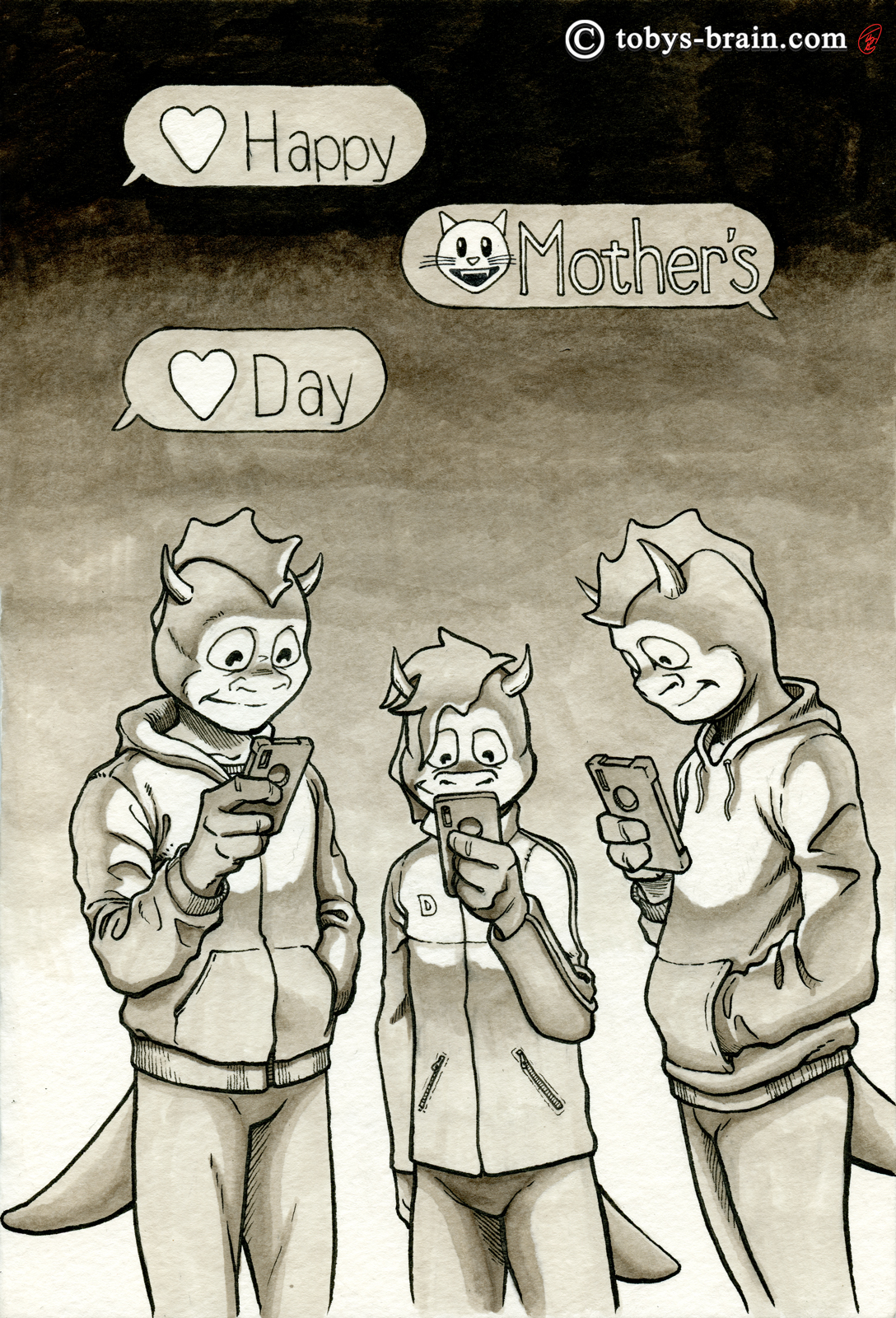
Normally, my theme each year is based off of something we have done together as a family, some notable occasion, some adventure we went on. Thinking back over the last year, though, nothing really stood out. At least, nothing that I could turn into a card (some graduations, an Eagle project, that sort of thing). We didn’t get out on any big hikes, didn’t camp as a family, didn’t kayak, didn’t ski together as a family. I took the boys to The Happy Place (the beach our family has gone to since my dad was born), but my wife was always stuck at home for those trips.
One thing that has been overly prevalent, however, is just how much everyone stares at screens, and I know it’s not just my household. Living kind of remotely the way we do, and coming out of 2 years of lockdown due to the pandemic, and just in general the shift towards texting and social media apps for social activity, I try to have a reasonable perspective on the issue. However, it would still be nice to see more physical activity, more analogue book reading (I need to make time to do that myself), more time spent outdoors, more time engaging with the actual world around oneself.
Originally, the image didn’t include the text balloons, but I thought that may have read as too harsh a criticism of our kids. Adding them gives the impression that they are at least thinking about their mother, rather than being completely absorbed into their phones. I debated whether or not to have the balloon tails pointing to them, but went with the standard look of a text screen instead. Our youngest child (dragon in the middle) loves cats, hence the cat emoji. I thought about giving each of them a somewhat identifying emoji based on their personalities and what they tend to text us, but all I could come up with was poop emojis and the word “bruh”.
I’m pretty happy with the way this one turned out. I like the way their likenesses look, and they’re all wearing things they actually wear for the most part. I debated how strong to go with the light emanating from the phones and how to tone the background to make it pop, I’m pretty happy with the artistic choices I made.
I enjoy making these cards, though I do get a little stressed each year about what my theme is going to be, and there’s always a little anxiety at each step (pencils to inks, then adding tones) because I’m so used to working digitally now and relying on being able to undo things or make non-destructive changes. It’s also pretty cool to be able to look back at all the previous cards and remember the event or activity that inspired them, and to see how I changed their appearances based on how they were aging. It’s also neat to have the timeline of my skills improving, which can be pretty obvious with a whole year of “training” in between each one.
So, there it is. Another year, another card, and closer and closer to my having to figure out how to handle the inevitable big life changes on the future cards (like kids moving out, maybe starting their own families…). My small way of showing appreciation. Every year, as my skills improve, I think I might get a little faster at these cards, but the amount of myself I pour into them stays the same. That’s kind of how art works.
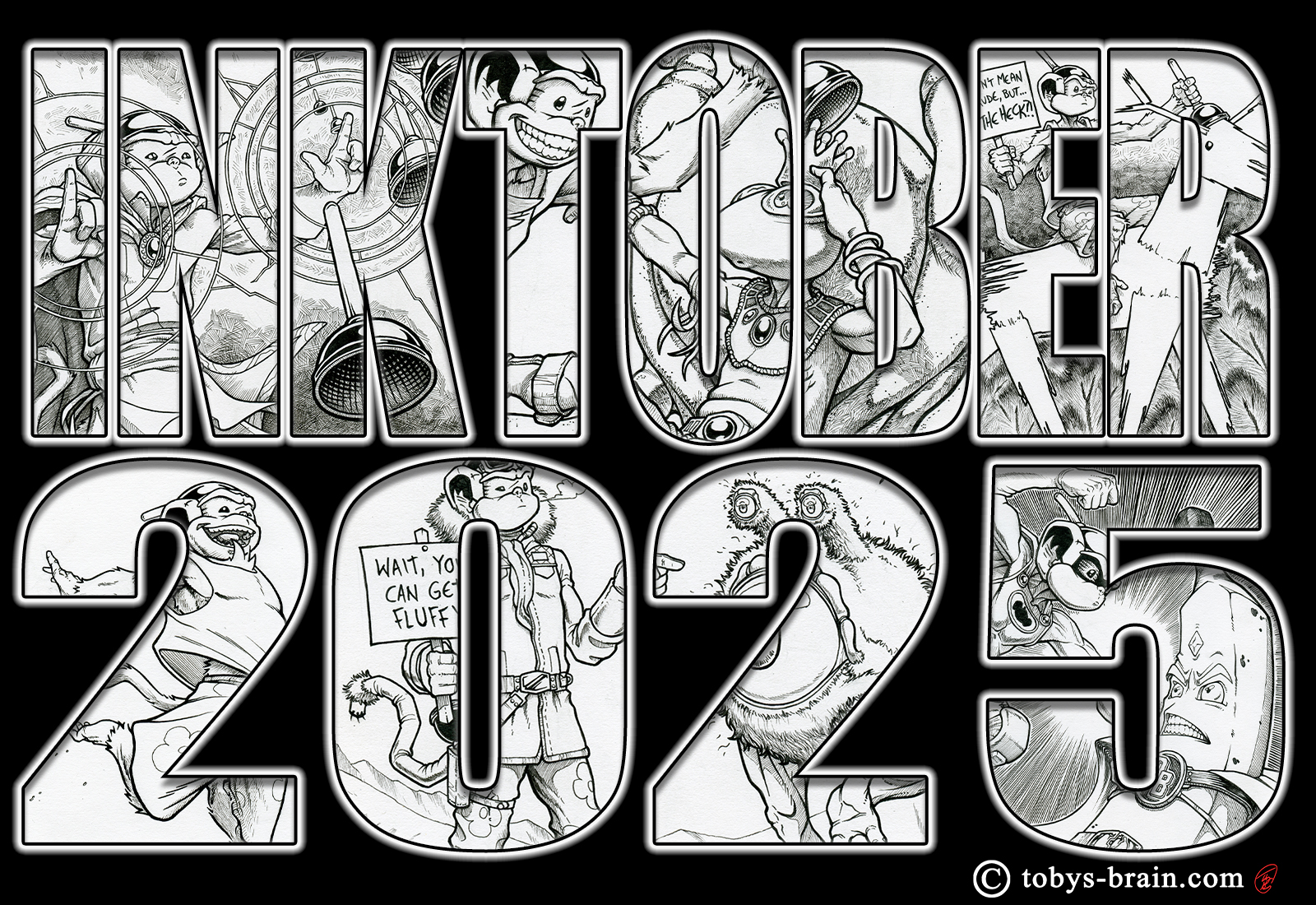
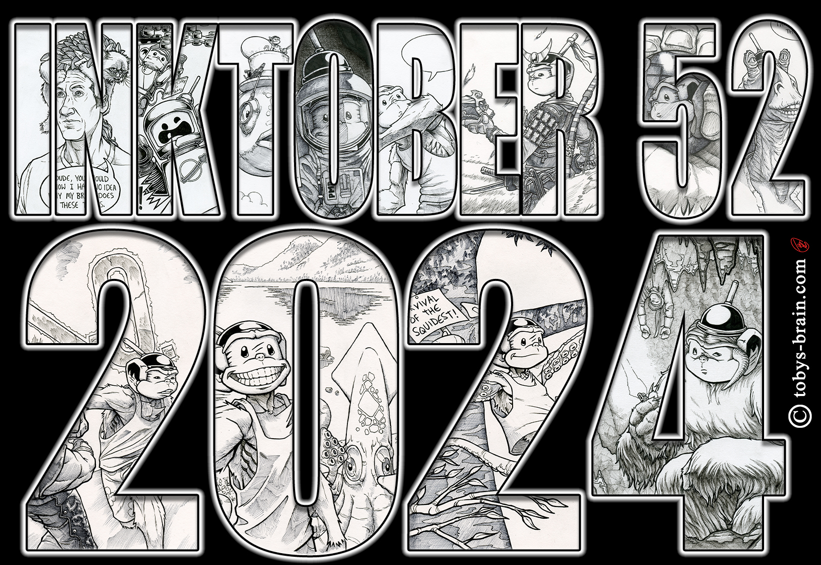
In other news, as I mentioned, I’ve been working diligently on a book project titled Inklings. During last year’s Inktober, I was struck with the idea of collecting all my PMD related Inktoberings into an art book with an illuminated manuscript style feel to it. It required learning how to use a new piece of software first, Affinity Publisher, as well as studying just what the heck makes an illuminated letter an illuminated letter (at least, what I think of one as stylistically, not so much the gold leaf stuff), and then designing at least three whole fonts of my own. It’s been a lot of work already with much more ahead, but I’m pretty happy with what I’ve accomplished so far. As an example of just how bad my ability to judge time is, I thought for sure I’d be wrapping things up by now and starting the more tedious process of dealing with ISBNs and printers and deciding how to actually publish the finished product (right now it’s between self-publishing/print-on-demand via Amazon through my PMD Press imprint, or maybe trying a Kickstarter, also through PMD Press). At the rate I’m going, I’m not sure if it will be before the end of the year.
As always, I have a lot of other project ideas kicking around the ol’ squishy thing, but I really want to start picking projects and focusing on them from start to finish. I still will dabble with the other ideas as a release from the main project, but I need to get some of them off the “to do” list before I croak. Right now, I’m spending my evenings sketching, trying to understand anatomy better, trying to get better at cartoonifying myself and drawing myself with minimal or no reference. At some point I might move on to other subjects, maybe landscapes or things with different textures, and eventually I’ll start picking away at some concept art for some of those other projects. Maybe I’ll even tackle a few shirt designs on the ever-growing list of ideas.
Speaking of other projects, I really need to get back to work on Inklings…
Please let me know what you think, it makes my brain happy.