Well, today is the kids’ first official day of summer vacation, and I’m managing to update the site. Hopefully that bodes well for the summer. Before I get to the actual post, I’d like to wish all my fellow dad’s out there a Happy Belated Father’s Day. Were it not for my own dad, I probably wouldn’t be pursuing my crazy art dreams. When he was younger, he dreamed of being a cartoonist or animator, likely working for Disney (to this day he’s a huge Disney fan, you should see my parents’ house. There’s your standard figurines and art, but there’s also a giant Mickey statue (that my youngest broke the nose off of…), cups, plates, even silverware, blankets…). Being logical and practical and thinking about job security, he decided to study architecture and went on to become a talented and successful architect and businessman. Both my parents have always supported my dreams, they never tried to dissuade me. I’ve always wondered how life would have been different for my dad had he been able to pursue a career as a cartoonist. I’m passionate about my art on my own, but I’ve always felt a little extra motivated so that my dad could experience it vicariously through me. So thanks for everything dad (and mom)!
Alright, for today’s post I thought I’d give a glimpse at my current digital art process, which is massively influence by former Disney animator and all around amazing artist Aaron Blaise. If you don’t know who he is, you’ve probably (like me) at least seen his work in Beauty and the Beast, Mulan, Brother Bear and countless other movies from his 20+ years at Disney. Do yourself a favor and check out his art and videos at his website: creatureartteacher.com. He’s truly amazing and a phenomenal teacher. He sells animation courses, but he has plenty of free tutorials on his site and his YouTube channel.
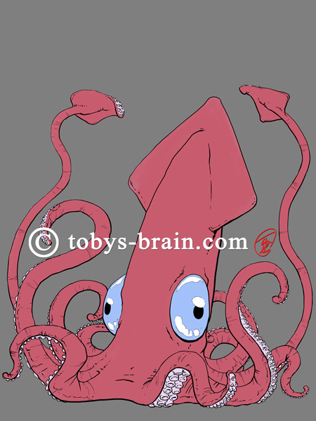
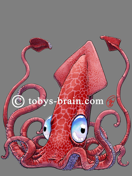
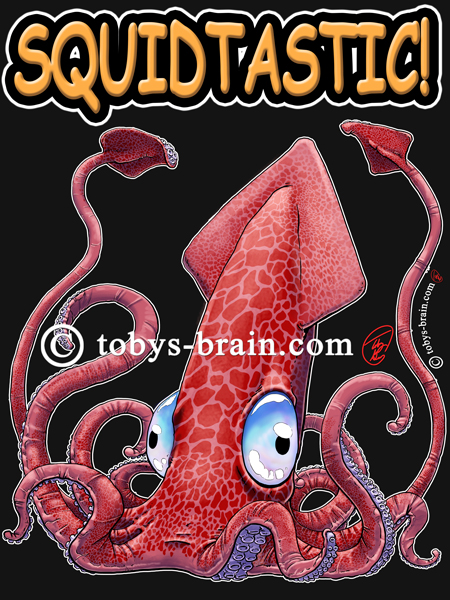
Anysquids, let’s break down that Squidtastic t-shirt design I posted a short while ago (the watermark was only added for posting here):
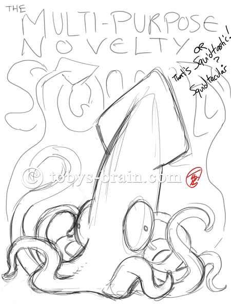
This is the initial sketch, just a white background layer and a line layer. While this is the much talked about (by me, anyway) Multi-Purpose Novelty Squid, I eventually decided to use Squidtastic as I thought it would somehow be more relateable…
I lowered the opacity of the sketch layer to 30% or so, then tidied up the sketch a little.
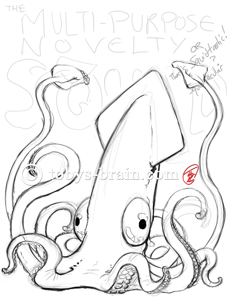
I hid the first sketch layer and dropped the opacity of the second sketch layer, then did a tight, finished line layer.
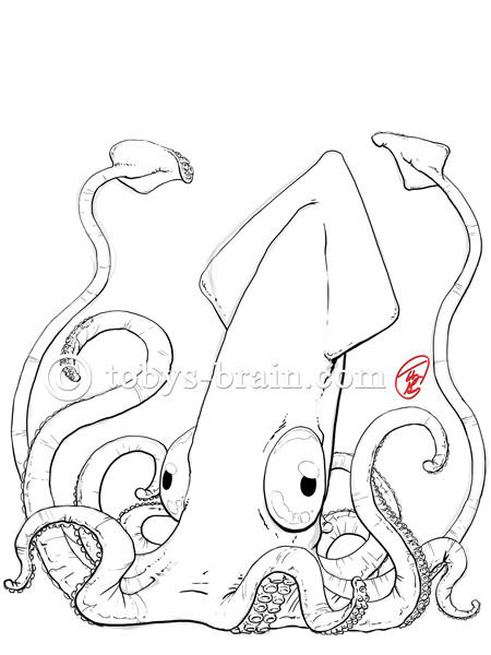
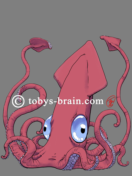
Next up is blocking in the local colors. I added a layer beneath my line layer and painted in the solid colors. I also added a black layer beneath that, but above the white background layer, and set it to 50% or so. It’s really tough to play with colors on a bright white background (this is true when working with traditional media, too). I still do the “pencil” layers on white or off white for the most part, though.
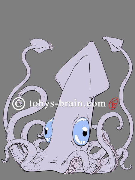
I decided I didn’t like the purple-grey skin color, so I added another layer and went redder.
Next up is the shadow layer, which I put on top of the local color layer, but beneath the line layer. This is when the blend modes for layers in Photoshop come in handy. I set this layer to multiply, chose a mid-tone, desaturated bluish-purple and painted with low opacities, building them up for darker areas. Very similar to air-brushing, with the benefit of not having to mix colors, the multiply setting does that for you, combining the colors on that layer with ones beneath. It’s a huge time saver, but to make it look good you do eventually have to go in on subsequent layers and do some color selecting and repainting.
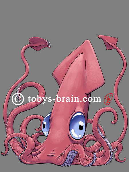
On top of the shadows, but still below the lines, I added another layer, this time set to overlay. This is similar to the way multiply works, but for highlights instead of shadows. I chose a soft warm color and tried to increase the sense of volume.

This one is subtle, but yet another layer, above the shadow and local colors, but below the lines, to brush in some reflected and secondary light. I go into the shadowed areas and use the color picker to select that color (it selects the combined color of all the layers visible), then I adjust the color to be a little warmer and brighter and start painting. If you’re having trouble finding this effect, look along the back of the squid’s body, in the shadow area. That bit of rim lighting is what I did throughout this layer.
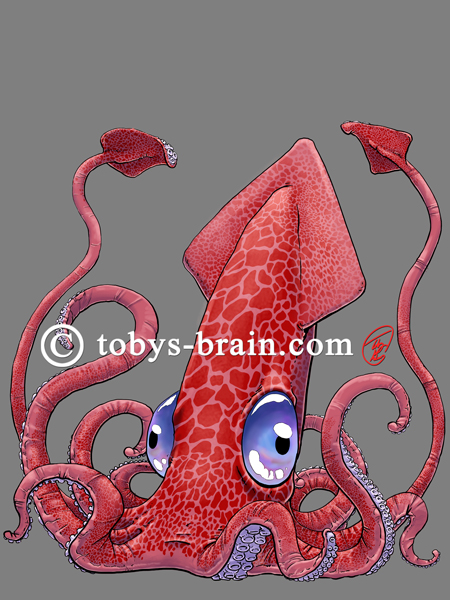
Beneath the line, multiply, and overlay layers, but above the local color layer, I decided to add that skin marking. Squids have that amazing ability to change colors and create different patterns, and the Multi-Purpose Novelty Squid is no different. This was a tedious process. I found some good pictures of various animal skin patterns and set about making custom Photoshop brushes from them. I ended up using mostly giraffe patterns. Being that giraffes are fuzzy and squids aren’t, I had to do a lot of clean up to make the patterns look right. Once I made them into brushes, I would vary the size of the brush and do a single “click” on it’s own layer. Then, I would make use of Phososhop’s powerful transform tools which allow you to take a layer and warp it like it was on a sheet of paper, creating a 3D effect without really being a 3D element. So, I’d make a single mark, wrap it around the body or a tentacle, then create a new layer and repeat. Once I had the whole body covered to my liking, I merged all those layers down into a single layer. The fact that these marks are below the shadow and highlight layers means that they get affected by them, creating the illusion of form. I also added some more colors to the eyes.
I wanted to up the highlight and shadow contrast, so I duplicated each of those layers and played with their opacities until I was happy with the look. I also did some more work on the eyes (on their own layer).
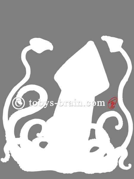
I got frustrated and erased everything. No, actually, I spent some time making a tight selection of the image, put it on it’s own layer and filled it with white. This layer was underneath everything (except for the background layers). This would allow me to apply some layer effects, mostly creating a tight white outline to help MPNS pop from whatever background color he gets printed on.
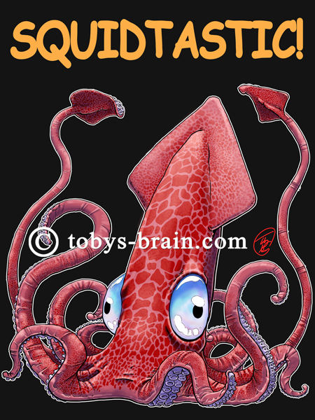
With the other layers turned back on, you can see that white outline. If I tried to apply that layer effect on the line layer, or even the local color layer, it wouldn’t have wound up so crisp and precise. Because this design will be printed on black t-shirts (for now), I decided to up the opacity of the black background layer from 50% to about 90% (100% appears much darker than the actual shirt color). I also added the basic Squidtastic text.
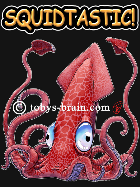
I added some layer effects to the text, namely a black stroke/outline, a white outer glow, and a bevel and emboss. It was a little too harsh, and I wasn’t quite happy with the result.
I mucked around with the layer effects on the text, toning down that bevel and emboss, as well as changed the size until I liked it. I threw in my copywrite and signature and warped it to match the curve of one of the tentacles.
And there you have it! I’m still refining my process and learning new tricks and skills, but this is how this Squidtastic Multi-Purpose Novelty Squid came together. I hope you enjoyed it!
Parents often wonder about the choices they make in life…especially when they involve the happiness and well-being of their children. I’ve always marvelled at your ability to express your thoughts in writing. I appreciate the “thanks” you offer to me and mom above. It is so rewarding for me to see you now able to spend more time growing as an artist, pursuing your passion(s), being a caring husband and father, and loving son. Carry on!!
I have some pretty big dreams and crazy ambitions, and I don’t doubt that I can achieve them with the support I have around me. My biggest challenge is time…
I want this shirt so bad. Give it. 😉 Awesome job, d00d!
Heh, me too. Gotta get my act together…