It’s later than I’d like, but it’s still New Shirt Friday! Despite the kids being home for April vacation this week, I’m still hitting my weekly goal, which feels good. I spent a lot of time this week tinkering with a whole variety of different shirt ideas in between life and parenting interruptions. I was mostly done with this week’s shirt design earlier in the week, but I made a few tweaks all the way up until listing it moments ago (partially because I forgot to do a few steps). After working on the image intently for a few days, I needed to turn to other ideas for a break before I could look at it again, assess it more clearly, make a few improvements, and feel good about it.
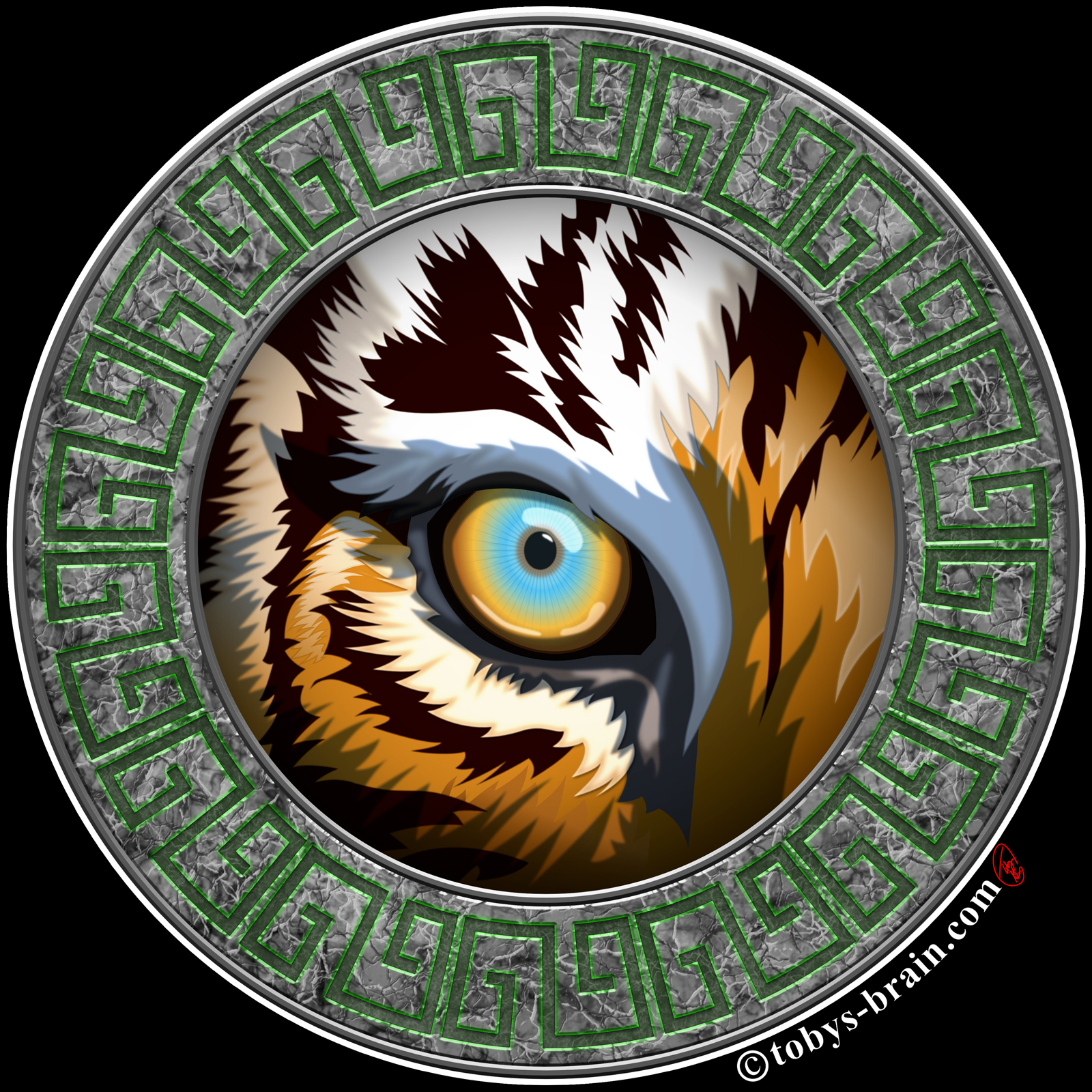
A new take on the tiger eye logo I designed for the Ten Tigers Honto Jutsu jiujitsu school I trained at for a little while.
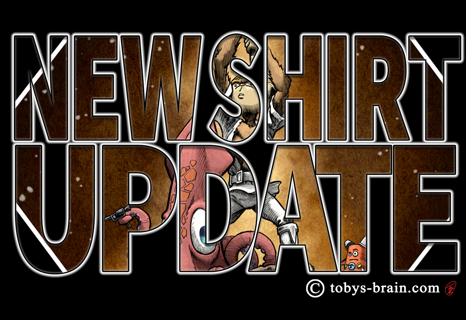
I’m really happy with the way this one turned out. I really stretched my boundaries as far as design and execution while working in Affinity Designer on my iPad. If you’ve paid attention, you’ll remember I mentioned I was going to take some old art and make a shirt out of it. That sounded good, but the big problem with “old” art for someone like me (who has a tendency to dislike and be disappointed in art I’m proud of moments after creating it. Being an artist is a head trip most of the time.) is that it looks, well, old. My skills have improved. I tried to make some adjustments and improvements, but it became incredibly tedious, so in the end I said “forget this” and started from scratch, using the old art more as inspiration.
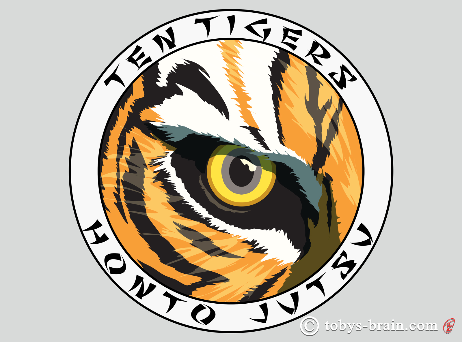
The original Tiger Eye image that I created for the jiujitsu school I was training at for a few years. This unused illustration was supposed to be a quick tweak into a new shirt but turned into a full blown new piece of art. Tigers and martial arts have gone together since the beginning. I once saw an interview with the amazing Jet Li, describing the fierce look he puts on during his fight scenes. He said he imagines the look in the eyes of a tiger about to pounce. I’d say he nails that look. A fun little anecdote about this particular image: I posted this on Instagram with the tag #eyeofthetiger or #tigereye or something like that. It got liked by some guy called Jim Peterik…you know, from Survivor? Your welcome for getting that song stuck in your head.
I wanted this design to be a part of a sub-line of shirts I’ve been planning that are focused on nature and the elements. Each design is set in a circular frame (for now. I may eventually move on to other shapes when I exhaust the circle) that is inspired by the element or force of nature that the image is a part of. For example:
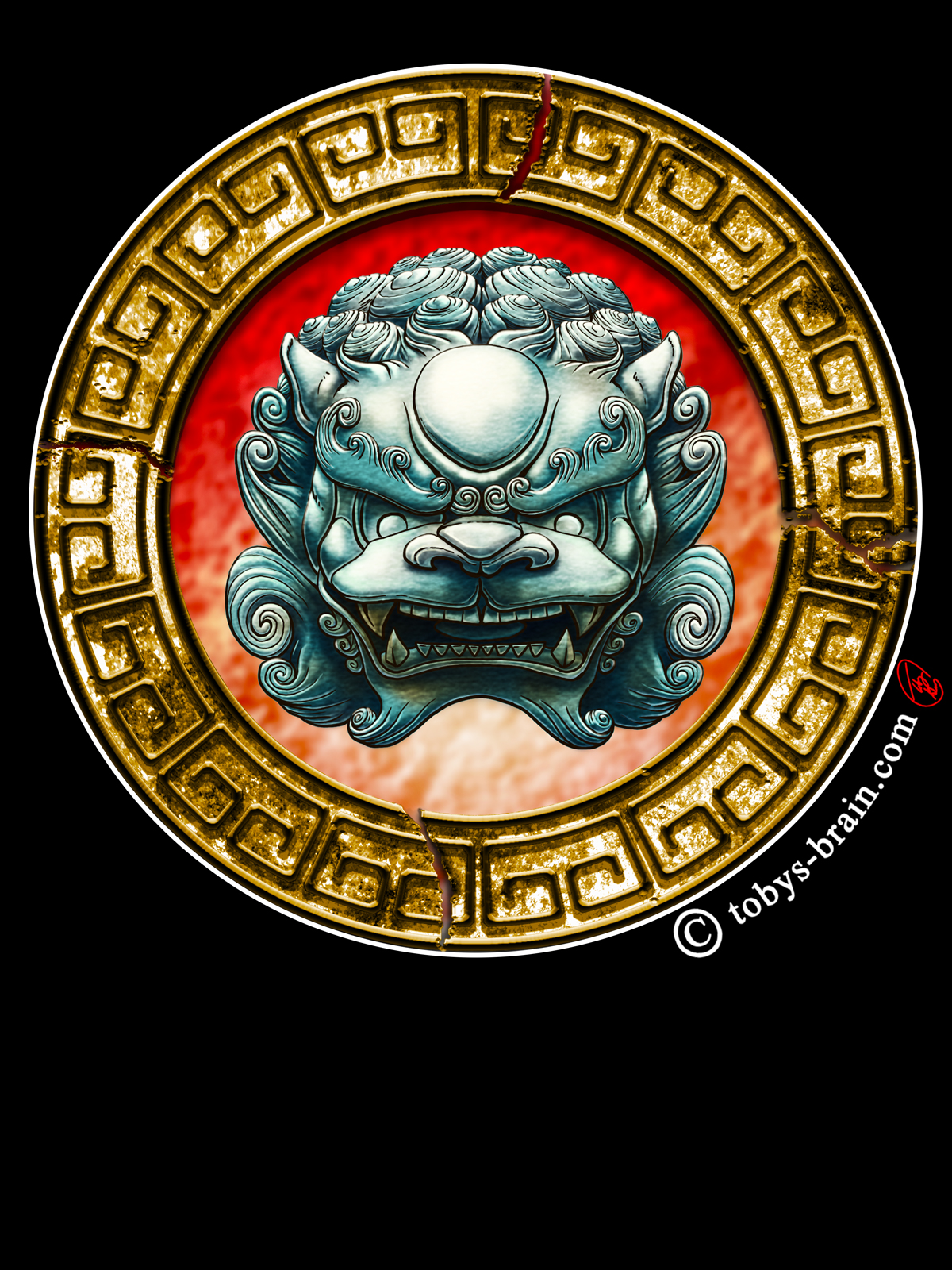
One of my original designs from many, many years ago when I first decided I was going to take a swing at the t-shirt thing, tweaked and updated more recently (reflecting improved skills and knowledge of how to use Photoshop to greater effect) when I finally got around to opening the Etsy store.
Note the similar frames around the tiger eye and the fu dog. I consider both to fall into the “earth” element category, which I envision as plants and rocks and such. The fu dog has a very apparent stone frame, cracked to reflect the ancient-ness of the mythical creature. The tiger eye has a stone ring with a subtle green glow from the relief carvings to tie the living, breathing (for now. It’s sad to imagine a world without an animal as impressive and amazing as a tiger. I’m sure Hobbes would agree) tiger to it’s jungle environment. I toyed with the idea of incorporating branches or leaves, but thought it would get a bit too busy.
I have lots of other ideas that will fall into the “elements” category, and when I sit down to work on one, I usually start coming up with a lot more. I have a squid one for “water” that needs finishing one of these days, it’s just a matter of deciding on the frame theme.
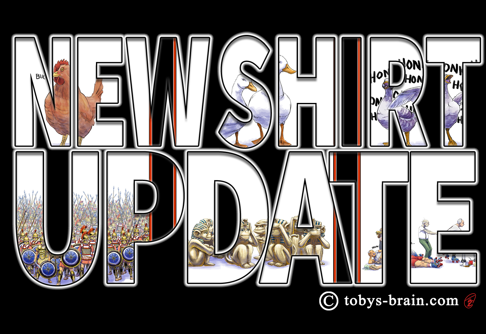
So, while I was puttering with the tiger eye, I started working up two new, completely different “lines” (it’s weird putting my shirts into categories or lines, as I’m not exactly doing a ton of business, but thematically it makes sense, and I have a penchant for categorizing and organizing my ideas that way). One is a series of 10 Things shirts. I thought it might be a fun merchandising tie in. Of course, more people have to start buying the book for that to really make sense, which means more people need to know about it (so spread the word, if you please), but, I find a reasonable amount of happiness in thinking about people walking around with a shirt with One Hen, Two Ducks, and Three Squawking Geese on it, with no words, and seeing how many other people look at the shirt and get it. I’m going to mock up shirts for every “thing” and some of the combined pages, then maybe I’ll put it to a vote as to which one or ones wind up as shirts. There’s a part of me that thinks it would be super cool to do one shirt per “thing”, so a group of 10 people could stand together and represent the whole tongue twister. Again, need some more fame and popularity for that to happen, though. What’s this 10 Things I’m talking about? Go get yourself a copy, enjoy the story, and read the explanation at the end.
The other shirt line will require some more fans before I can justify making it happen. It will also require I get back to work on IPMDT, Inside Toby’s Brain, and some other things. Long ago I thought a PMD silhouette would make a good shirt, I’ve drawn the silhouette many times for other things. I have to admit to being inspired by the iconic Mickey Mouse ears silhouette that’s instantly recognizable pretty much world-wide. Plunger Monkey is essentially my Mickey Mouse…not that PMD is on that level (nor am I the second coming of Walt Disney). Anyway, while taking a break from the tiger eye, I decided to mock up a PMD silhouette in Affinity Designer, which then opened the flood gates for another idea: PMD superhero logos. I had watched a Photoshop tutorial a few years back when I was trying to understand the vast potential of the Layer Styles options in which tutorial dude made a sweet looking, shiny, highly detailed, generic superhero logo (I think it was a Blue Lightning Tv tutorial…actually, that’s exactly what it was. Here’s part 1, and part 2.). My first thought was “that would look pretty sweet with the letters PMD”. So, over the course of a few days, I’ve designed 7 or so PMD Superhero emblems, with more ideas kicking around. I’m not sure if they’ll all see the light of day, but they are fun to design.
Again, though, in order for it to be worth making those shirts available, I need a serious uptick in fans, and more importantly, people willing to spend some money on my merch. That’s going to come from word of mouth and my producing more content starring my alter ego. It’s incredibly hard to get noticed in a sea of brilliant ideas, amazing art, and highly skilled people. I’m not quite sure where else I can promote myself (nor do I realistically have a ton of extra time to expend doing it), so I’ll just stick to creating and waiting for now.
Don’t let that stop anyone from raving about what I do to everyone you know, and several you don’t.
Anyway, I should have another shirt ready to go next Friday, then I will hopefully be ready to decide on at least one 10 Things shirt for the following week. Then, it’s time for new shirts to return to the back burner so I can focus on IPMDT panels, Inside Toby’s Brain, Revery, and perhaps a side track to make my dream every day carry bag and/or some more wool goodies for a while. I set some solid goals for this year, and so far I’ve done really well hitting them (though I’m drifting a bit behind, I’m still making progress). I’m on track to making 2019 a really good arting year.
Please let me know what you think, it makes my brain happy.